Worldwide typeface — A single-line font inspired by a wireframe symbol of the globe
about:
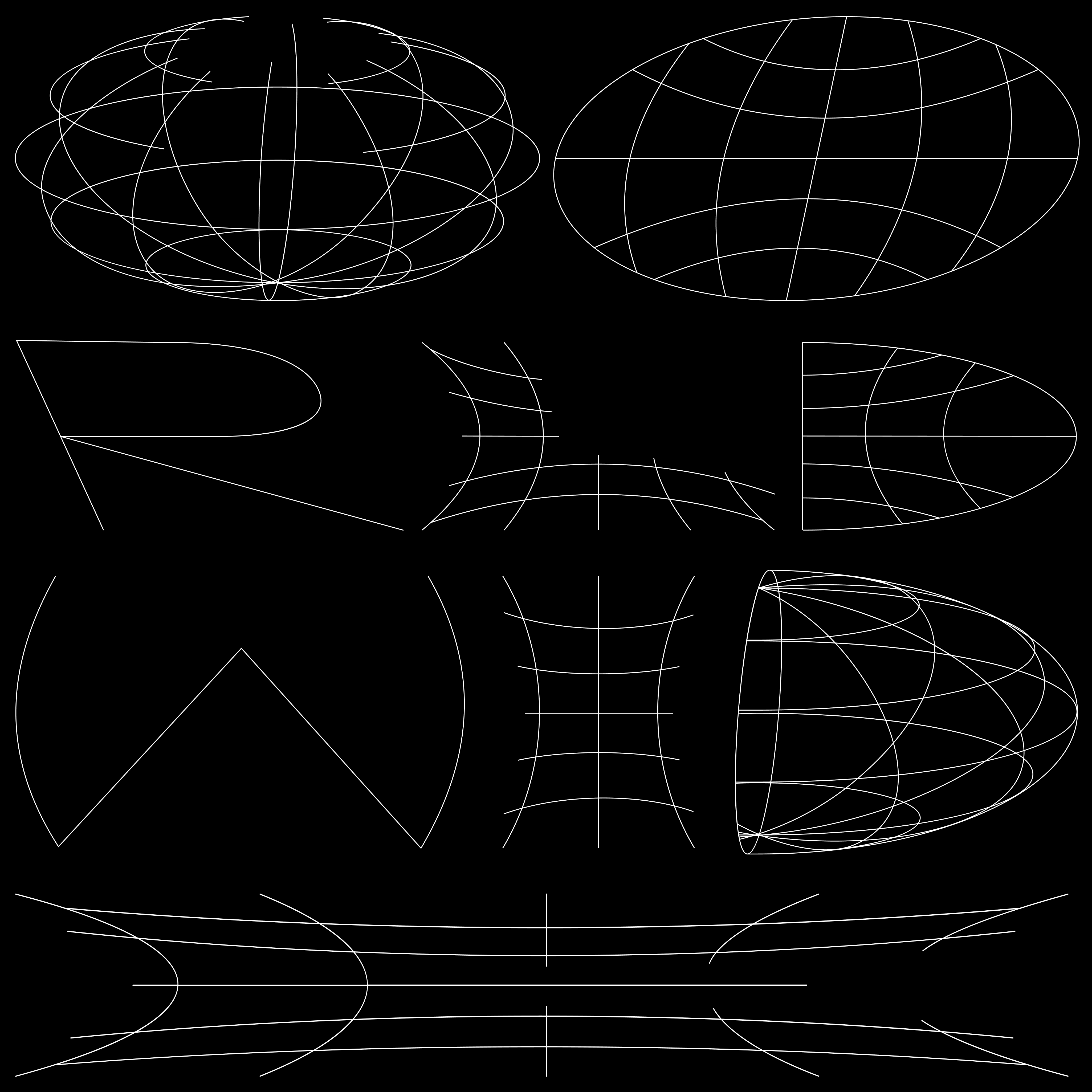
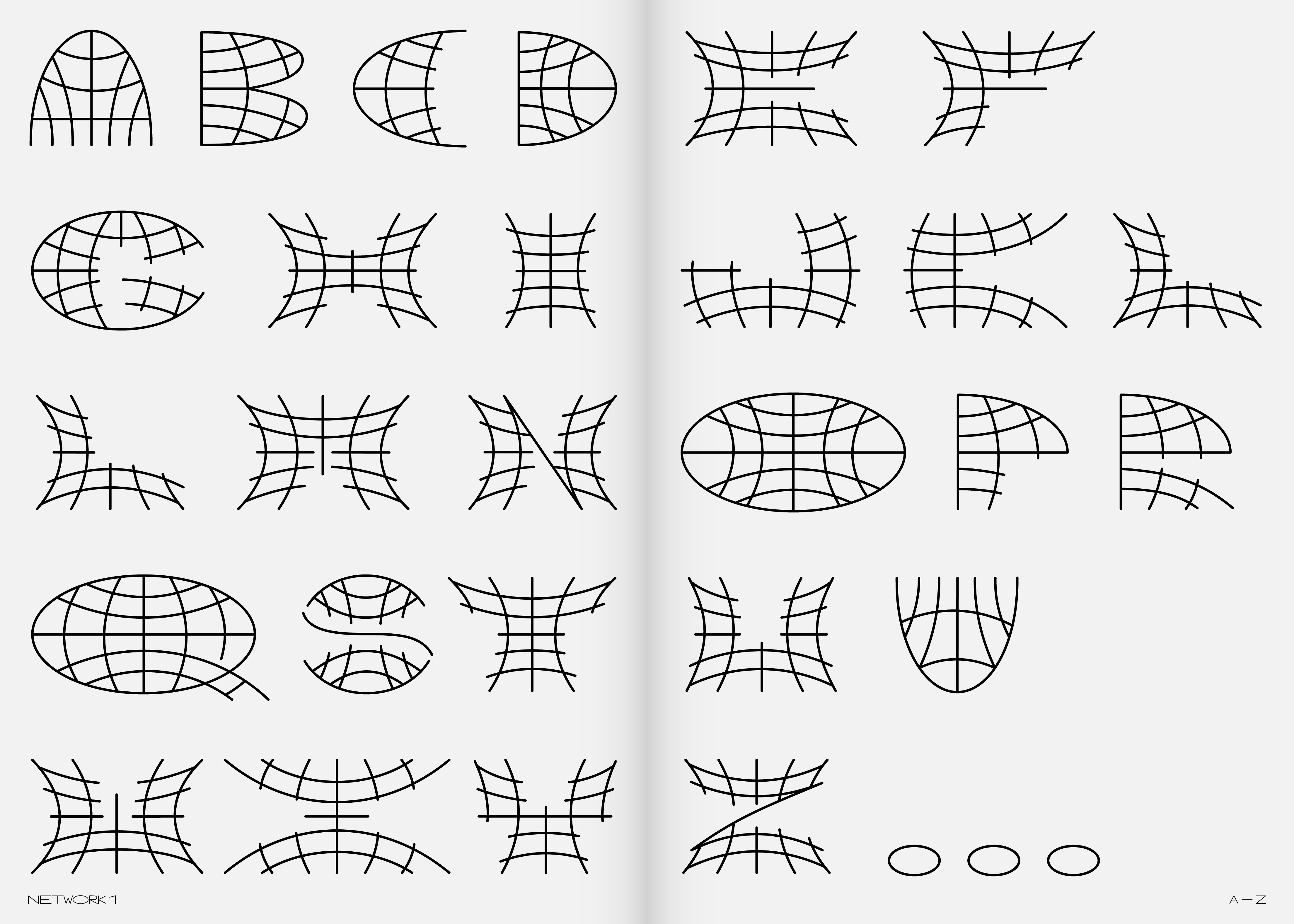
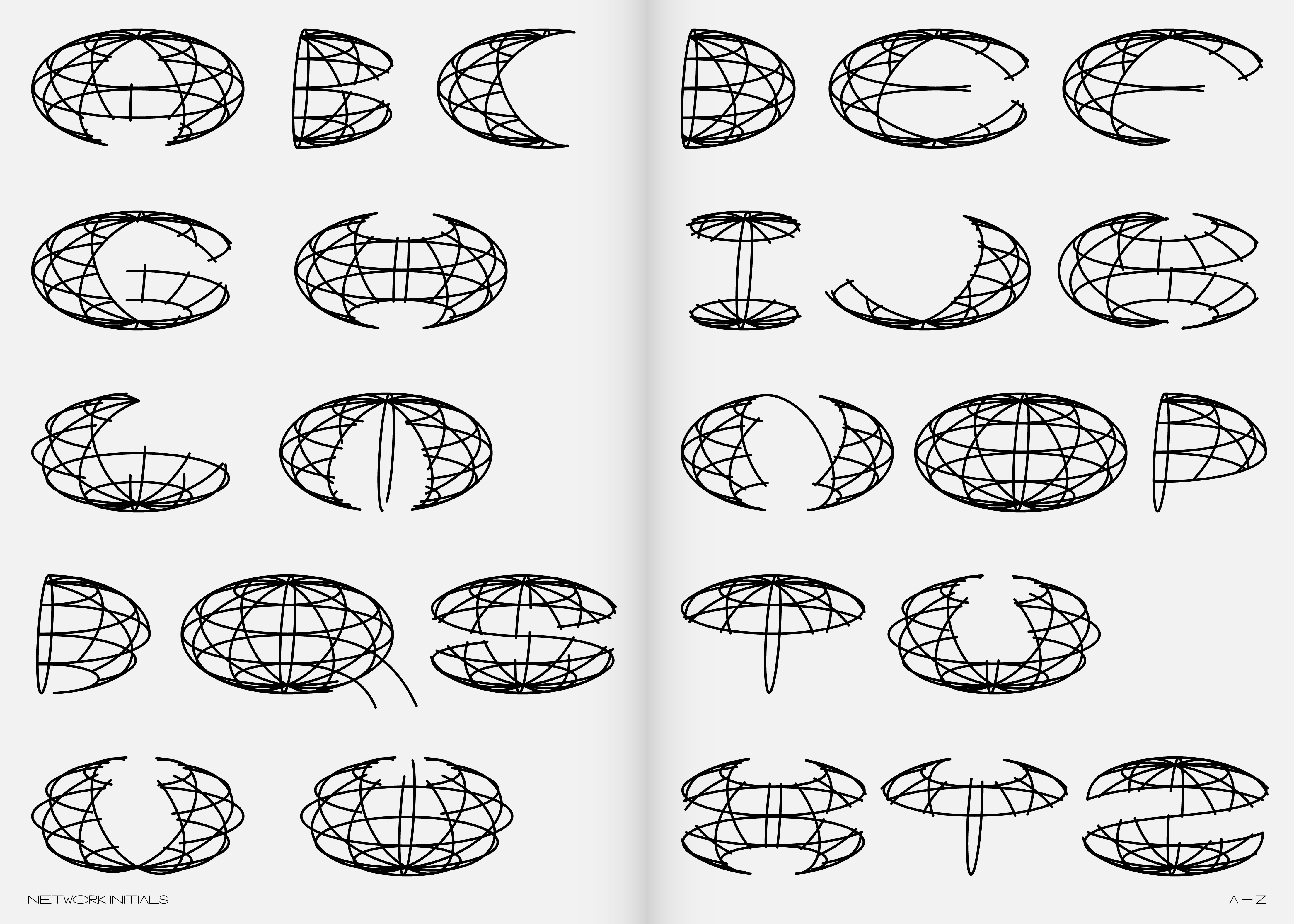
The infamous wireframe symbol of the globe is used extensively in graphic design. It is an internationally understandable symbol, although it has multiple meanings. It can symbolize language and time — it is also often associated with the visuals of logistics companies. As “Worldwide,” this symbol usually refers to the planet Earth. As part of my obsession with this symbol, I set myself the following task: “Create an alphabet by deconstructing this symbol. Interfere with the structure of the symbol as little as possible and test whether this task will be possible.” Thus, the symbol became a structural network, and I could design the entire uppercase alphabet with a basic set of characters and symbols. This skeleton, in which I tried to find all the Latin alphabet characters, plays on traditional font skeletons and the “cult” of fonts intended for CNC machines. Inherently, I attempted to leave the font with an open contour and thus create a playful version of the one-line font.
The infamous wireframe symbol of the globe is used extensively in graphic design. It is an internationally understandable symbol, although it has multiple meanings. It can symbolize language and time — it is also often associated with the visuals of logistics companies. As “Worldwide,” this symbol usually refers to the planet Earth. As part of my obsession with this symbol, I set myself the following task: “Create an alphabet by deconstructing this symbol. Interfere with the structure of the symbol as little as possible and test whether this task will be possible.” Thus, the symbol became a structural network, and I could design the entire uppercase alphabet with a basic set of characters and symbols. This skeleton, in which I tried to find all the Latin alphabet characters, plays on traditional font skeletons and the “cult” of fonts intended for CNC machines. Inherently, I attempted to leave the font with an open contour and thus create a playful version of the one-line font.
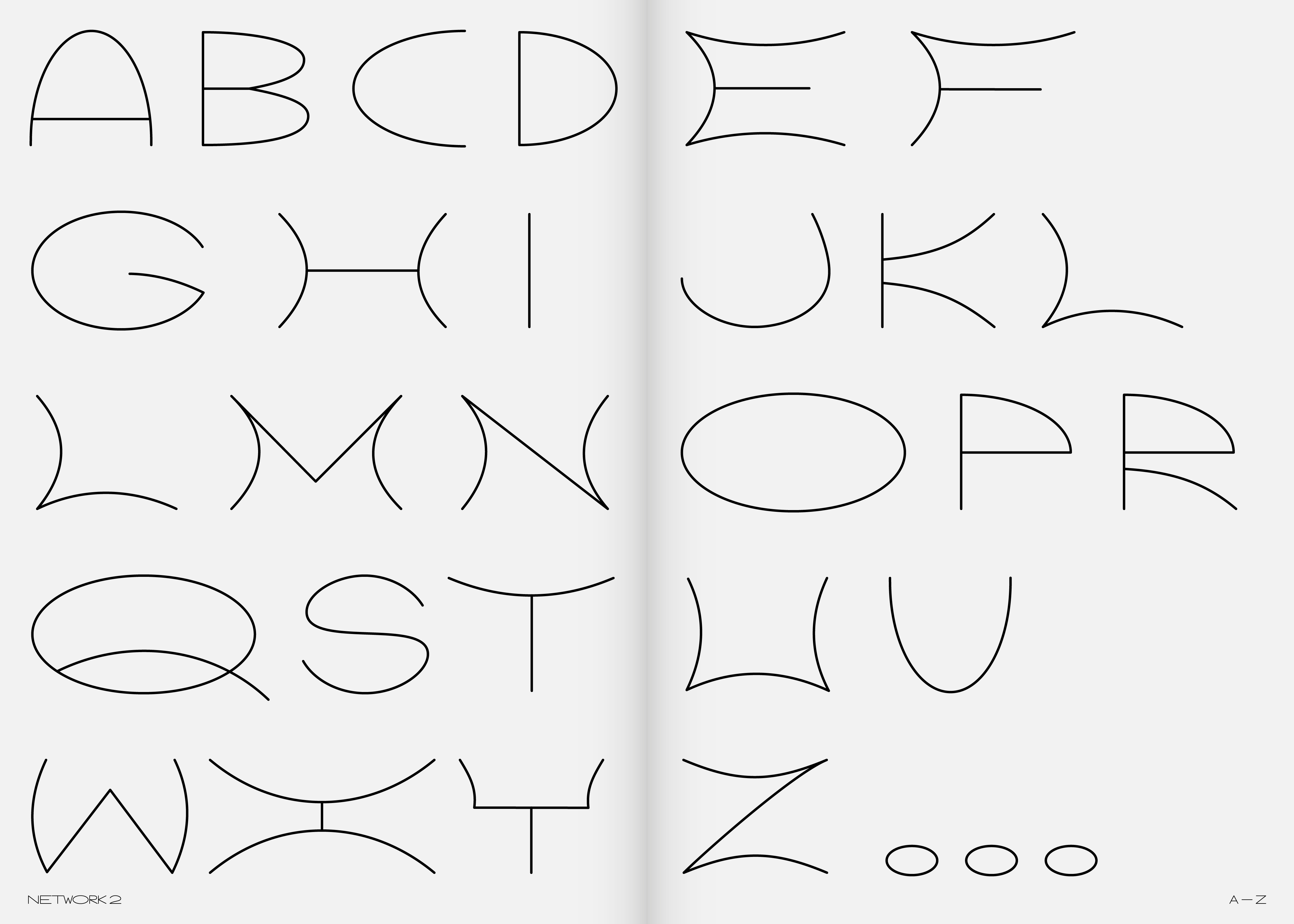
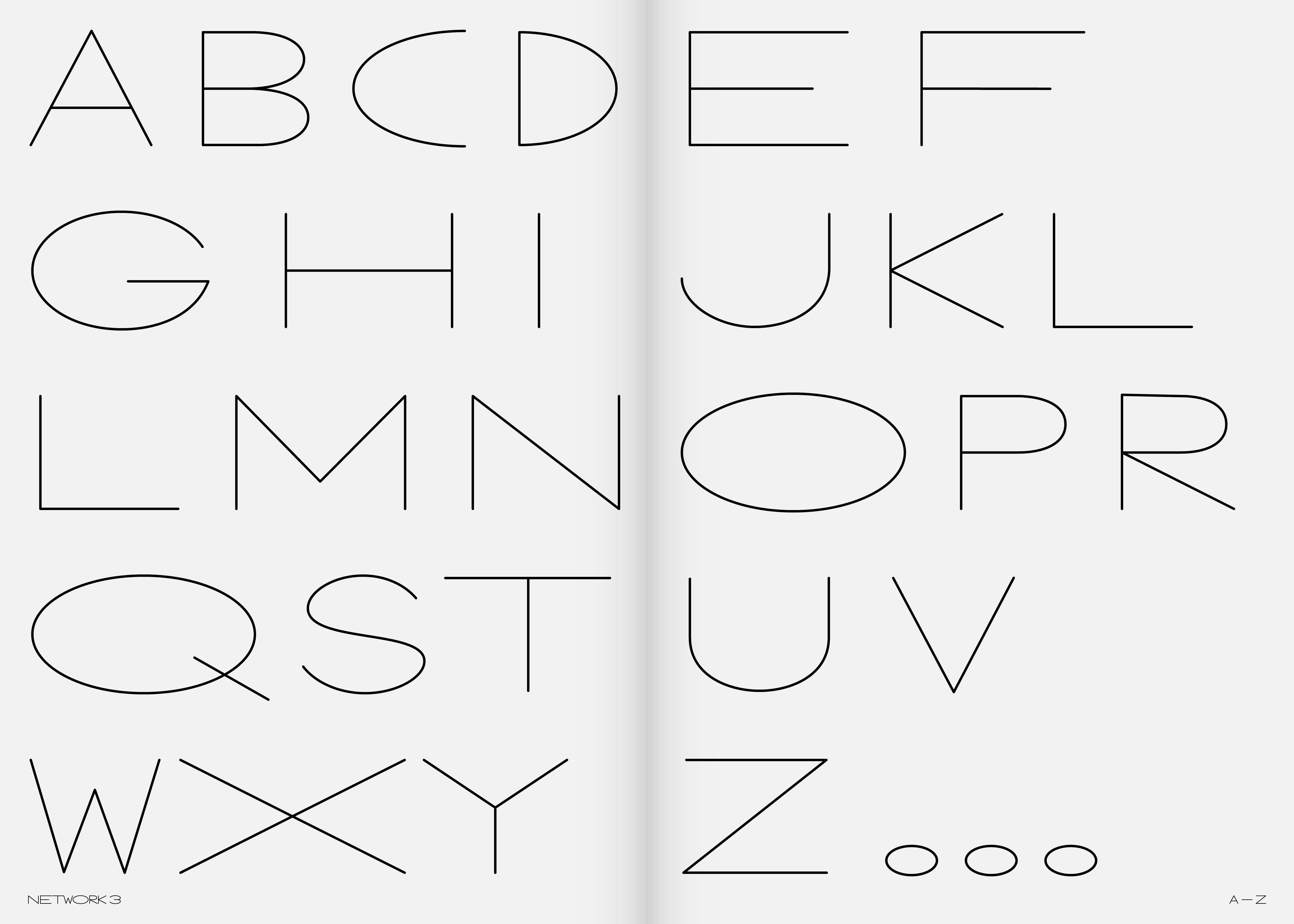
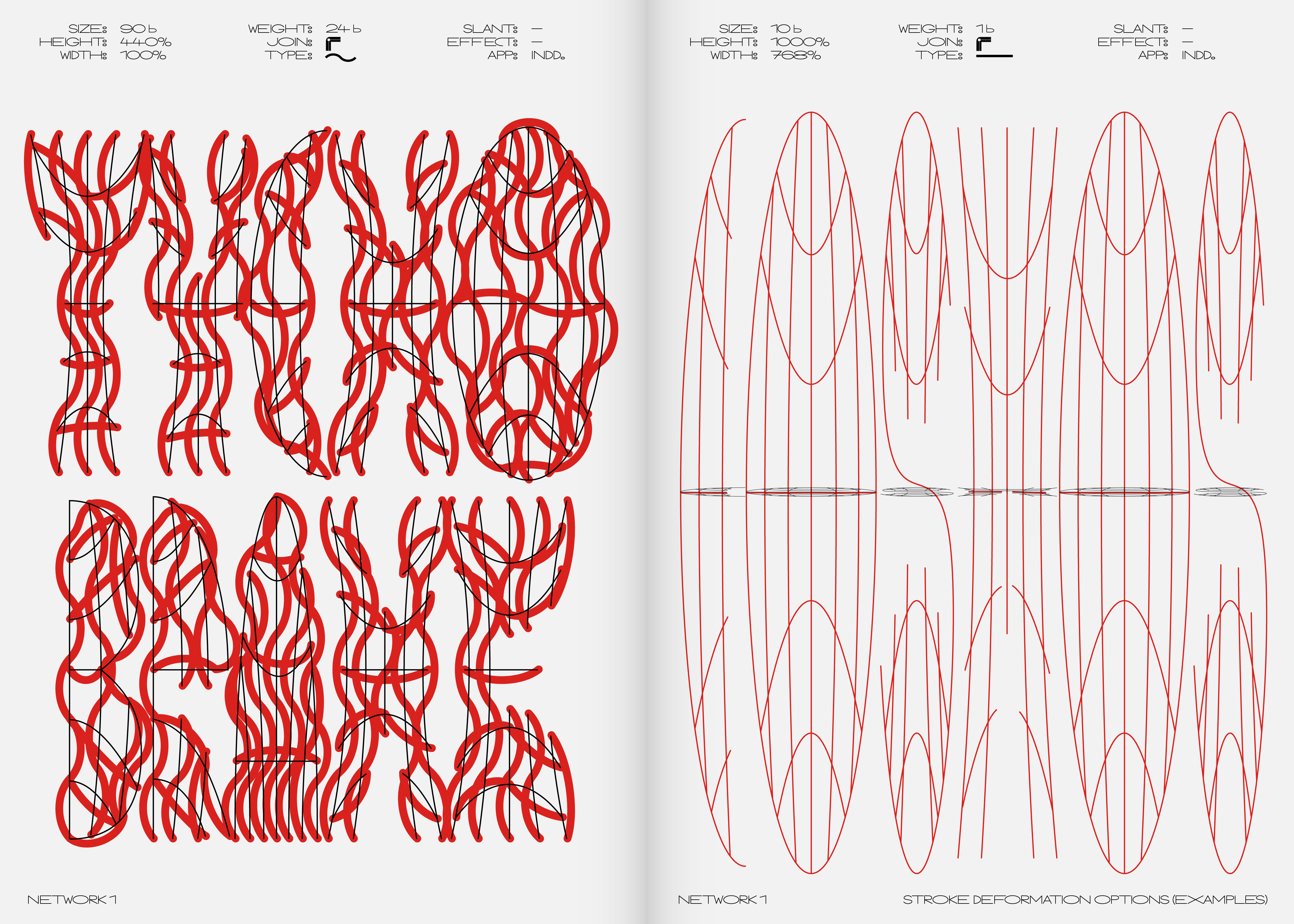
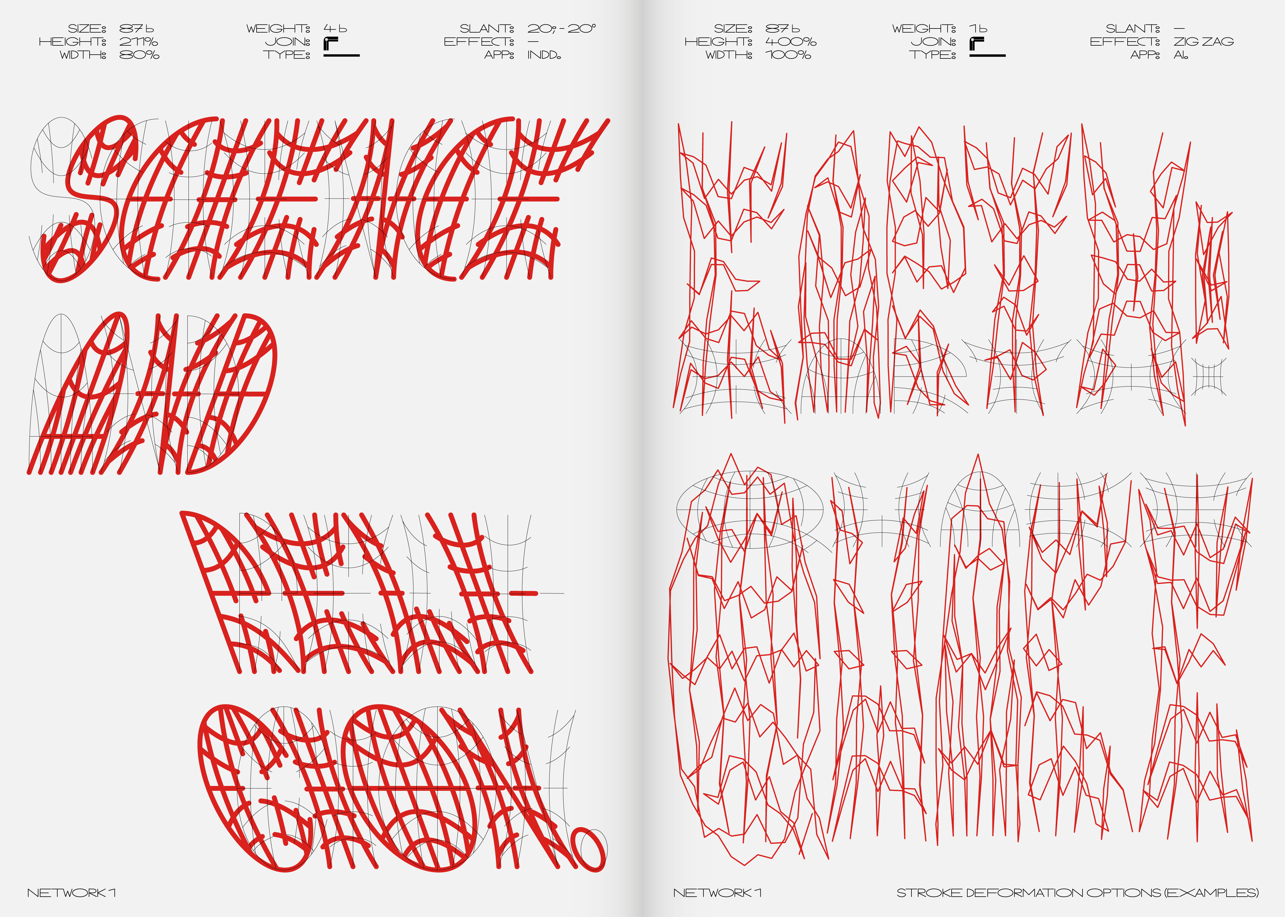
The default Network 1 style, which is mainly suitable for heading use, was later expanded with three more styles that depend on its shape and proportions. The Network 2 style is its simplification to the outer shape (just one line). The Network 3 style reacts to the previous cut, swapping character shapes for the traditional morphology of the Latin alphabet. These two minimalistic versions also work well for use in shorter texts. However, we must remember that even the wire symbol of the globe comes from the stylization of its 3D model. So, my next attempt was to check whether I could design one style from a 3D model, too — and that’s how the Network Initials style was created.
In graphics programs, it is possible to adjust the width and shape of the stroke, as well as the height and length of the characters, which still retain their inner skeleton of letters due to deformation. The font is, therefore, intended for users who like to use the possibility of further intervention in its final shape.
- status:
-
Version 1.0: Done
- year:
-
(Time is a construct)
- type:
-
#type-design