Speed Grotesk typeface — font define by Slant & Width extremes
about:
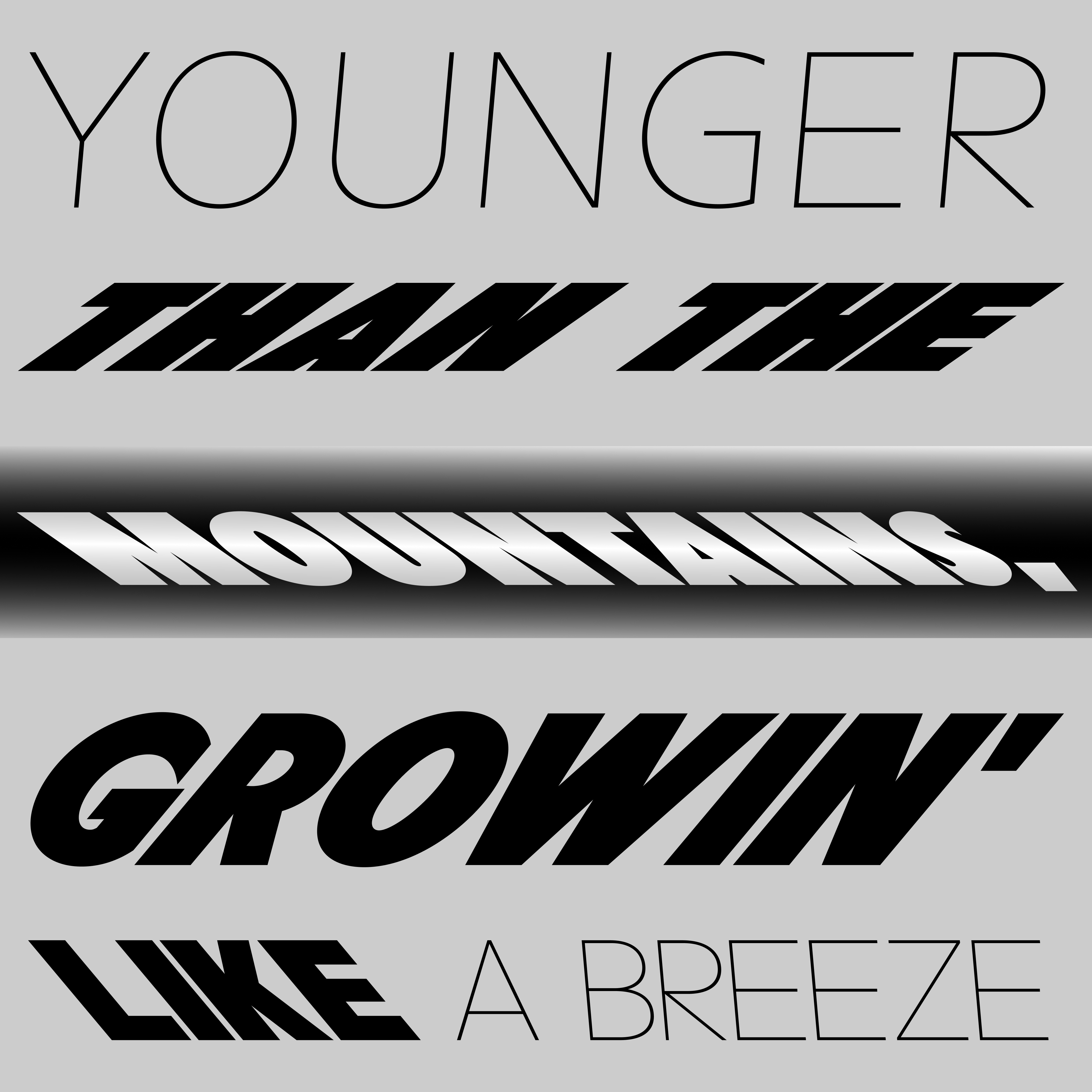
The Speed Grotesk typeface is an experimental font indicated by extreme positions of the slant and weight of the styles and the firm connection between them. The development of the Speed Grotesk font originates in custom lettering work for the visual identity of the bicycle brand. Lettering originally had three styles, which varied in slant and weight. This differentiation was based on dividing bikes according to the route’s difficulty (slope of the landscape and speed). The greater the difficulty, the greater the slant and weight of the style. From an almost invisible slanted Light (Cities) to a highly slanted Black (Mountains). Also, each style has two variants of italics (left and right italics), used separately for each side of the bike and thus perfectly quote movement direction.
The Speed Grotesk typeface is an experimental font indicated by extreme positions of the slant and weight of the styles and the firm connection between them. The development of the Speed Grotesk font originates in custom lettering work for the visual identity of the bicycle brand. Lettering originally had three styles, which varied in slant and weight. This differentiation was based on dividing bikes according to the route’s difficulty (slope of the landscape and speed). The greater the difficulty, the greater the slant and weight of the style. From an almost invisible slanted Light (Cities) to a highly slanted Black (Mountains). Also, each style has two variants of italics (left and right italics), used separately for each side of the bike and thus perfectly quote movement direction.
However, during the lettering’s development, we already recognized the font’s qualities and shape universality, which could be completed into a full-scale font, thus allowing for further interpretation opportunities.
As for the font design, I first had to choose a suitable origin typeface due to the extreme nature of the slants and weights. After extensive testing, I decided on the Futura font, characterized by a vertical end of the strokes. This decision allows for extreme slants of the font while preserving its metrics. This quality has proven essential, especially for radical combinations like extreme slant + black weight.
The font is currently still in development.
- status:
-
Version 1.0: In development / Waiting
- year:
-
(Time is a construct)
- type:
-
#type-design