La Pipe typeface — Way to Keep Utopia!
about:
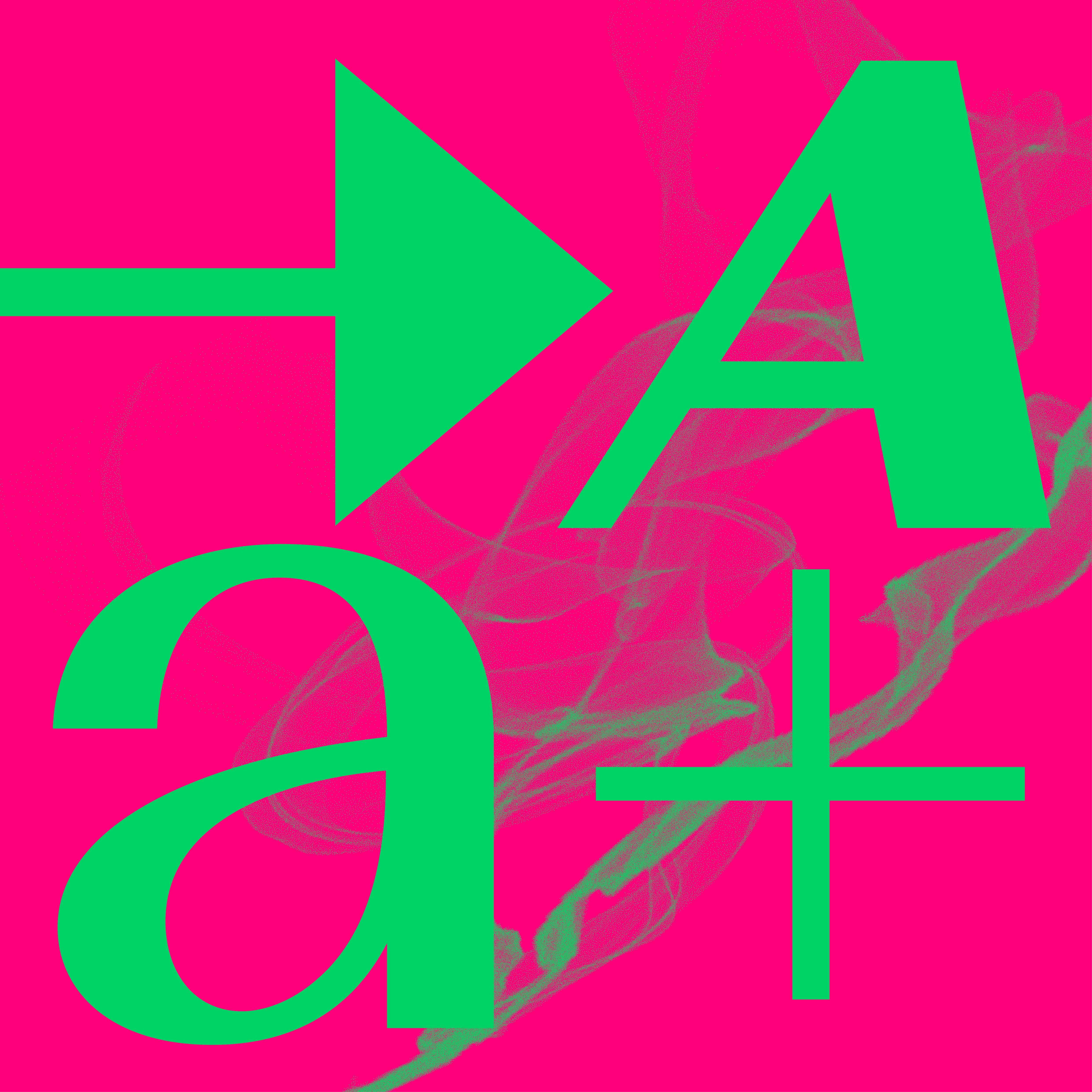
Until recently, I was among those people who outright rejected Peignot, primarily due to its typical period design. But then, suddenly, out of the blue, Cassandre bases his typeface on Bayer’s universal typeface. This fact inspired my first idea to create a grotesque version of the typeface, but this completely wiped out the attractiveness of the original design. Maintaining the contrasting character stress was a must. So, I returned to the beginning with a simple question: “What would make this typeface more contemporary?” If the designer’s personality disappears from the typeface, their stylization also disappears, and I can focus on the skeletons of the letters. I minimized the means of expression and chopped off the rounded endings, which are so characteristic of the lowercase “a,” “e,” “v,” and “n.” But I retain one of the most important things – the utopia in changing the letterforms while maintaining good readability. Likewise, I continued the toning-down process in the design of Touraine and finished the classic lowercase shapes.
Until recently, I was among those people who outright rejected Peignot, primarily due to its typical period design. But then, suddenly, out of the blue, Cassandre bases his typeface on Bayer’s universal typeface. This fact inspired my first idea to create a grotesque version of the typeface, but this completely wiped out the attractiveness of the original design. Maintaining the contrasting character stress was a must. So, I returned to the beginning with a simple question: “What would make this typeface more contemporary?” If the designer’s personality disappears from the typeface, their stylization also disappears, and I can focus on the skeletons of the letters. I minimized the means of expression and chopped off the rounded endings, which are so characteristic of the lowercase “a,” “e,” “v,” and “n.” But I retain one of the most important things – the utopia in changing the letterforms while maintaining good readability. Likewise, I continued the toning-down process in the design of Touraine and finished the classic lowercase shapes.
This concept of adding shapes seemed contemporary to me, so I decided to continue it. Although Cassandre never wanted to create a slanted style for the typeface, my version has three styles. The “Rotated” style is more of a rallying work. It is related to Programme, a generated typeface that refers to technology – just like Peignot, which referred to the period’s engraving technology. I also created classic and reverse Italics, which may be mixed and matched. The three style sets allow users to pick the forms they prefer.
This is the scale of use for my new utopia. La Pipe is the evolution of Peignot. “Pipe” refers to Casandre’s favorite pastime, as seen in period photographs, and evokes typical stroke stress. Finally, using a French name suggests where its model is from.
- status:
-
Version 1.0: Done
- year:
-
(Time is a construct)
- type:
-
#type-design