Creatura typeface™ — Organically shaped, uni-width typeface simulating letterpress.

about:

Sensitively reconstructed and redesigned for our “post-everything” times… The Creatura typeface was created to be used in longer texts. It is specially designed for the sixteen-point text size, which faithfully copies the proportions of the original typeface – the Aldine Roman, from 1499. Despite this, the organic shape of the alphabet, which simulates the uneven press of the original typeface on letterpress (the printing techniques of that time), allows the font to be used for larger heading sizes or experimental designs. The two additional styles (Press 2 and Press 3) are genuinely naughty variations you can utilize for larger sizes without hesitation. The Creatura typeface is an alternative to the classic digitalization of text fonts with sharp contours. It tries to be a blend (ideal ratio) between severe study and playful insight.

Sensitively reconstructed and redesigned for our “post-everything” times… The Creatura typeface was created to be used in longer texts. It is specially designed for the sixteen-point text size, which faithfully copies the proportions of the original typeface – the Aldine Roman, from 1499. Despite this, the organic shape of the alphabet, which simulates the uneven press of the original typeface on letterpress (the printing techniques of that time), allows the font to be used for larger heading sizes or experimental designs. The two additional styles (Press 2 and Press 3) are genuinely naughty variations you can utilize for larger sizes without hesitation. The Creatura typeface is an alternative to the classic digitalization of text fonts with sharp contours. It tries to be a blend (ideal ratio) between severe study and playful insight.

👇 About the Creatura typeface or organic fonts and where to find them

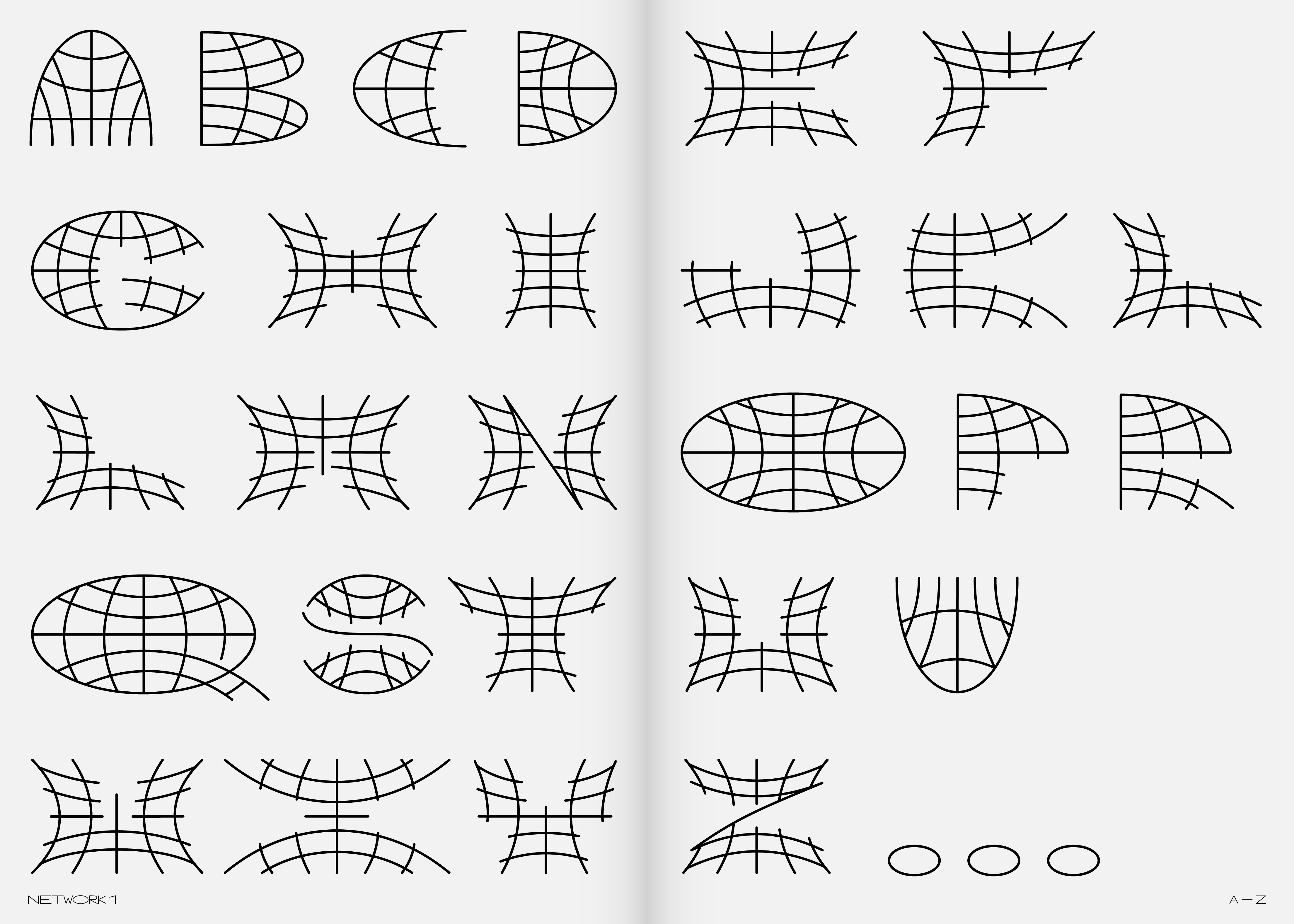
If we were to characterize the organic typeface, it would probably sound like this: “An organic typeface (or a typeface of organic shapes) is any typeface that respects the principles of free drawing.” Free drawings that don’t know too sharp edges and geometric construction. The alphabet of organic shapes is a system of freely drawn letters that may or may not respect the established construction of the Latin alphabet.

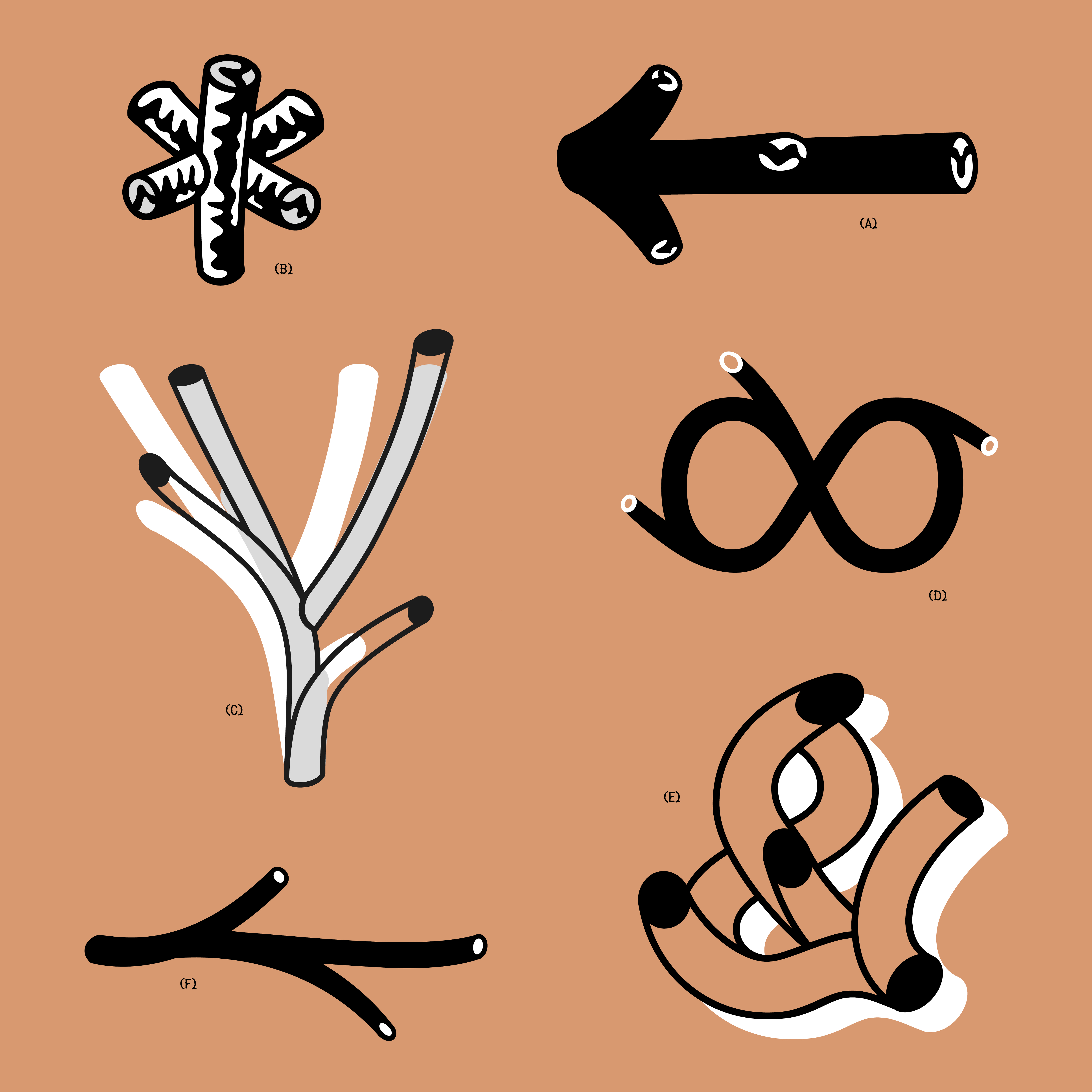
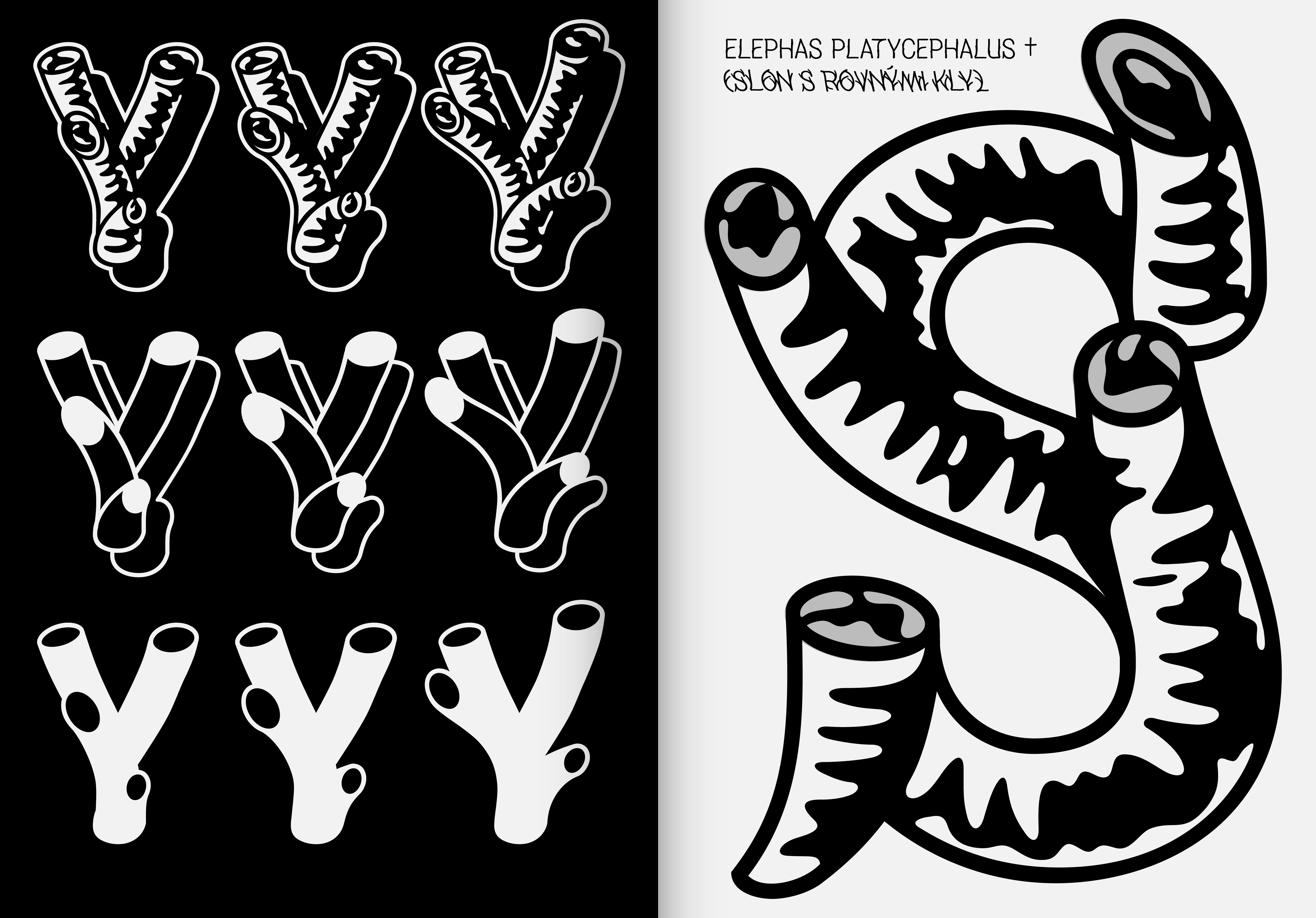
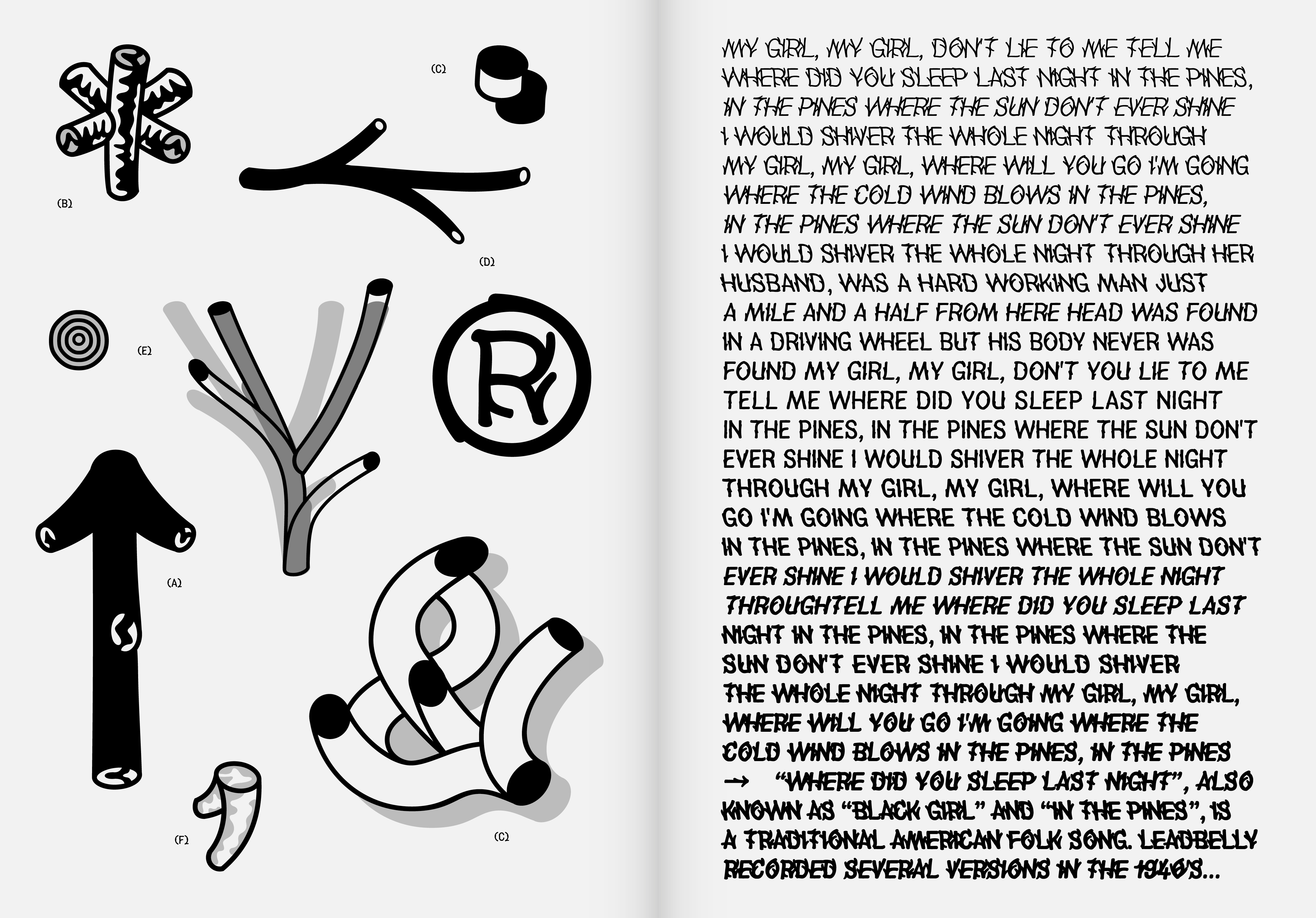
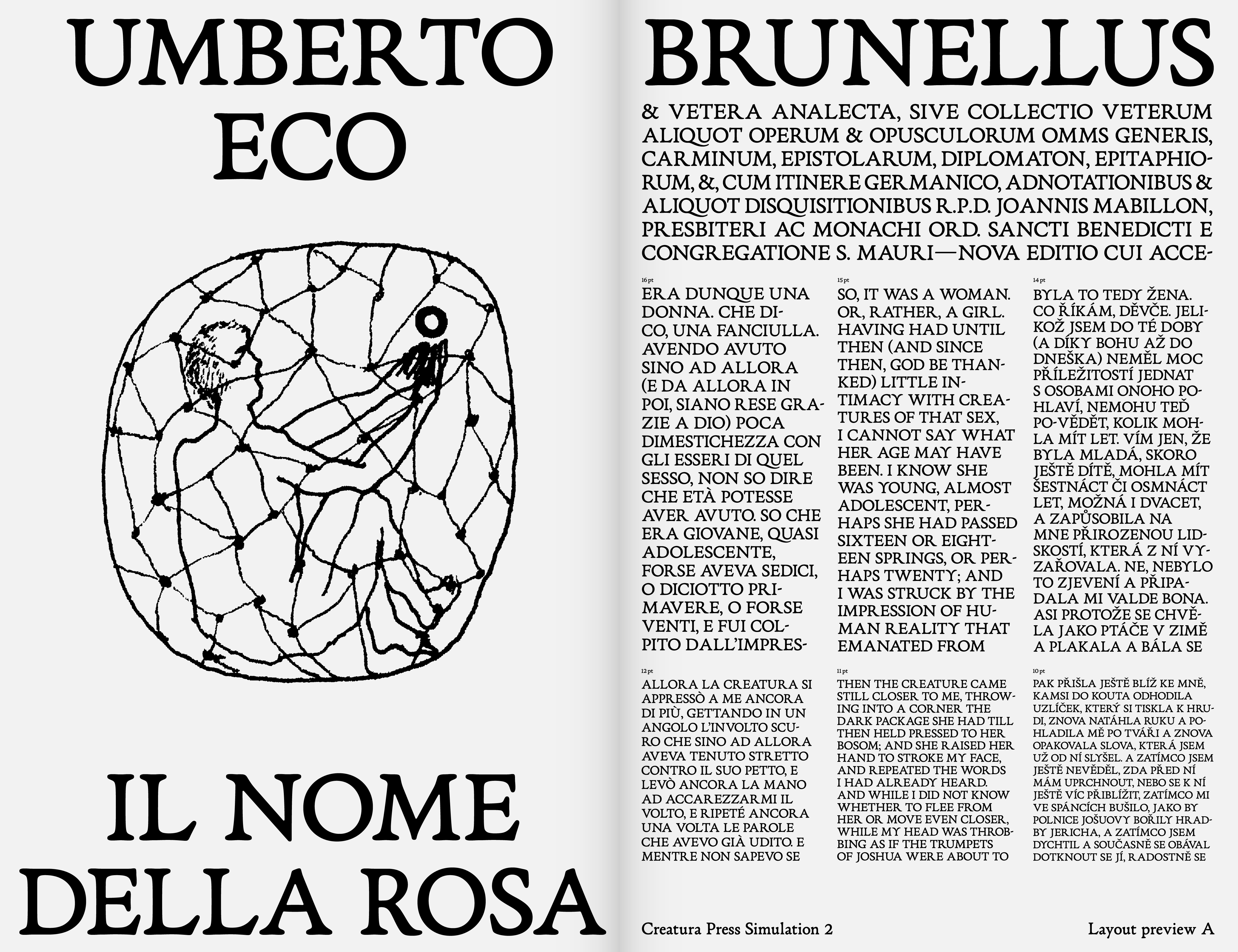
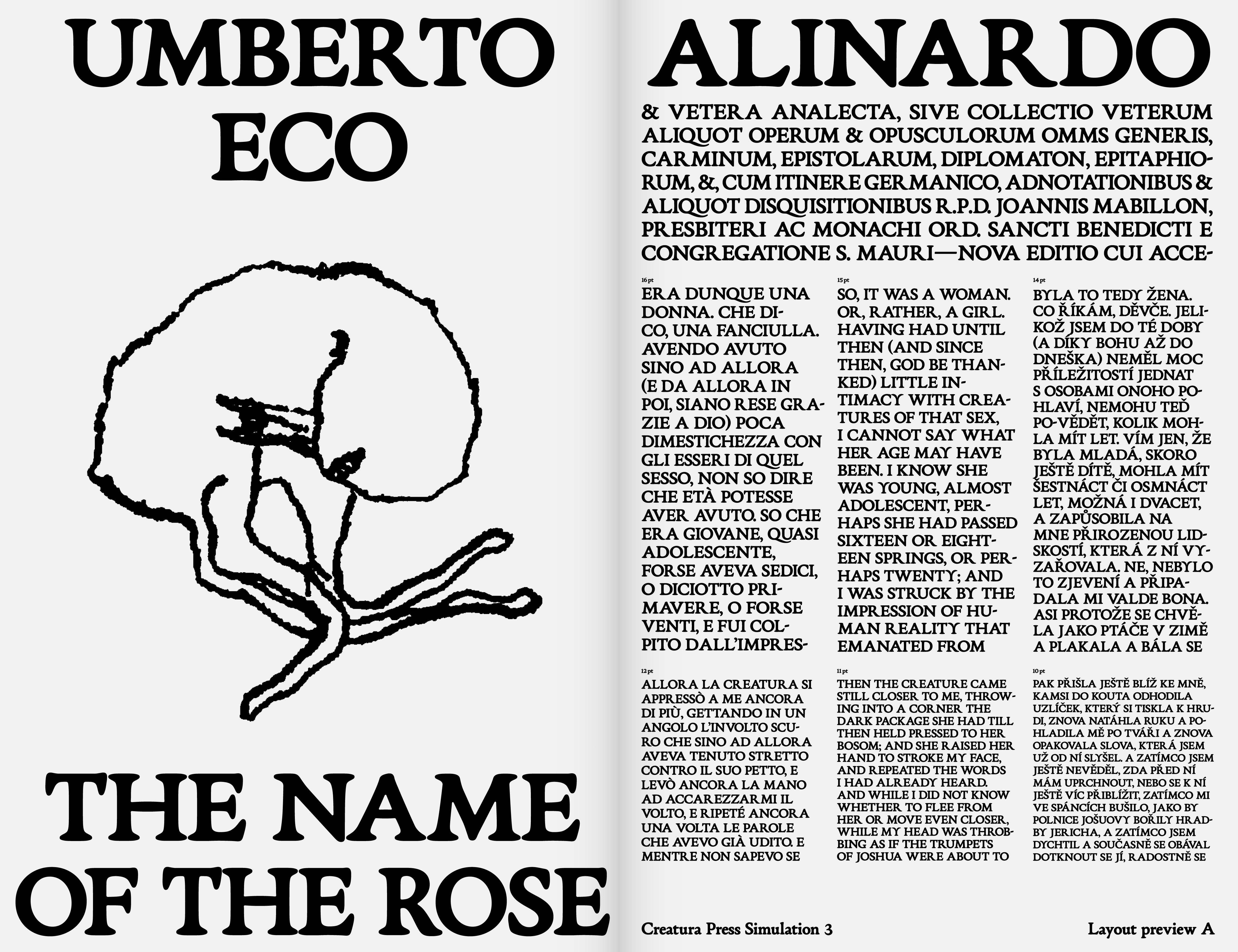
My interest in this project was learning the serif typeface construction principles. Secondly, to discover the use for the organic shapes of the typeface in its construction and origin technology. The old prints are a perfect combination of these goals because they were the beginnings of the construction of Latin fonts, which also struggled with the imperfect technology of engraving letter by letter and the following imprint that created a characteristic organic contour. The Aldin Roman became a winning model for me. According to František Muzika, this alphabet stands among the first attempts to construct the Latin alphabet and its established principles. I was especially fascinated by the imprints of the letters in the original prints and some specific constructions of the letters, such as the Greek palm Ypsilon.

Initially, I started from the hypothesis that by redrawing selected imprints of individual letters, I would achieve the primary intention, i.e., a living organic typeface. This process resulted in two styles that differed by weight based on the different pressures on the letters in the original prints. Finally, I abandoned this path because the typeface lacked/needed the basic skeleton of individual letters. It was necessary to go deeper into the roots of the skeleton of Aldin Roman. By analyzing the original prints, I got (mostly) very clean imprints of the letters, which convinced me of the greater precision of executing the origin type. Therefore, I based the proportions of the horizontal and vertical strokes of the Creatura typeface on the imprints of the origin. The effort was to create a balanced typeface for book typesetting. The primary style is thus drawn from the beginning for its original size of 16 points, corresponding to the origin type’s size. I also devoted a long time to the final construction of the serifs. It isn’t easy to recognize the original author’s intention from the imprints of the origin type. In my interpretation of the organic construction, I created a simple four-point serif construction that guaranteed enough softness. At the same time, the fundamental parameter of Dynamic Antiqua (Renaissance Antiqua), the gentle bending of the serif, is involved.

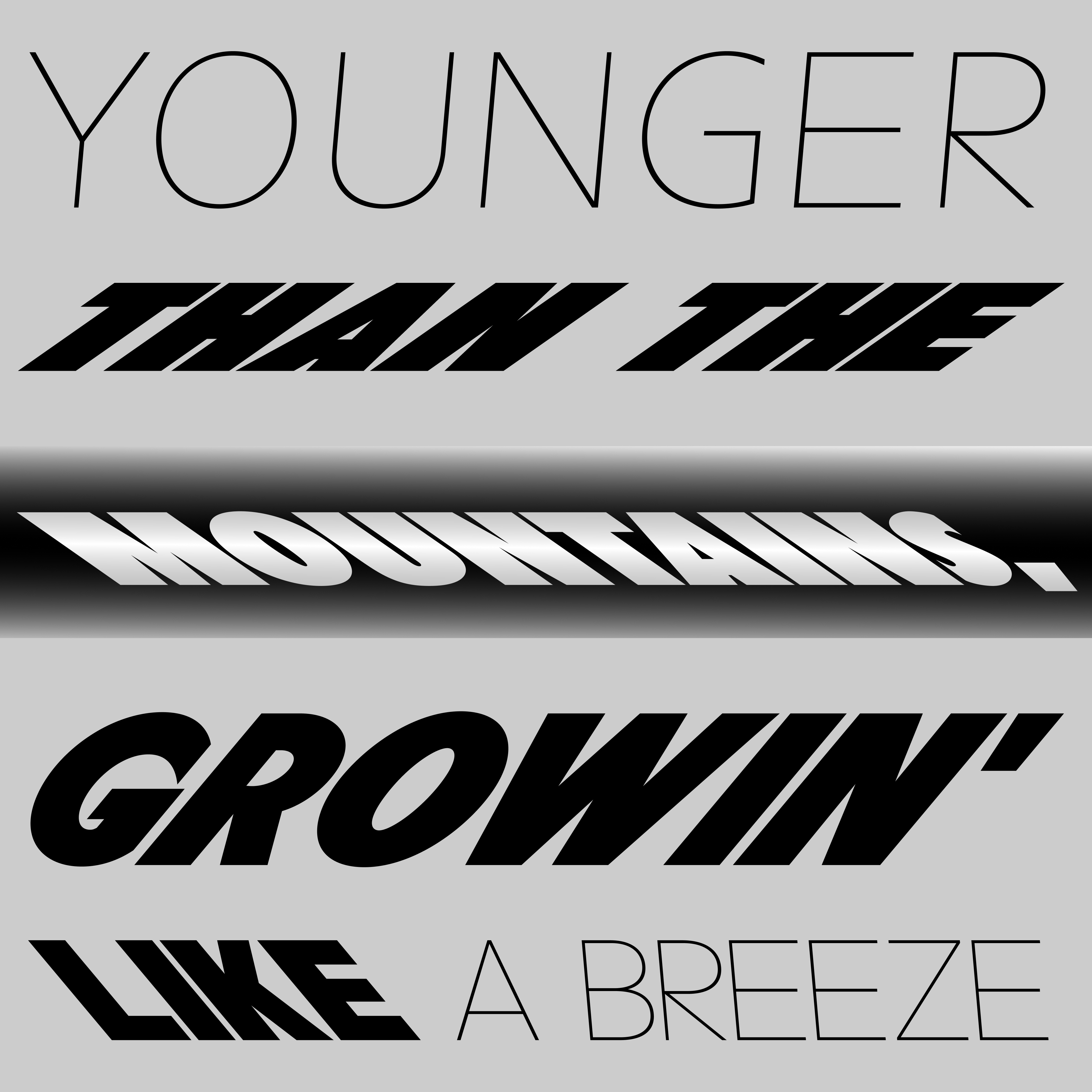
The original x-height was preserved entirely. In contrast, the cap height has become lower, and the difference between the Uppercase and Lowercase is no longer so significant. The changes also affected the shapes of some letters. In the Lowercase, especially in the case of the letter a, whose loop is connected higher, the teardrop terminal is smoothly finished without a vertical serif. The finial is drawn lower than its origin model. However, as an answer to lovers of the original design, the font also contains a stylistic set with its original shape. As in the original, the letter f has two versions, with a shorter and wider ascender. The letter s is far more balanced than the original model, which followed the construction of the uppercase S in the Roman Capitals. In the case of Uppercase, I decided to make new modern shapes as a default set, and I kept the beautifully shaped (nor as such functional) shapes of the origin as an “ancient stylistic set.” In the “ancient stylistic set,” the Uppercase alphabet contains the original distinctive features. Above all, it is a wide-spaced R with an organically drawn leg (the default version of the font includes a modern version with a shorter leg). I also preserved the original letter P with an open bowl. Like the Poliphilus font (Morison’s variant of the Aldine Roman), Creatura contains the original palm letter Y, which gives the font a great character (again, the font also includes a modern variant of the letter anatomy). All around, the Uppercase thus kept its original monumental proportions, which are still close to the construction of Roman Capitals.

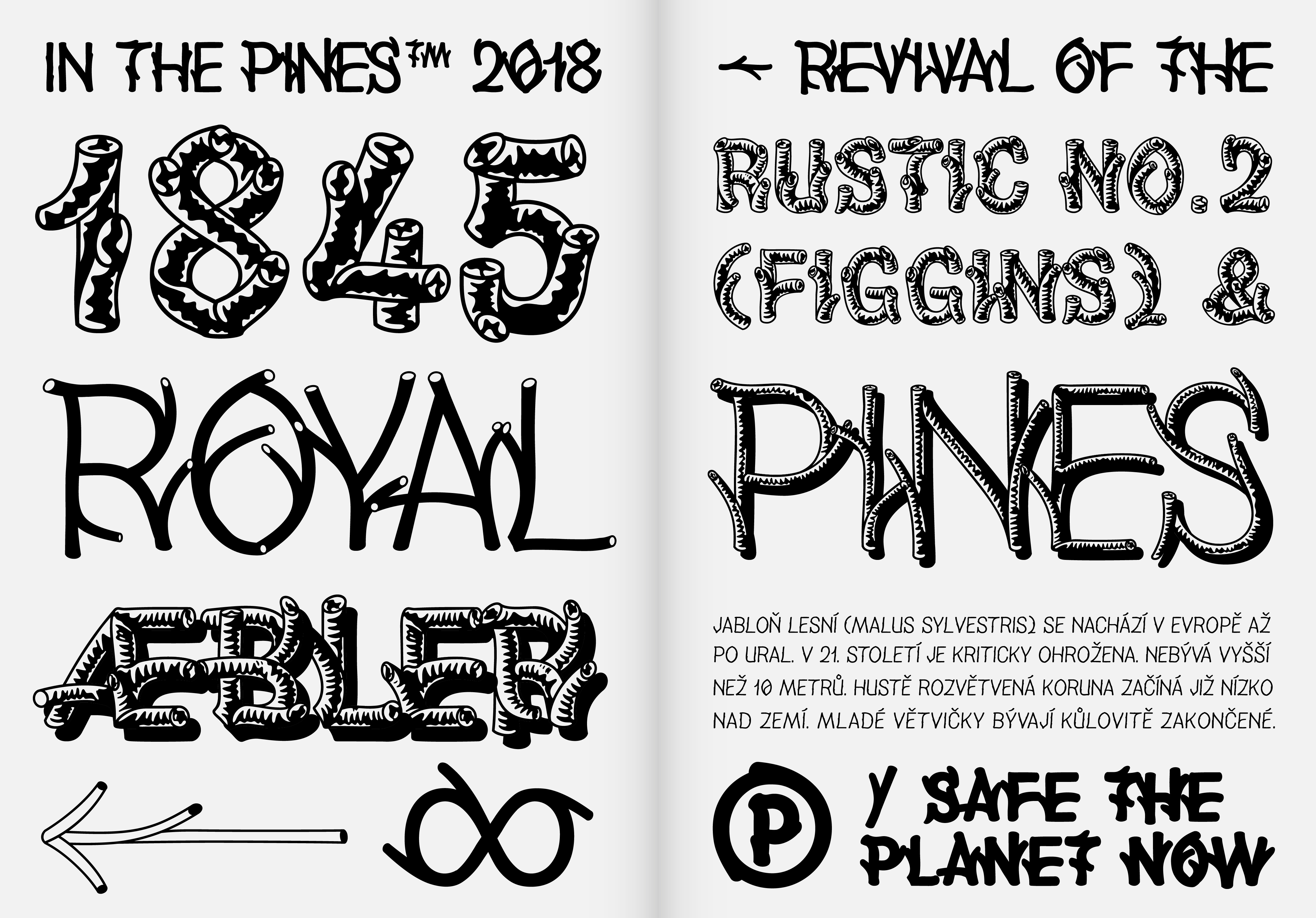
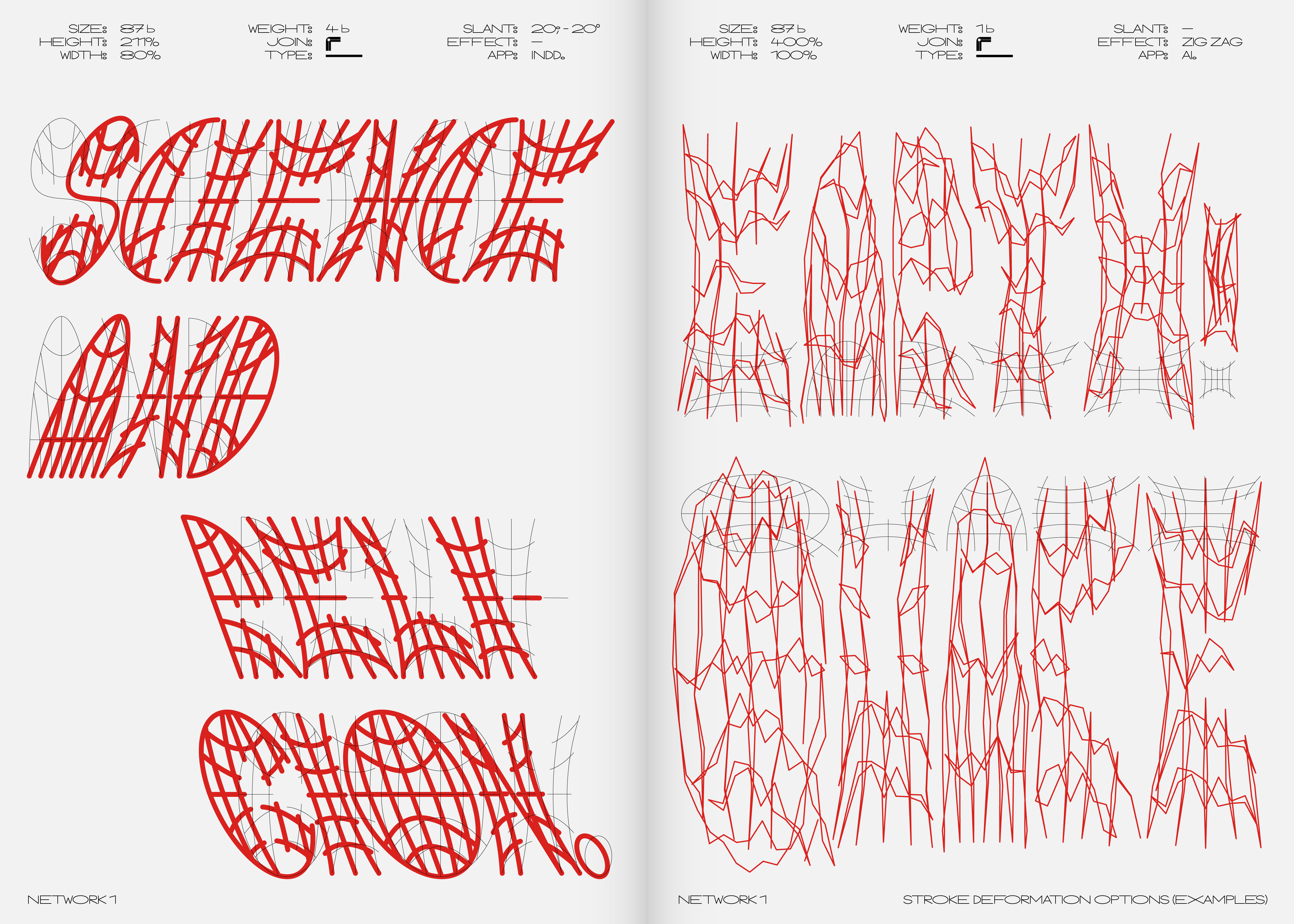
The fundamental style (Press Simulation 1) then serves as a skeleton for two other styles: Press Simulation 2 and Press Simulation 3. These styles are based on the authentic intention to digitalize the Aldin Roman from its original imprints (not from the matrix itself). These styles thus represent varieties of printed letters depending on the pressure of the letterpress (the contemporary printing technique). This principle of designing font weights is an alternative to the standard protocols for designing font weights. The strokes of the letters were strengthened in all directions so that the feeling of the imprint was convincing. However, the protocol for expanding the font contour differs in all directions. By examining the origin prints, I found that the color absorbed much more into the paper in places with a denser drawing on a small area. The effect was that there was more paint around these places. These places are mainly the serifs and their connection to stems and other strokes. For example, uppercase letters are, thus, much more cleanly printed than lowercase letters because the area on which the pressure works is more significant.

The font’s name comes from the Latin word “Creatura,” which means “Creature” or “being.” Consequently, the name paraphrases a system of drawing in which the contours change across the styles, a system of various “living” organic shapes.

status:
  • Version 1.0: Done

  • Version 2.0: In development / Ongoing

year:
(Time is a construct)
type:
#type-design

Speed Grotesk typeface — font define by Slant & Width extremes

about:

The Speed Grotesk typeface is an experimental font indicated by extreme positions of the slant and weight of the styles and the firm connection between them. The development of the Speed Grotesk font originates in custom lettering work for the visual identity of the bicycle brand. Lettering originally had three styles, which varied in slant and weight. This differentiation was based on dividing bikes according to the route’s difficulty (slope of the landscape and speed). The greater the difficulty, the greater the slant and weight of the style. From an almost invisible slanted Light (Cities) to a highly slanted Black (Mountains). Also, each style has two variants of italics (left and right italics), used separately for each side of the bike and thus perfectly quote movement direction.

The Speed Grotesk typeface is an experimental font indicated by extreme positions of the slant and weight of the styles and the firm connection between them. The development of the Speed Grotesk font originates in custom lettering work for the visual identity of the bicycle brand. Lettering originally had three styles, which varied in slant and weight. This differentiation was based on dividing bikes according to the route’s difficulty (slope of the landscape and speed). The greater the difficulty, the greater the slant and weight of the style. From an almost invisible slanted Light (Cities) to a highly slanted Black (Mountains). Also, each style has two variants of italics (left and right italics), used separately for each side of the bike and thus perfectly quote movement direction.

However, during the lettering’s development, we already recognized the font’s qualities and shape universality, which could be completed into a full-scale font, thus allowing for further interpretation opportunities.

As for the font design, I first had to choose a suitable origin typeface due to the extreme nature of the slants and weights. After extensive testing, I decided on the Futura font, characterized by a vertical end of the strokes. This decision allows for extreme slants of the font while preserving its metrics. This quality has proven essential, especially for radical combinations like extreme slant + black weight.

The font is currently still in development.

team:
status:
  • Version 1.0: In development / Waiting

year:
(Time is a construct)
type:
#type-design

In the Pines typeface — Variable font imitates Wooden Structures and Other Organic Forms

about:

A longtime interest in typefaces that imitate wooden structures and organic shapes was crucial in searching for a specific problem of the variable format. The starting point was the typeface Rustic No. 2 of 1845, created by the Figgins type foundry In London. From that point onward, the typeface made a long journey across the ocean, where dozens of copies were produced in wooden and metal form. At the end of the 20th century, there were dozens of incomplete digitalizations. The typeface Rustic No. 2 (in digital form under names such as Pinewood, Log Cabin, Woody, and others) lives on in imperfect forms.

A longtime interest in typefaces that imitate wooden structures and organic shapes was crucial in searching for a specific problem of the variable format. The starting point was the typeface Rustic No. 2 of 1845, created by the Figgins type foundry In London. From that point onward, the typeface made a long journey across the ocean, where dozens of copies were produced in wooden and metal form. At the end of the 20th century, there were dozens of incomplete digitalizations. The typeface Rustic No. 2 (in digital form under names such as Pinewood, Log Cabin, Woody, and others) lives on in imperfect forms.

The typeface In the Pines, in its loose reconstruction of the original model, literally grew by other weight variants. The question remains, though: where could such a typeface occur? Is the world of logs too unidirectional? It’s not just the variety of different types of wood that you can simulate with this font. In small sizes, it seems to be growing grass, and its illegibility leads us to compete for the most beautiful English lawn. In deep oceans, it can describe the magic of undulating seaweed or anemone. When better judgment is gone, it happily finds itself on a sex shop’s signboard, where the typeface changes into dozens of growing phalluses; let’s admit that it often happens in nature. 

Ultimately, not even the variable format fulfills all the functions of the typeface In the Pines. The question remains of the possibility of a variable-color font, which is incompatible with the variable format. Finally, I want to mention the addition of a typeface with an expanded set of characters and symbols, which is a (still) uncommon feature in an attempt to revive the Rustic No. 2 face.

status:
  • Version 1.0: Done

  • Version 2.0: Waiting

year:

(Time is a construct)

type:

#type-design

La Pipe typeface — Way to Keep Utopia!

about:

Until recently, I was among those people who outright rejected Peignot, primarily due to its typical period design. But then, suddenly, out of the blue, Cassandre bases his typeface on Bayer’s universal typeface. This fact inspired my first idea to create a grotesque version of the typeface, but this completely wiped out the attractiveness of the original design. Maintaining the contrasting character stress was a must. So, I returned to the beginning with a simple question: “What would make this typeface more contemporary?” If the designer’s personality disappears from the typeface, their stylization also disappears, and I can focus on the skeletons of the letters. I minimized the means of expression and chopped off the rounded endings, which are so characteristic of the lowercase “a,” “e,” “v,” and “n.” But I retain one of the most important things – the utopia in changing the letterforms while maintaining good readability. Likewise, I continued the toning-down process in the design of Touraine and finished the classic lowercase shapes.

Until recently, I was among those people who outright rejected Peignot, primarily due to its typical period design. But then, suddenly, out of the blue, Cassandre bases his typeface on Bayer’s universal typeface. This fact inspired my first idea to create a grotesque version of the typeface, but this completely wiped out the attractiveness of the original design. Maintaining the contrasting character stress was a must. So, I returned to the beginning with a simple question: “What would make this typeface more contemporary?” If the designer’s personality disappears from the typeface, their stylization also disappears, and I can focus on the skeletons of the letters. I minimized the means of expression and chopped off the rounded endings, which are so characteristic of the lowercase “a,” “e,” “v,” and “n.” But I retain one of the most important things – the utopia in changing the letterforms while maintaining good readability. Likewise, I continued the toning-down process in the design of Touraine and finished the classic lowercase shapes.

This concept of adding shapes seemed contemporary to me, so I decided to continue it. Although Cassandre never wanted to create a slanted style for the typeface, my version has three styles. The “Rotated” style is more of a rallying work. It is related to Programme, a generated typeface that refers to technology – just like Peignot, which referred to the period’s engraving technology. I also created classic and reverse Italics, which may be mixed and matched. The three style sets allow users to pick the forms they prefer. 

This is the scale of use for my new utopia. La Pipe is the evolution of Peignot. “Pipe” refers to Casandre’s favorite pastime, as seen in period photographs, and evokes typical stroke stress. Finally, using a French name suggests where its model is from.

status:
  • Version 1.0: Done

year:

(Time is a construct)

type:

#type-design

Worldwide typeface — A single-line font inspired by a wireframe symbol of the globe

about:

The infamous wireframe symbol of the globe is used extensively in graphic design. It is an internationally understandable symbol, although it has multiple meanings. It can symbolize language and time — it is also often associated with the visuals of logistics companies. As “Worldwide,” this symbol usually refers to the planet Earth. As part of my obsession with this symbol, I set myself the following task: “Create an alphabet by deconstructing this symbol. Interfere with the structure of the symbol as little as possible and test whether this task will be possible.” Thus, the symbol became a structural network, and I could design the entire uppercase alphabet with a basic set of characters and symbols. This skeleton, in which I tried to find all the Latin alphabet characters, plays on traditional font skeletons and the “cult” of fonts intended for CNC machines. Inherently, I attempted to leave the font with an open contour and thus create a playful version of the one-line font.

The infamous wireframe symbol of the globe is used extensively in graphic design. It is an internationally understandable symbol, although it has multiple meanings. It can symbolize language and time — it is also often associated with the visuals of logistics companies. As “Worldwide,” this symbol usually refers to the planet Earth. As part of my obsession with this symbol, I set myself the following task: “Create an alphabet by deconstructing this symbol. Interfere with the structure of the symbol as little as possible and test whether this task will be possible.” Thus, the symbol became a structural network, and I could design the entire uppercase alphabet with a basic set of characters and symbols. This skeleton, in which I tried to find all the Latin alphabet characters, plays on traditional font skeletons and the “cult” of fonts intended for CNC machines. Inherently, I attempted to leave the font with an open contour and thus create a playful version of the one-line font.

The default Network 1 style, which is mainly suitable for heading use, was later expanded with three more styles that depend on its shape and proportions. The Network 2 style is its simplification to the outer shape (just one line). The Network 3 style reacts to the previous cut, swapping character shapes for the traditional morphology of the Latin alphabet. These two minimalistic versions also work well for use in shorter texts. However, we must remember that even the wire symbol of the globe comes from the stylization of its 3D model. So, my next attempt was to check whether I could design one style from a 3D model, too — and that’s how the Network Initials style was created.

In graphics programs, it is possible to adjust the width and shape of the stroke, as well as the height and length of the characters, which still retain their inner skeleton of letters due to deformation. The font is, therefore, intended for users who like to use the possibility of further intervention in its final shape.

status:
  • Version 1.0: Done

year:

(Time is a construct)

type:

#type-design