Naturfyt Bio — Visual identity for a company oriented on custom production of cosmetics
about:
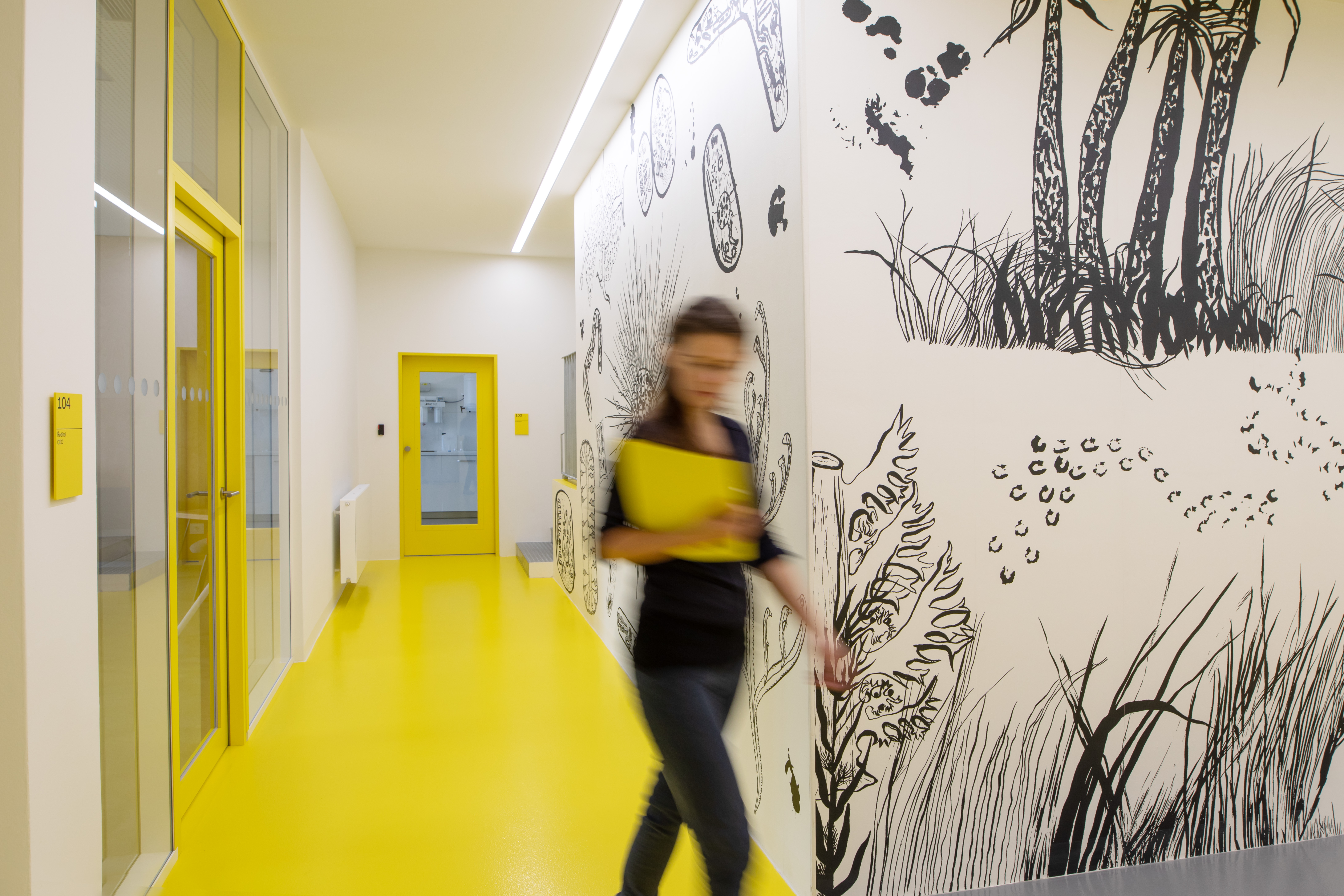
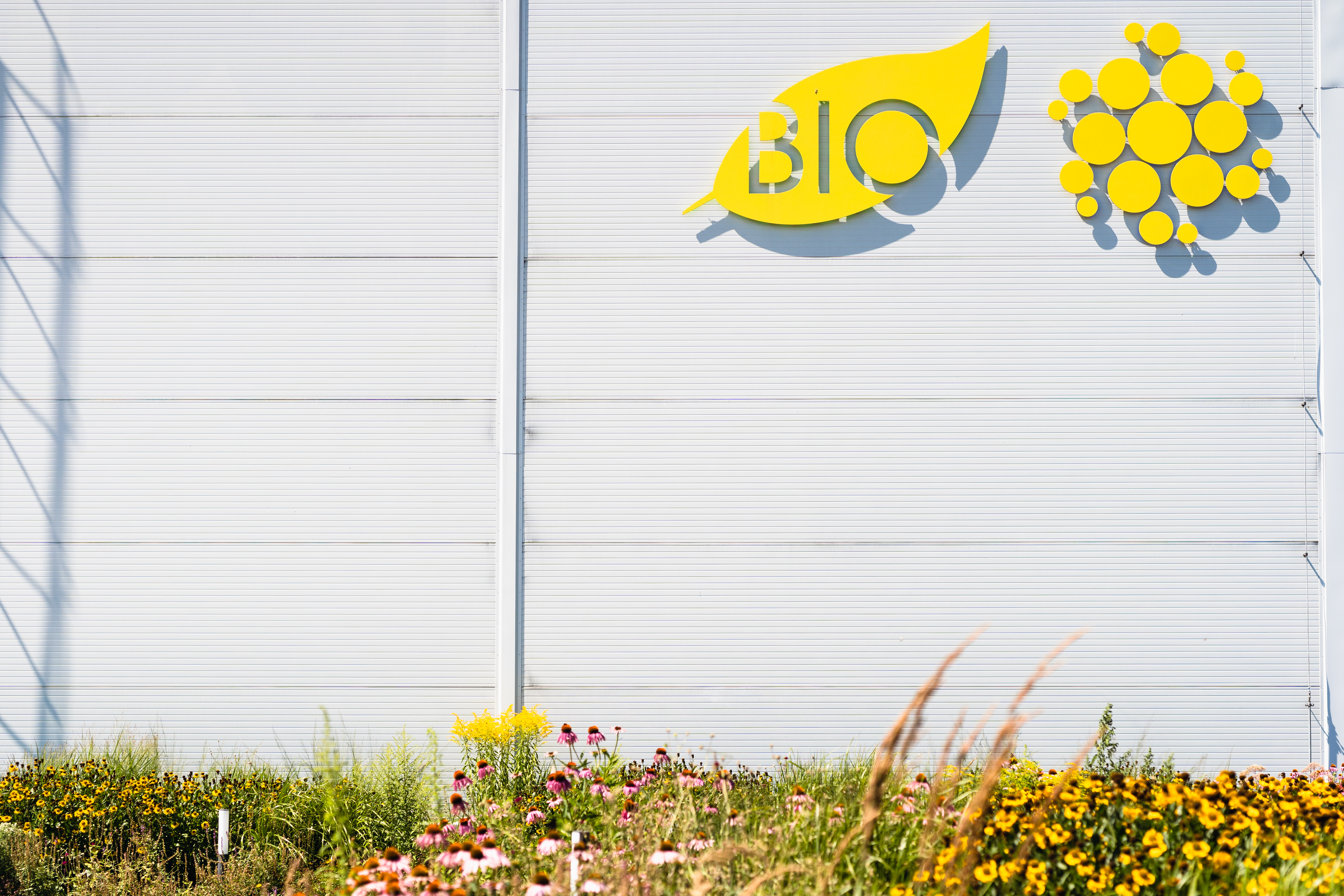
Collaboration with Naturfyt Bio started in 2018 when we worked on the navigation system and interior design for a new factory building — and we returned in 2021 for the full-scale rebranding of the visual identity. Identity for Naturfyt Bio should be modest (almost default), focusing on the maximum compatibility across a wide range of platforms that this company uses in daily practice (to communicate with their clients). The main identity archetypes became the color yellow (initially chosen for the interior of the hall — the so-called “factory yellow”), a black-and-white, hand-drawn illustration inspired by science and nature (micro/macro worlds), and the default font Arial. All components are covered by the default graphic editing with a focus on the ability to manage most of the graphic outputs within the company. For two years, we worked on a new website and various presentation materials (such as prints, digital documents, packaging, identity manual, and many more).
- link:
-
Visit the website: https://naturfyt.bio/
Visit the manual of brand identity: https://naturfyt.bio/brand-identity
- client:
-
Naturfyt Bio [with: DDDS]
- team:
-
concept, illustrations: Klára Čermáková
concept, design, communication: Jakub Hojgr
concept, coding, development: Lukáš Dobeš
- status:
-
Realized/Ongoing
- year:
-
(Time is a construct)
- type:
-
#identity #system-design #process-automation-design #consultancy #ui-ux-design #navigation-systems