mmcité — Rebranding & visual identity for street furniture company
about:
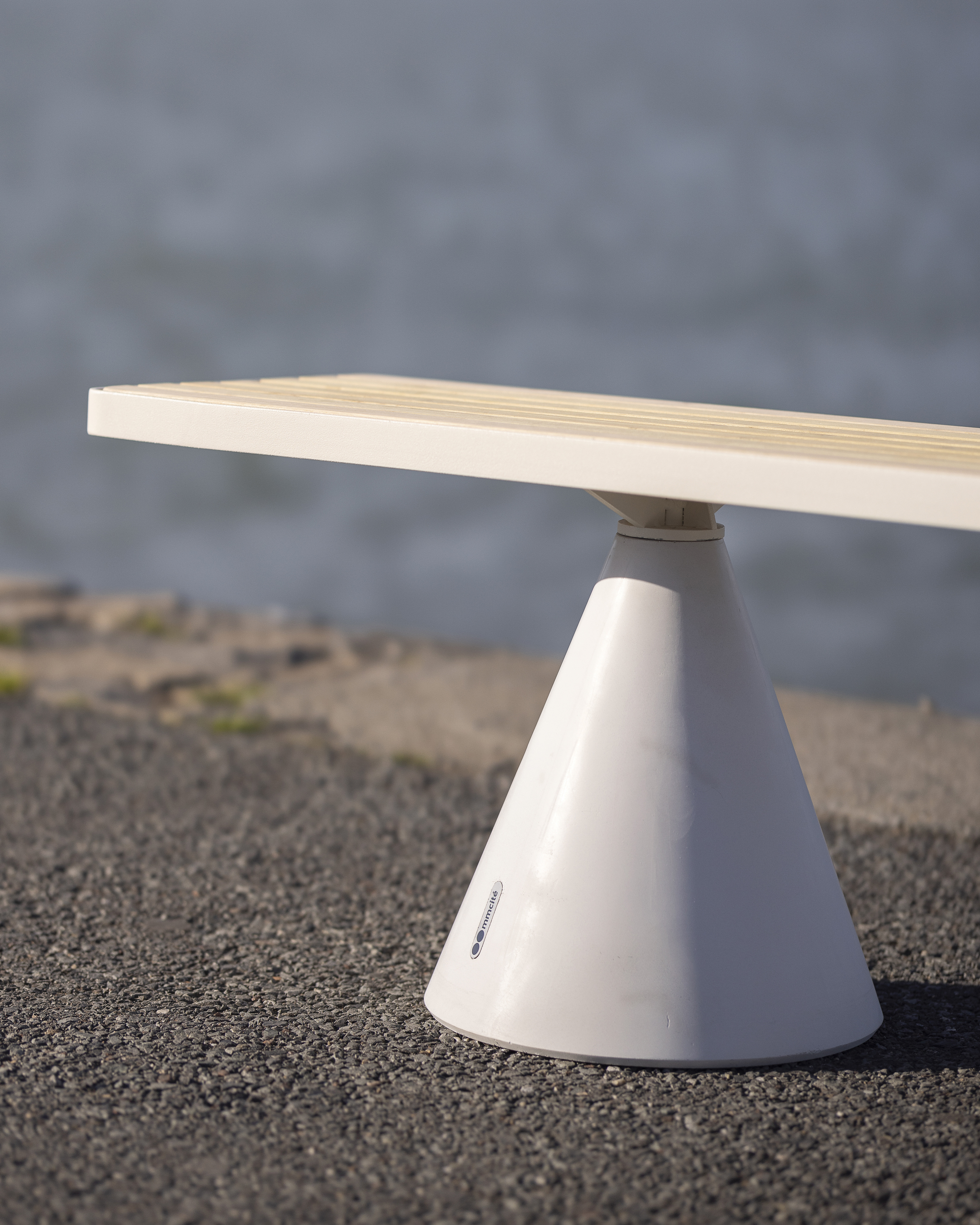
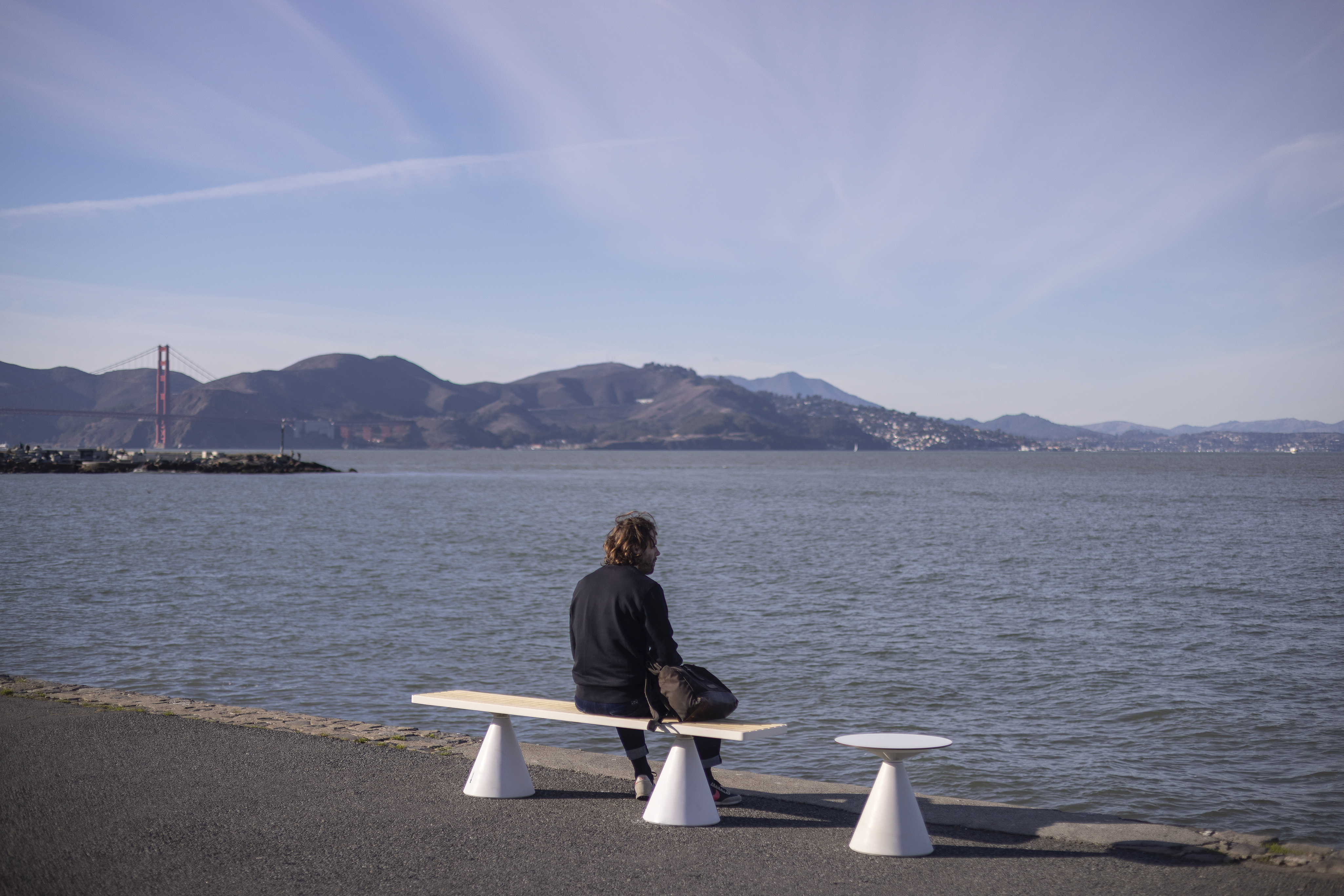
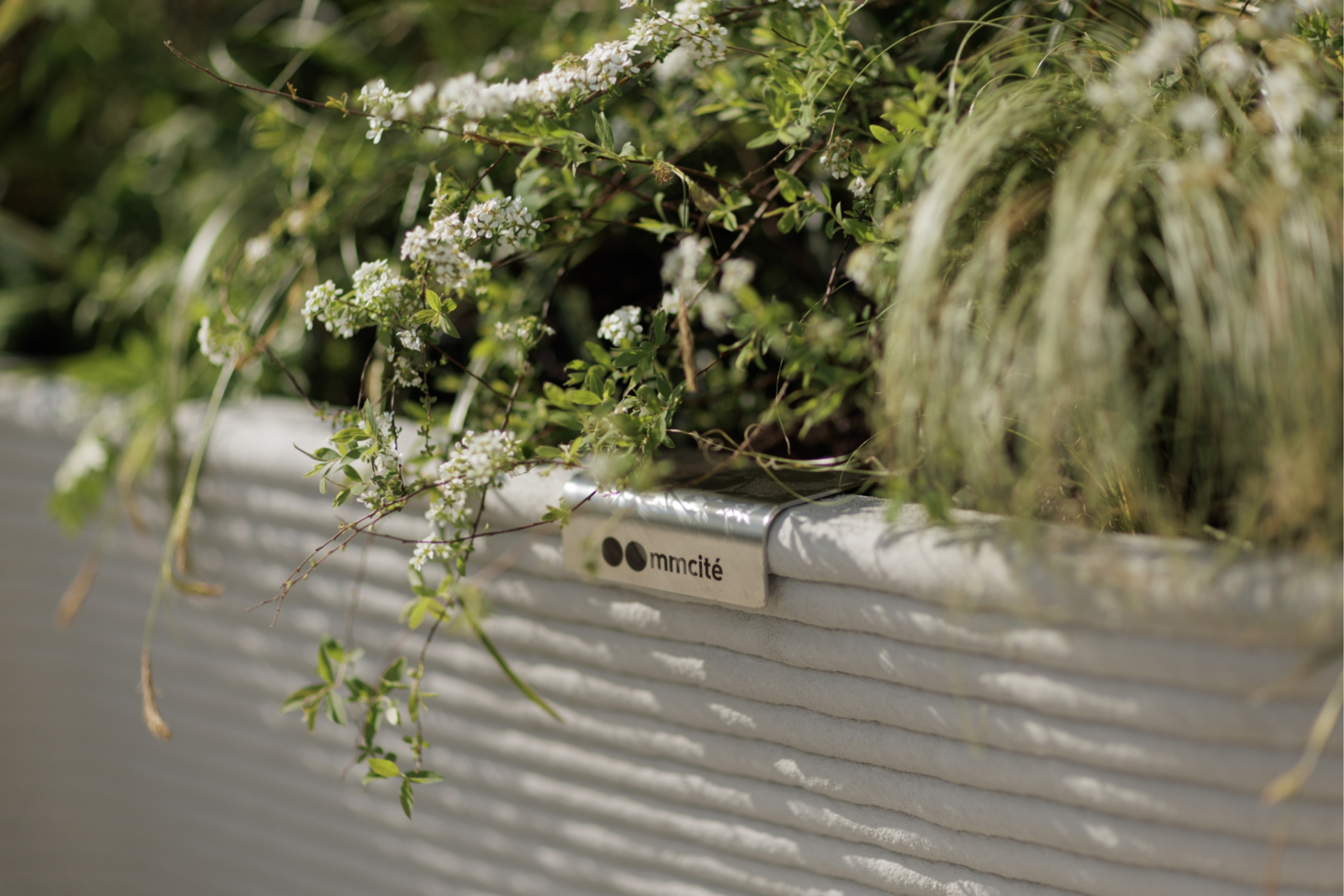
In the Laboratory studio, I had the opportunity to redesign the identity of the mmcité, a company producing high-quality street furniture. Instead of radically transforming the entire brand, I decided on a “rational revision/update” of the current state and development of the logotype & identity. For the main logotype, I made (just) precision typographical changes and touches — the same way I continued in all its variants (mainly, I deal with change of cuts, redrawing of diacritics, and change of metrics/kerning). As part of the identity revision, I choose new additional fonts. Another change was the improvement of color — the corporate Pantone neon orange I synchronized with the web colorspaces such as RGB/HEC — the principles of CMYK color selection were also improved). In detail, I focus on the rules of layout application and the system of working with the logotype, images, and illustrations. Finally, I designed a pack of new pictograms plus prepared and supervised the implementation of a new identity for the latest company’s website.
- client:
-
mmcité [with: laboratory.cz]
- team:
-
consultations, communication: Petr Babák
concept, design*, communication: Jakub Hojgr
*The website was developed by DesignDev and Creepy. I designed a pack of new pictograms and prepared/supervised the implementation of a new identity.
- status:
-
Realized
- year:
-
(Time is a construct)
- photo:
-
(archive of mmcité)
- type:
-
#identity #system-design #uiux-design