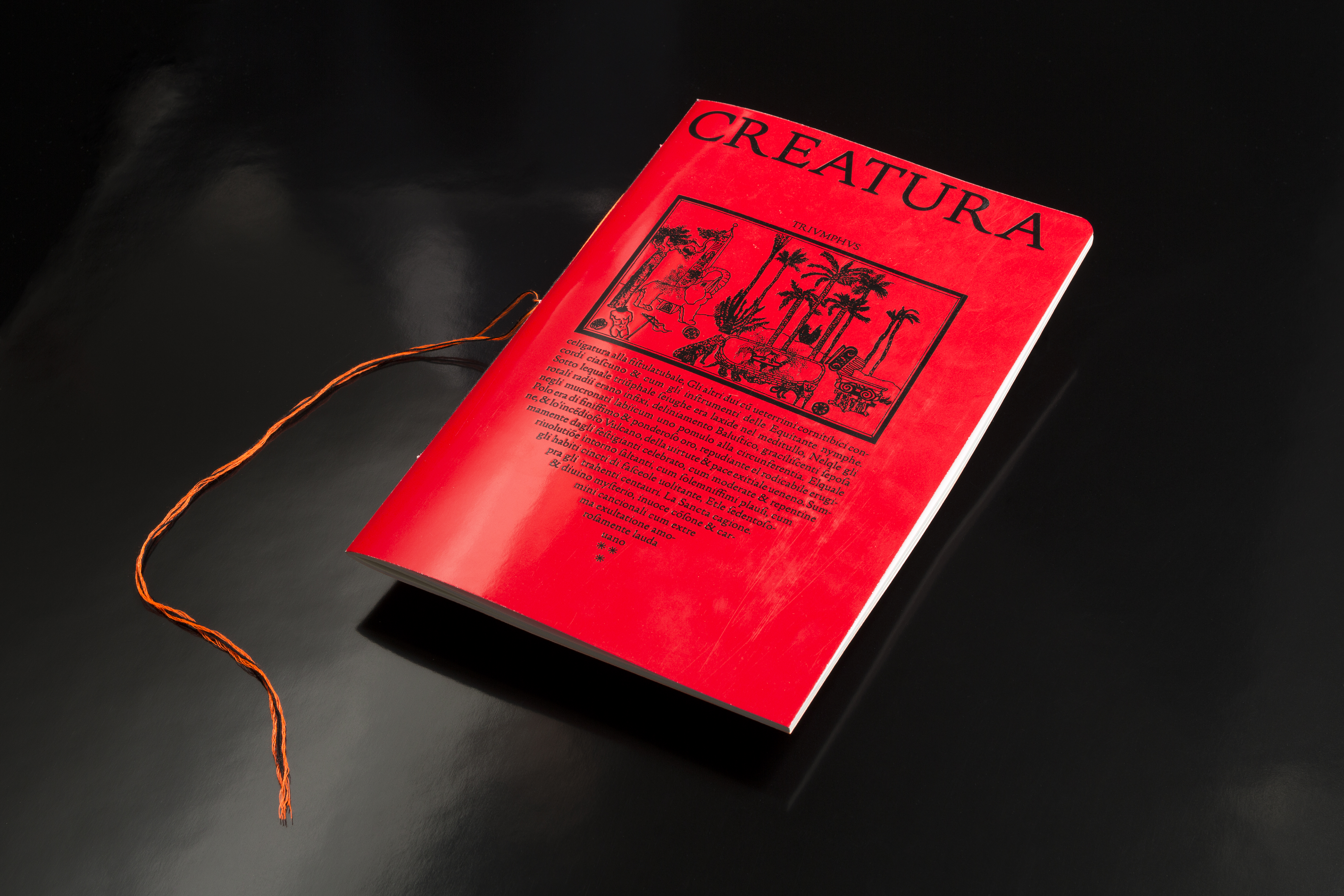
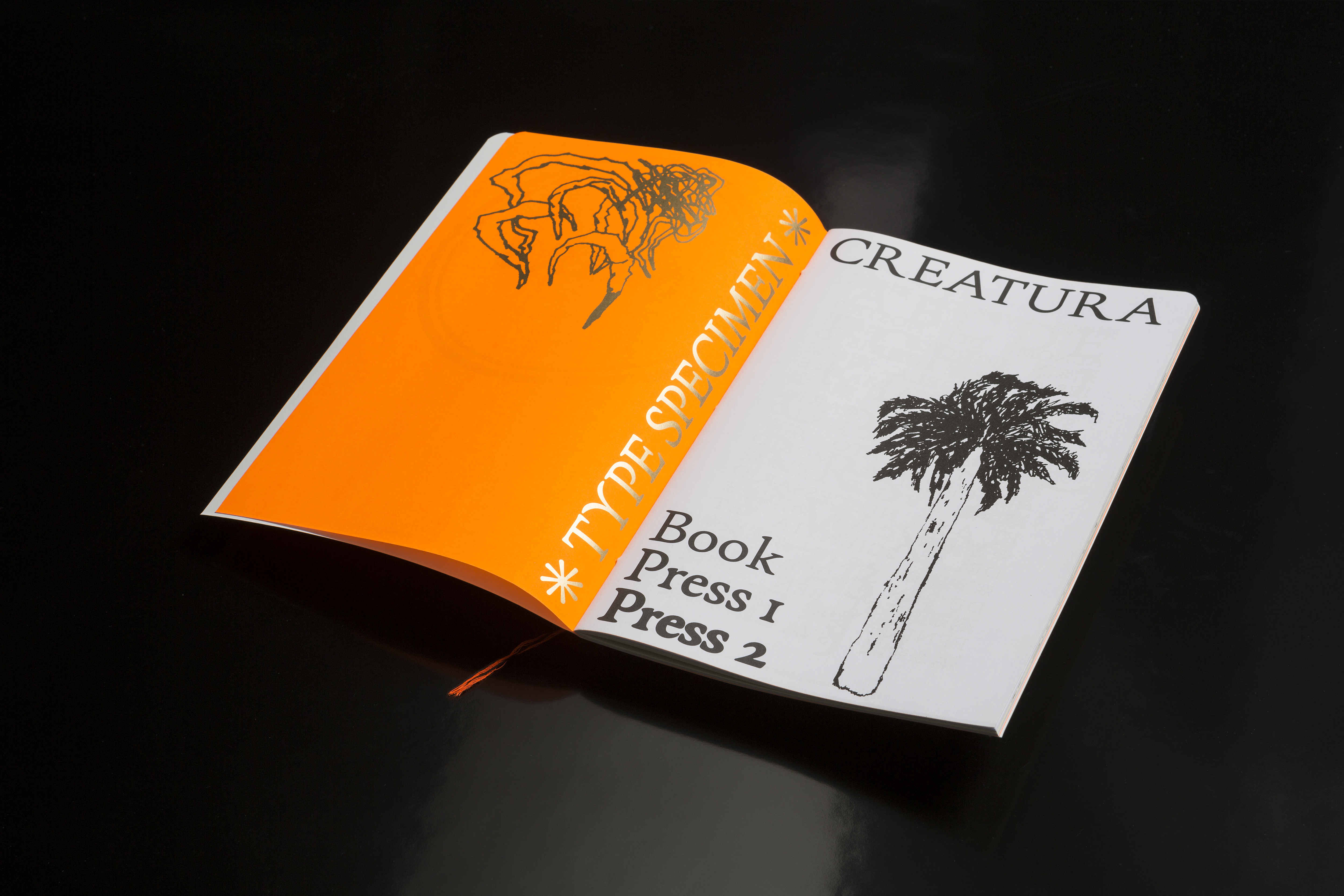
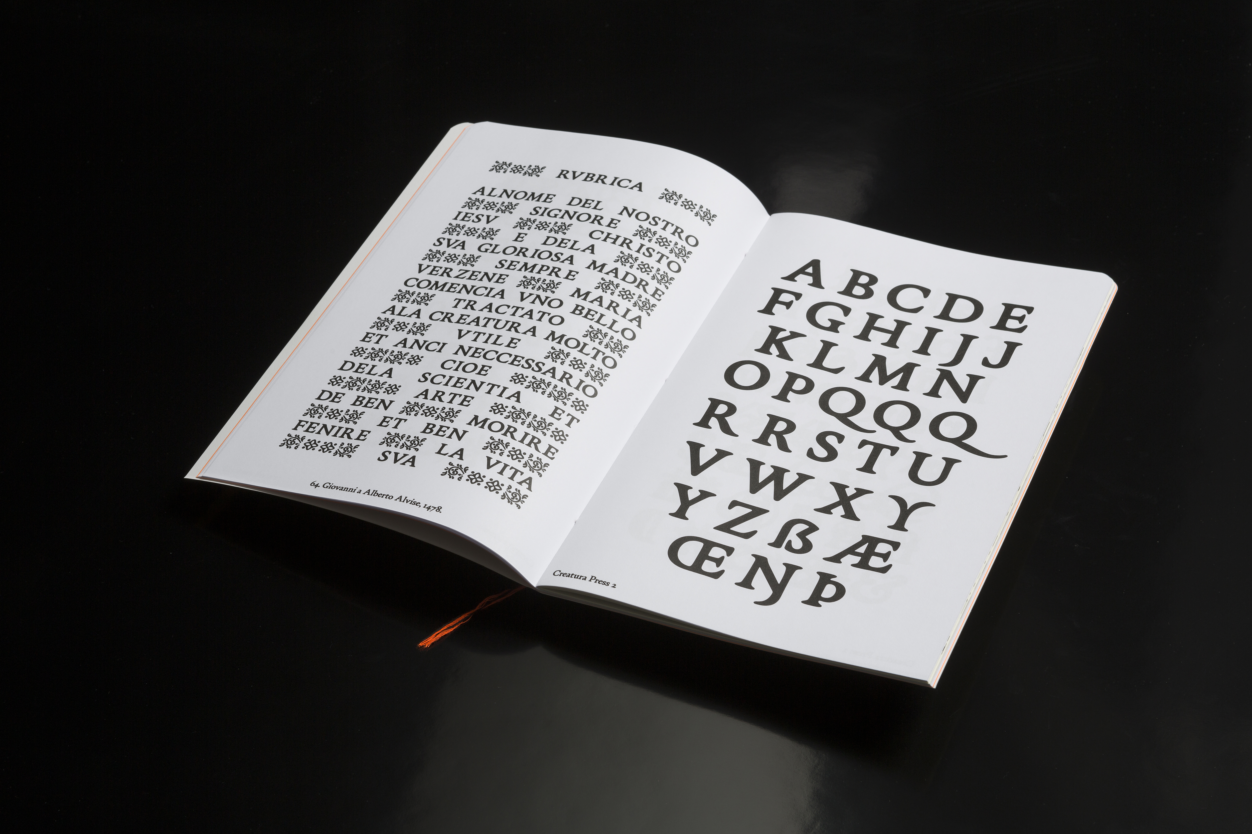
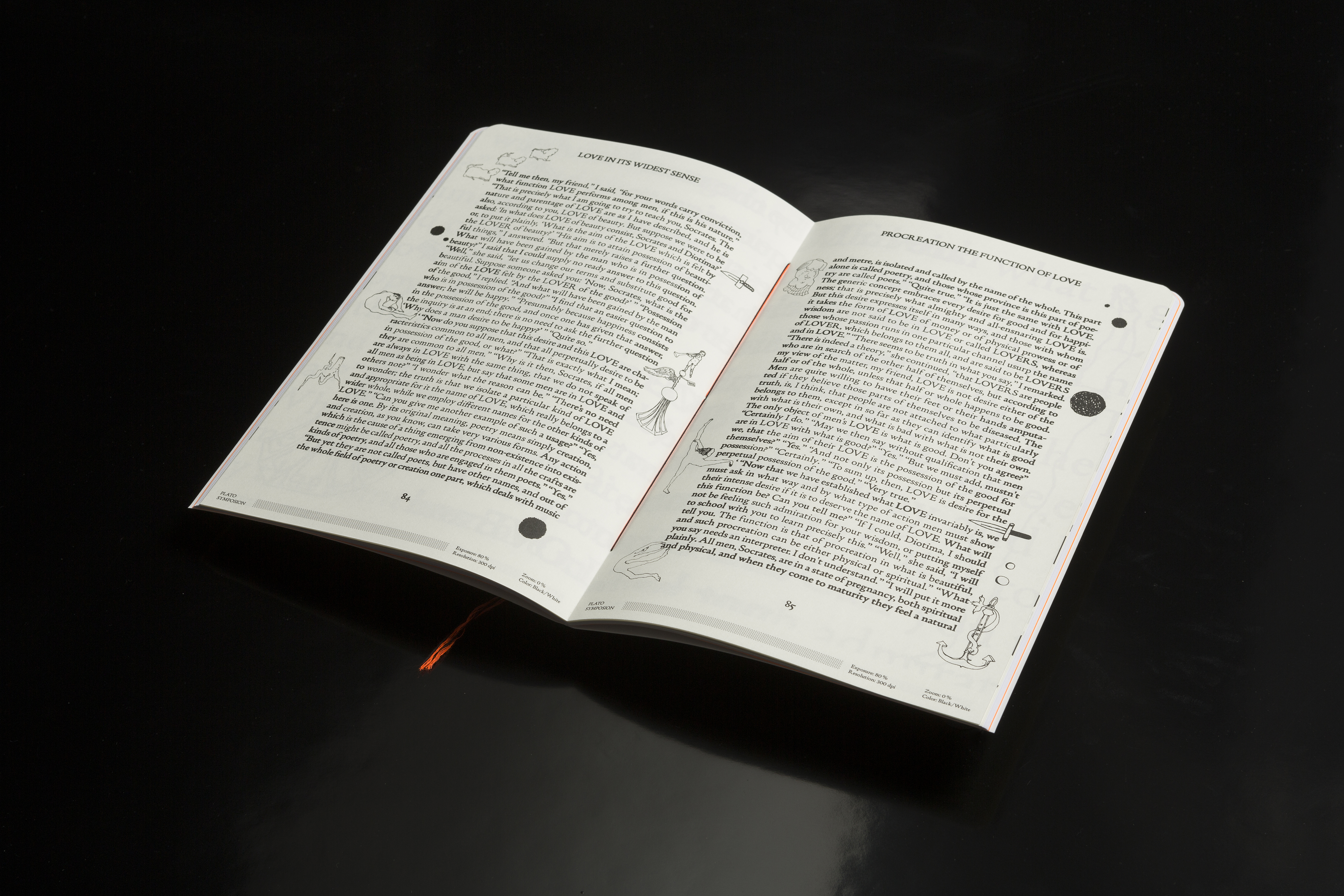
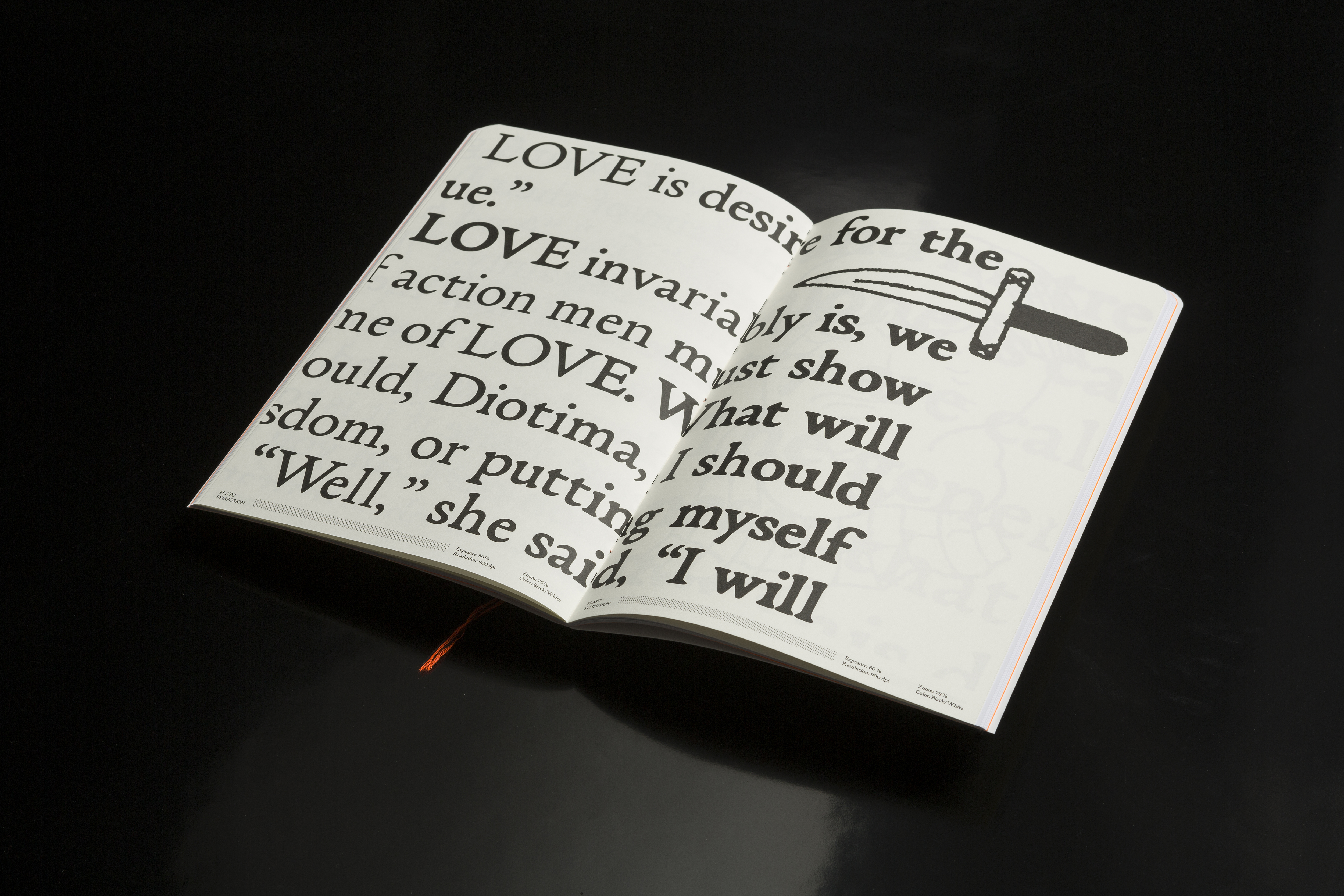
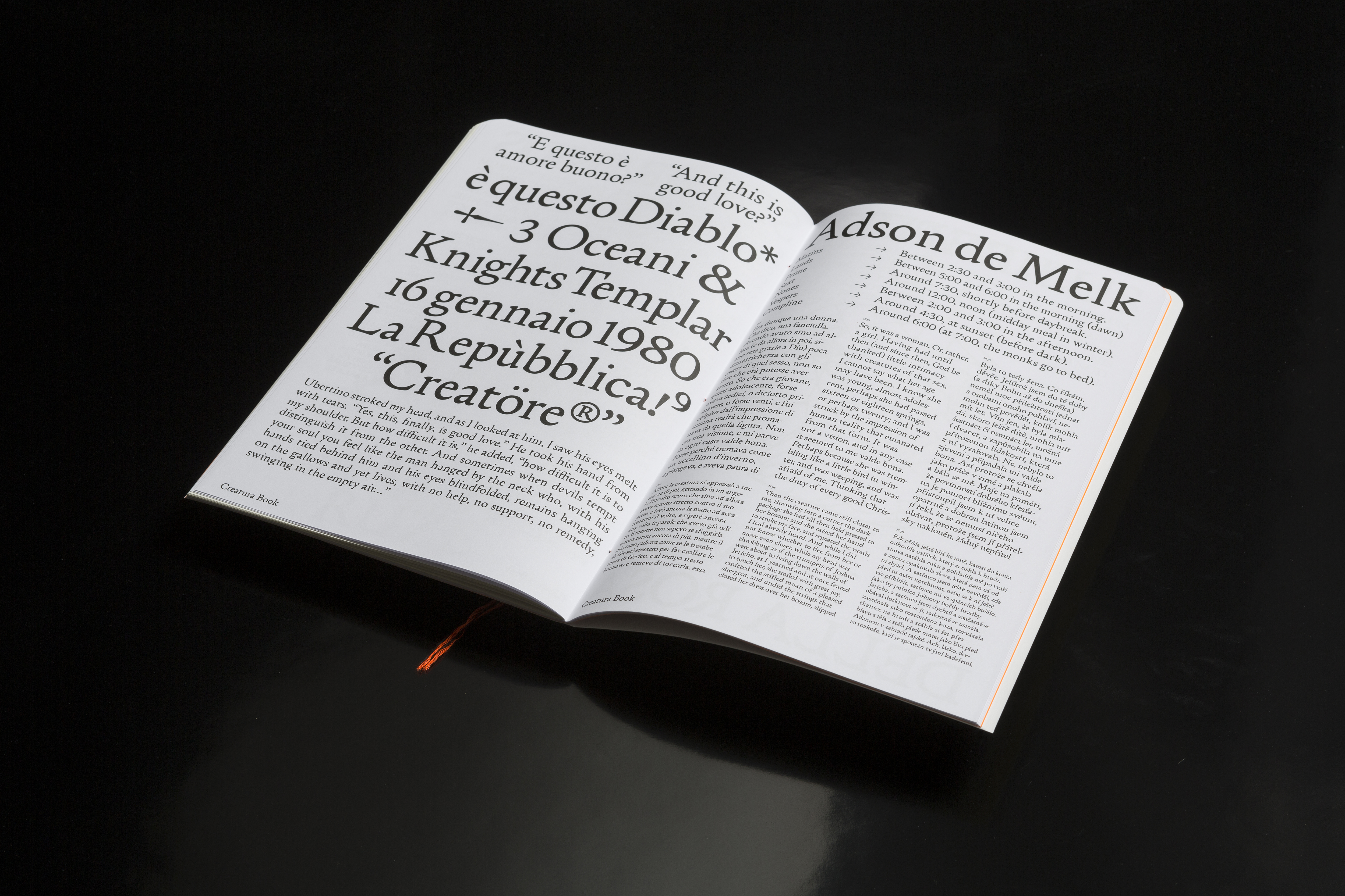
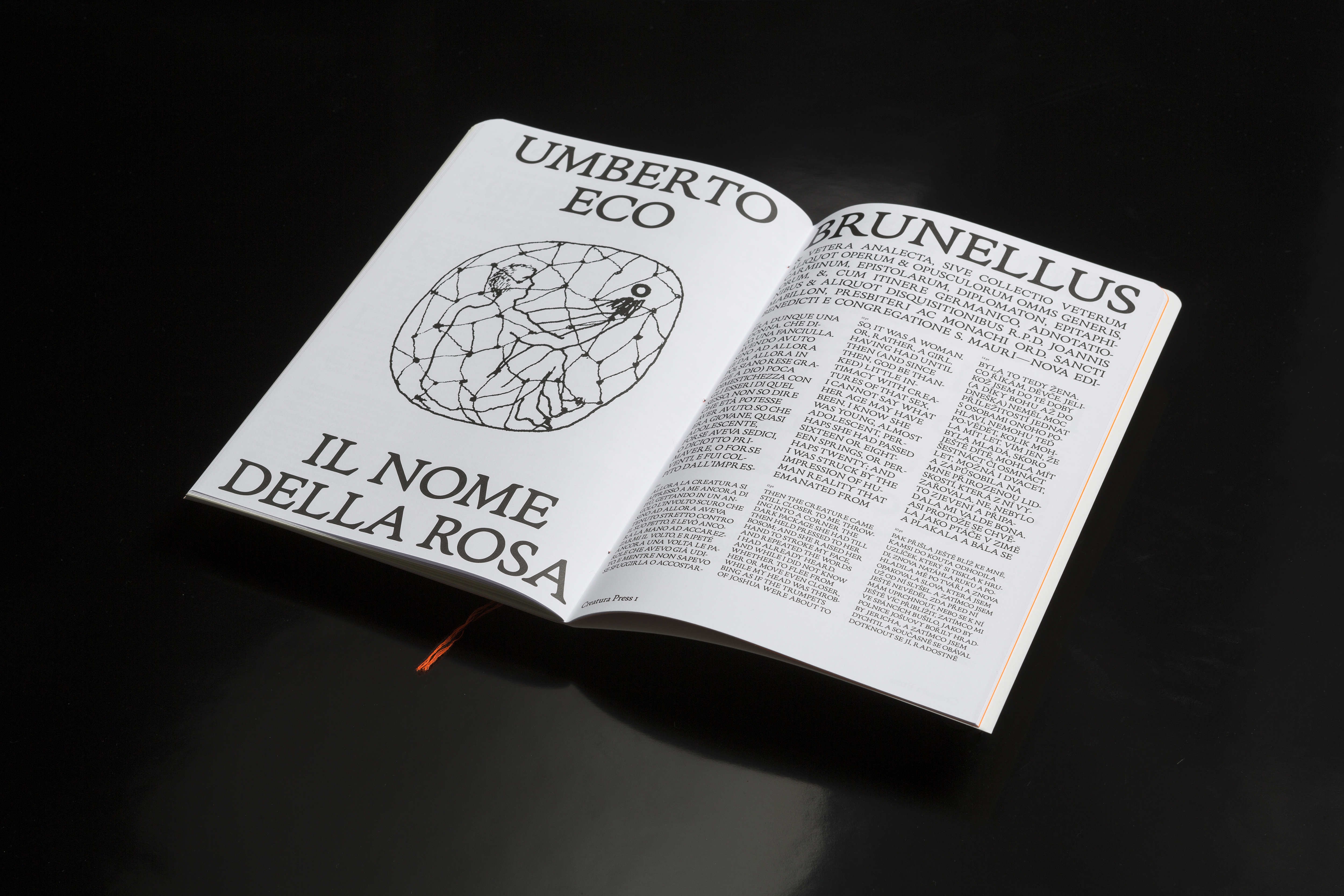
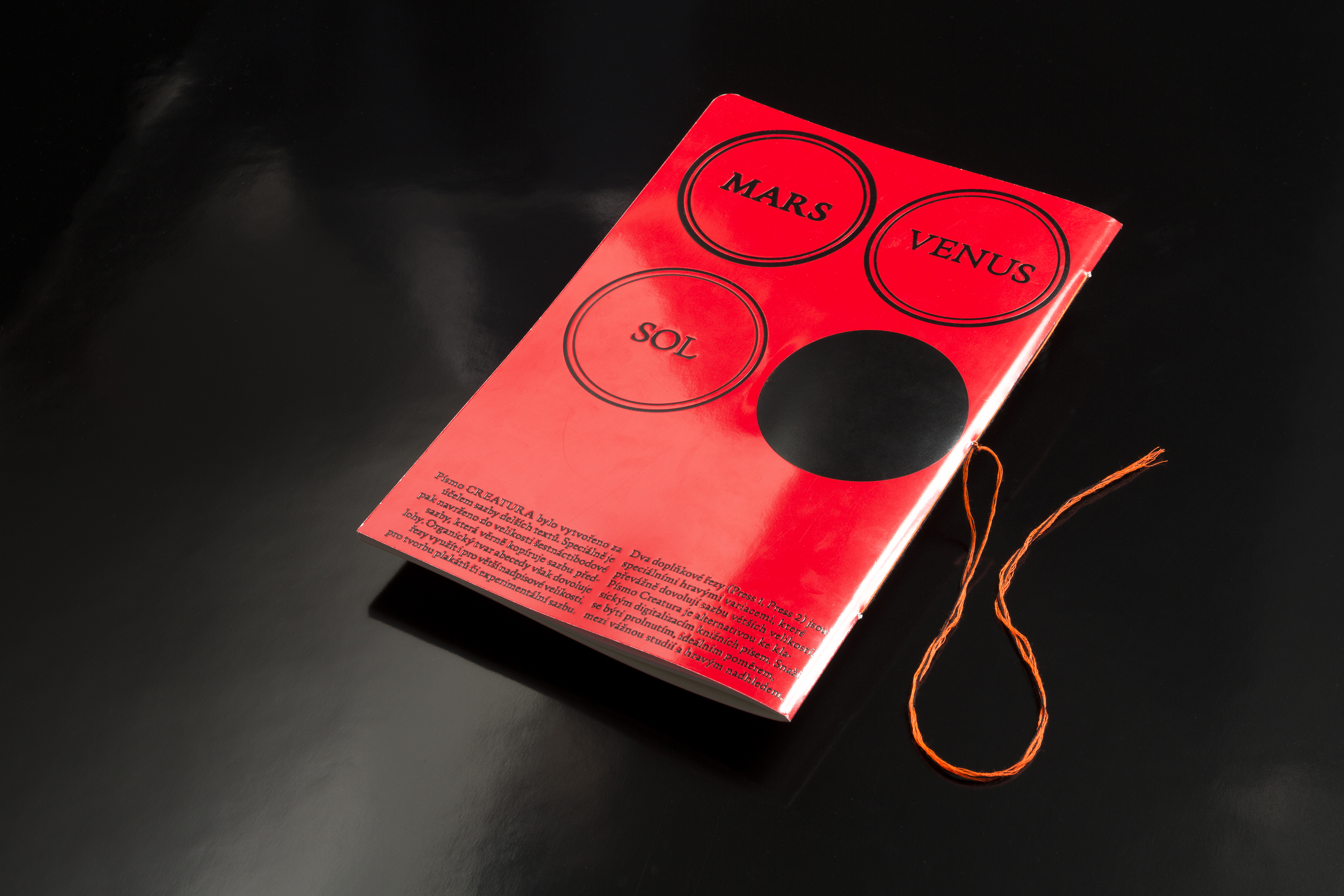
Specimen book for Creatura typeface™ — Organically shaped typeface simulating book press
about:
- client:
-
none / personal project
- team:
-
concept, type-design. book-design: Jakub Hojgr
concept, graphics/illustrations: Klára Čermáková
- status:
-
Realized
- year:
-
(Time is a construct)
- photo:
-
Jan Kolský
- type:
-
#type-design #book-design
Naturfyt Bio — Visual identity for a company oriented on custom production of cosmetics
about:
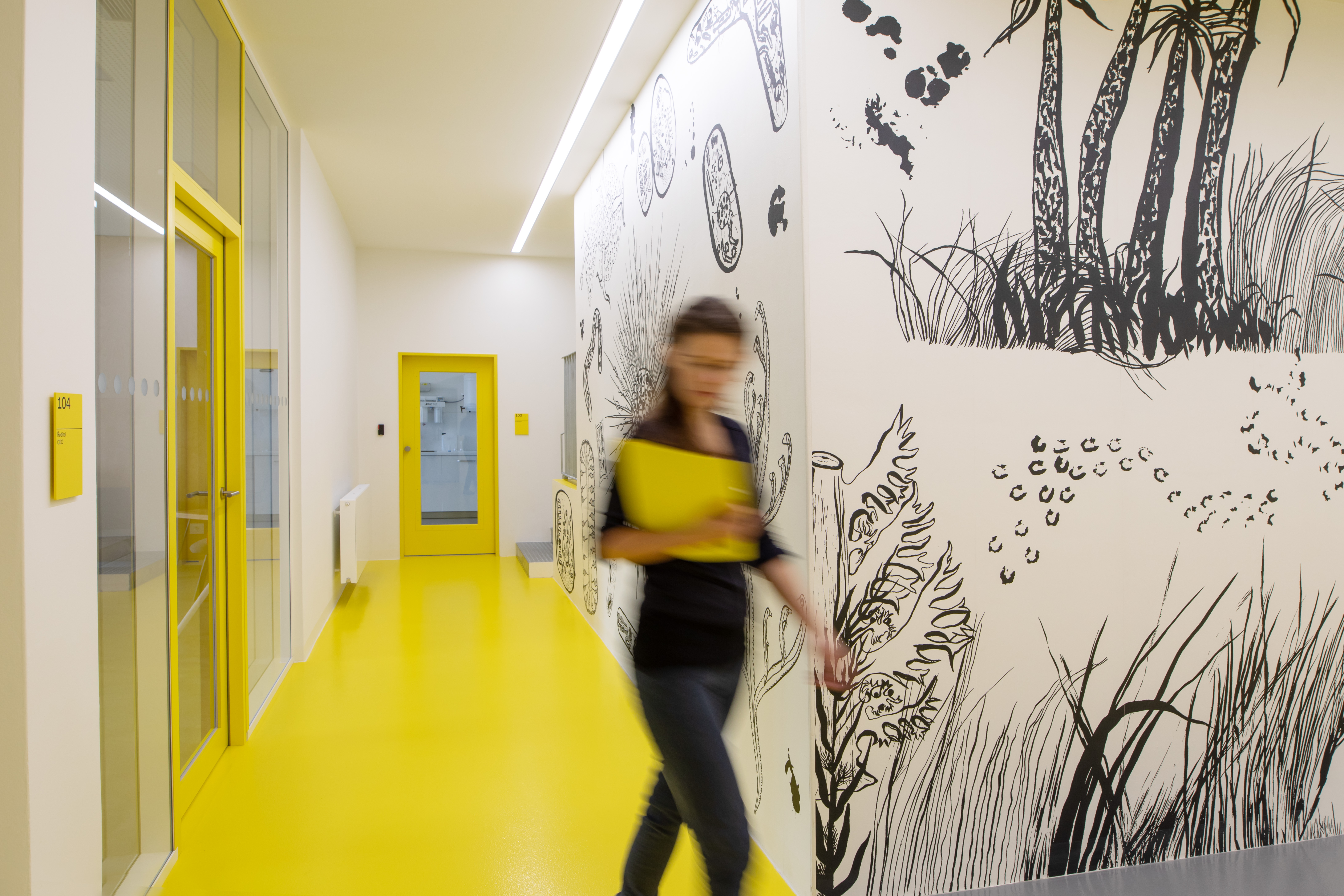
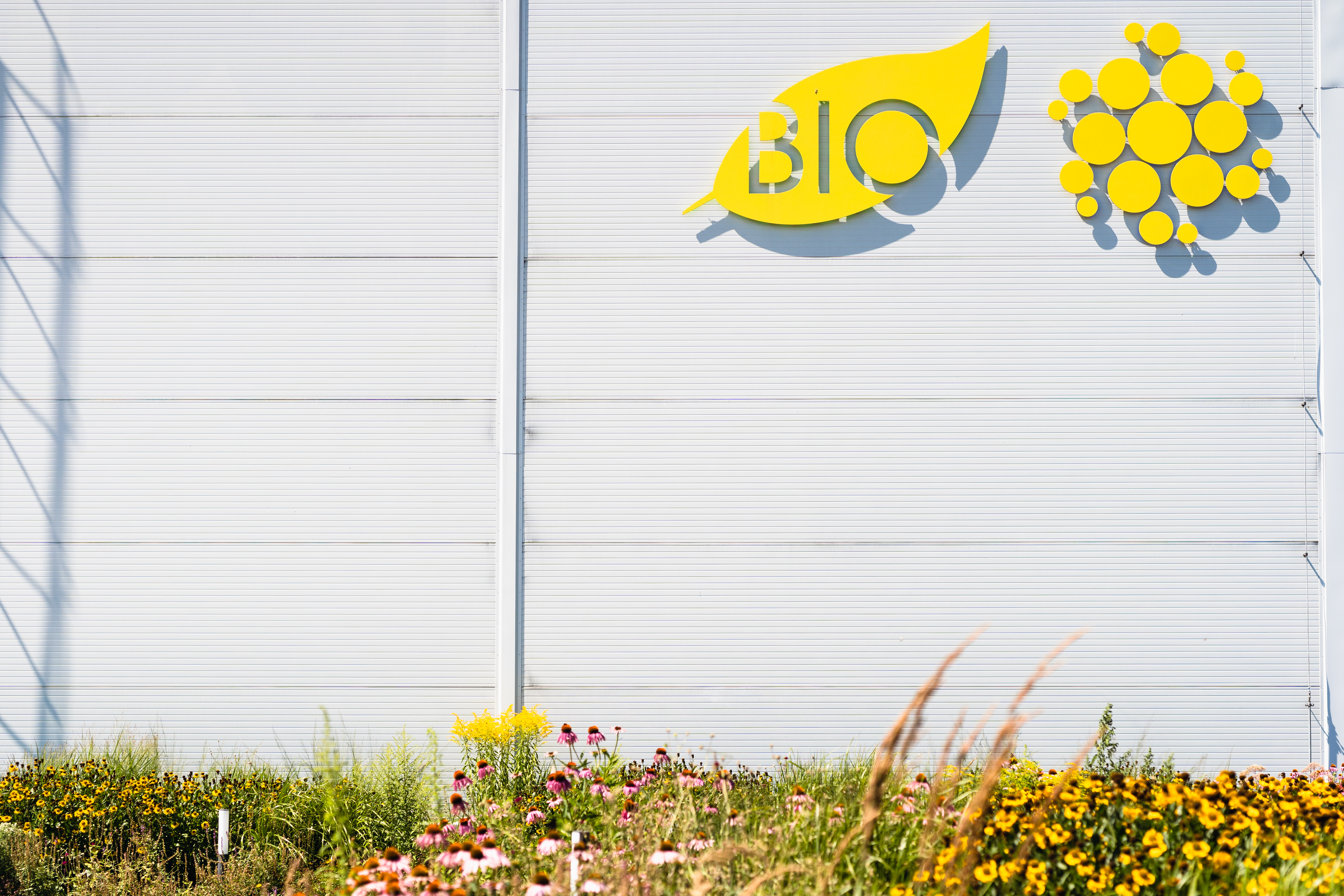
Collaboration with Naturfyt Bio started in 2018 when we worked on the navigation system and interior design for a new factory building — and we returned in 2021 for the full-scale rebranding of the visual identity. Identity for Naturfyt Bio should be modest (almost default), focusing on the maximum compatibility across a wide range of platforms that this company uses in daily practice (to communicate with their clients). The main identity archetypes became the color yellow (initially chosen for the interior of the hall — the so-called “factory yellow”), a black-and-white, hand-drawn illustration inspired by science and nature (micro/macro worlds), and the default font Arial. All components are covered by the default graphic editing with a focus on the ability to manage most of the graphic outputs within the company. For two years, we worked on a new website and various presentation materials (such as prints, digital documents, packaging, identity manual, and many more).
- link:
-
Visit the website: https://naturfyt.bio/
Visit the manual of brand identity: https://naturfyt.bio/brand-identity
- client:
-
Naturfyt Bio [with: DDDS]
- team:
-
concept, illustrations: Klára Čermáková
concept, design, communication: Jakub Hojgr
concept, coding, development: Lukáš Dobeš
- status:
-
Realized/Ongoing
- year:
-
(Time is a construct)
- type:
-
#identity #system-design #process-automation-design #consultancy #ui-ux-design #navigation-systems
Apache Bikes — Visual identity for Czech bicycle company
about:
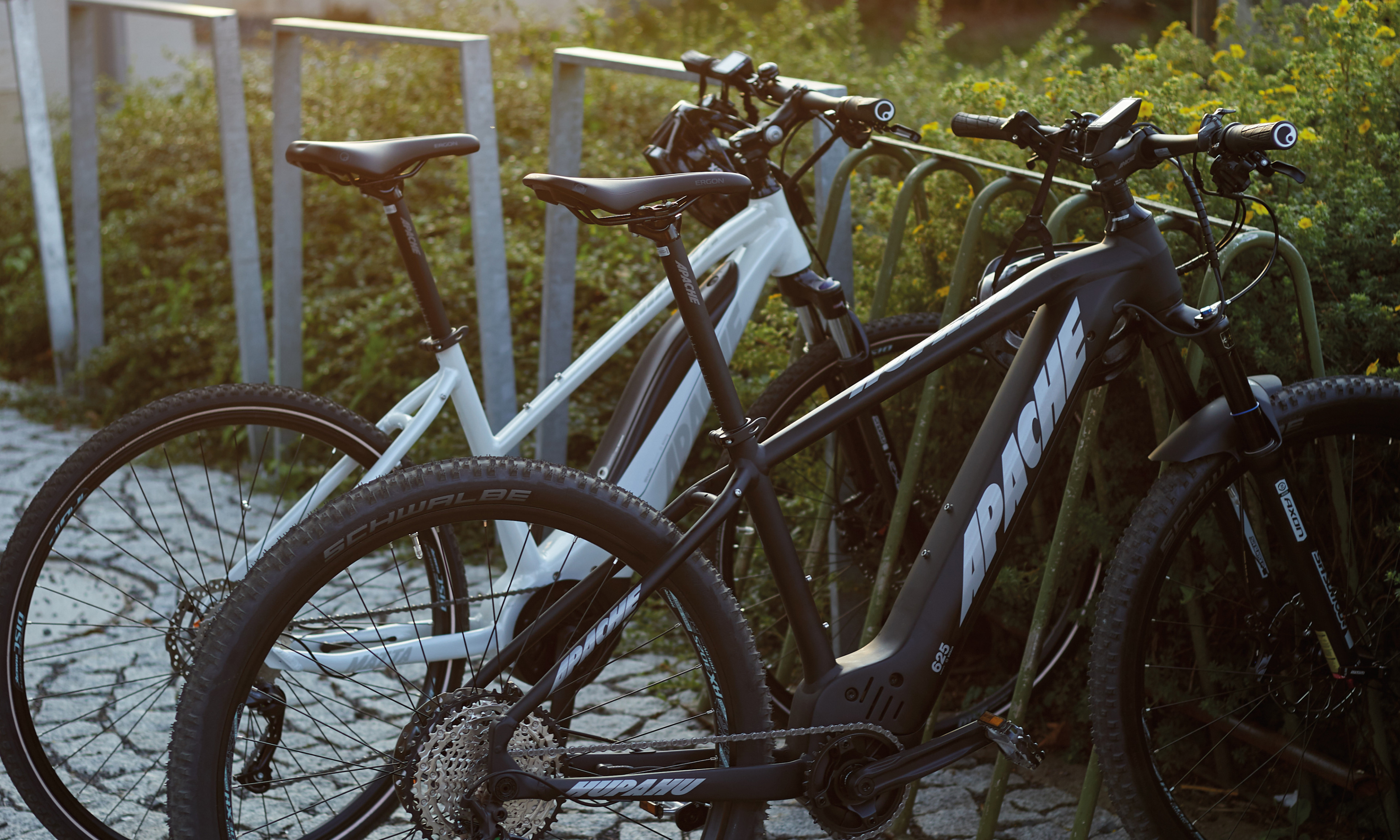
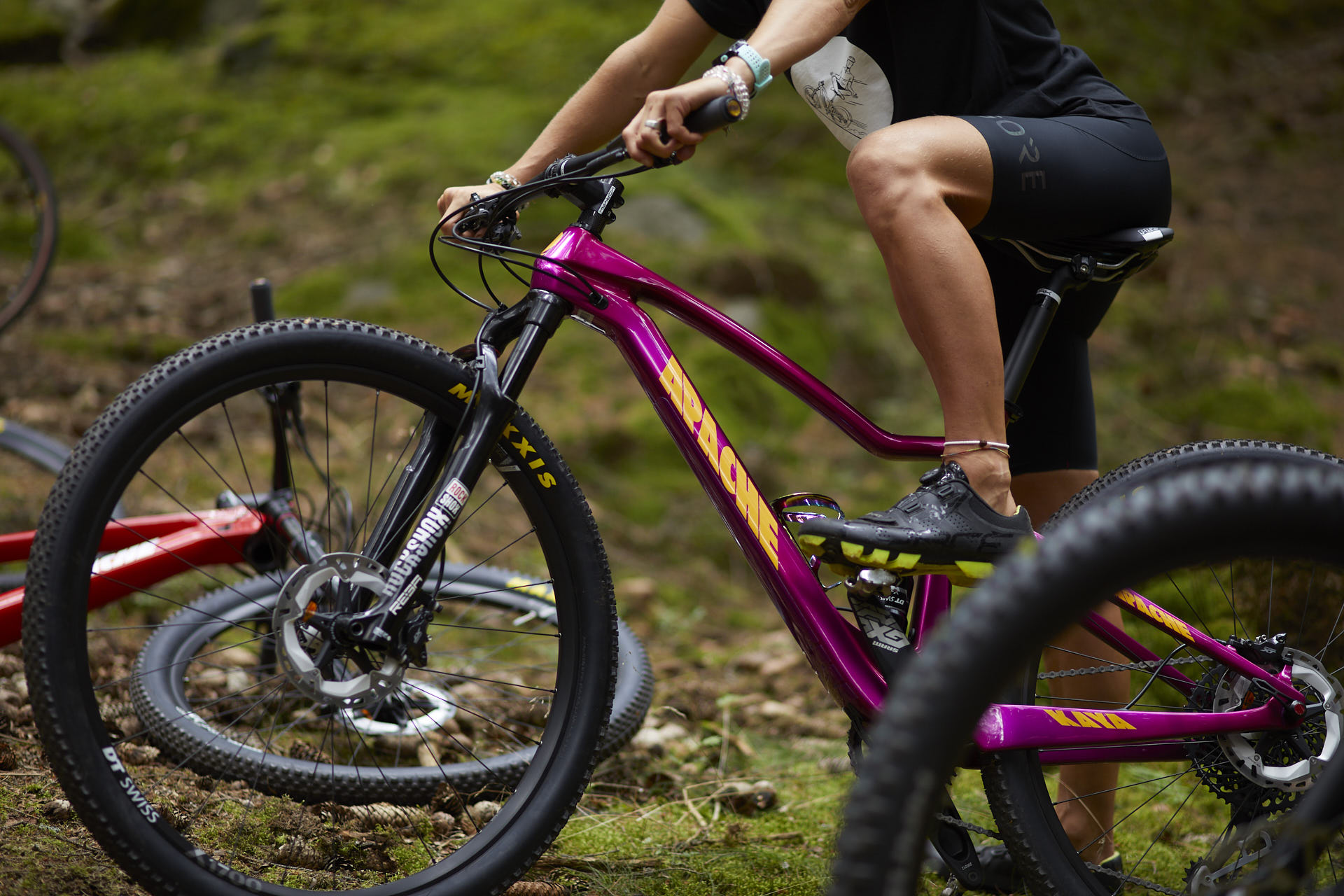
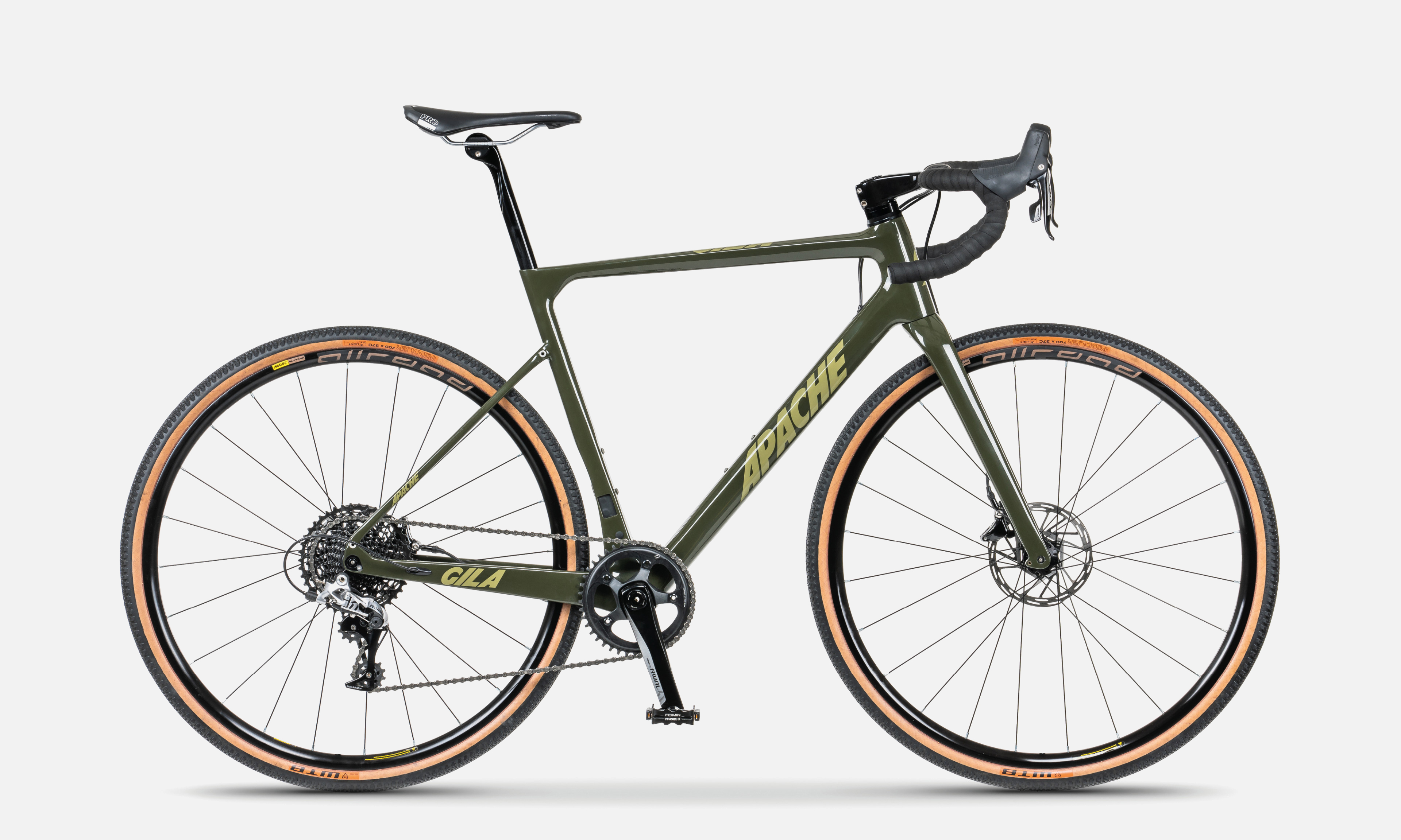
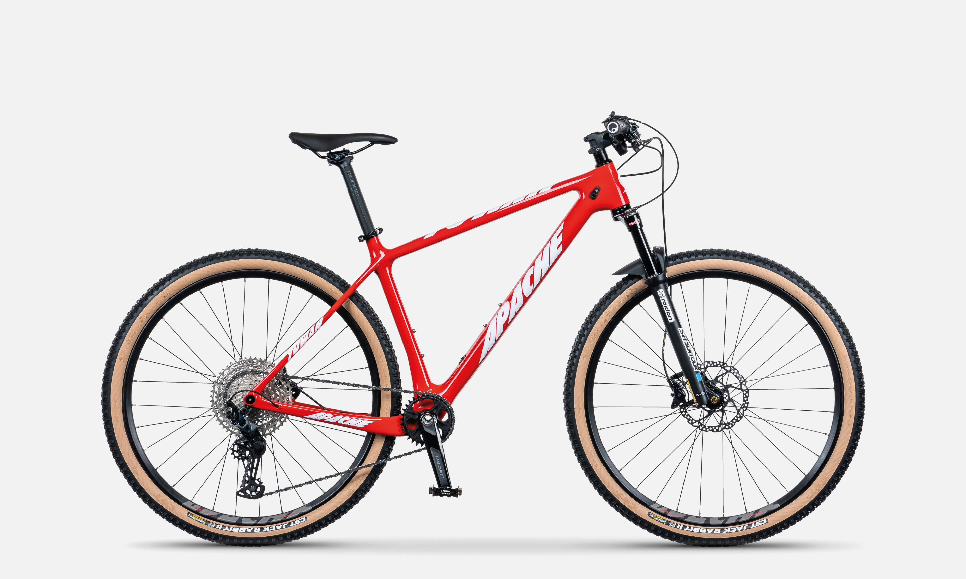
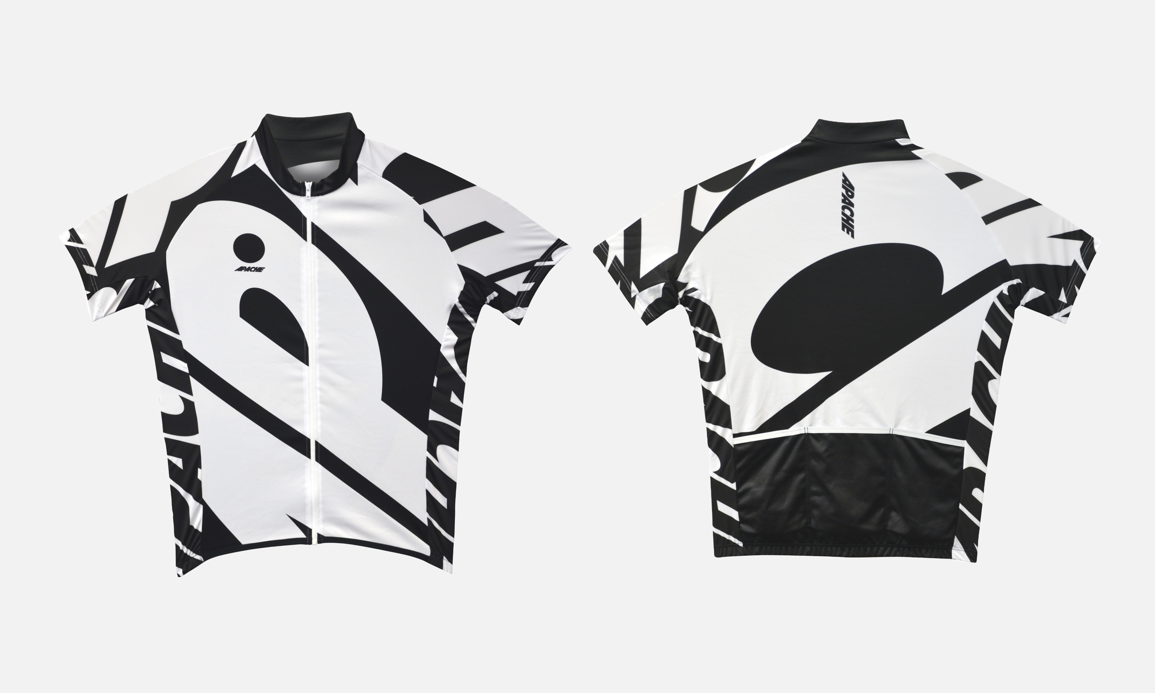
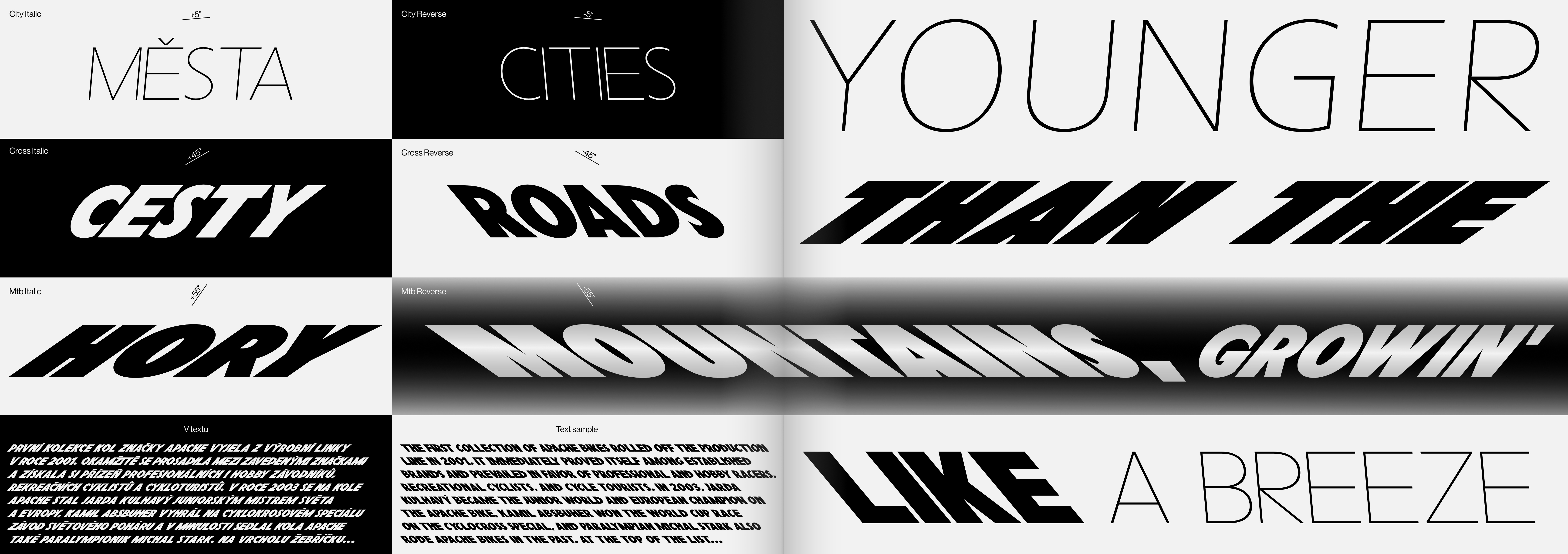
The new visual identity for Apache Bikes* is based on solid/expressive typography (header custom lettering / later designed as full-scale font, called Speed Grotesk typeface), minimalist layout, and illustration. The header lettering has three styles that differ in slant and weight. This differentiation is based on dividing bikes according to the route’s difficulty (slope of the landscape and speed) into three categories — Cities / Roads / Mountains. The greater the difficulty, the greater the slant and weight of the style. From an almost invisible slanted Light (Cities) to an extremely slanted Black (Mountains). Also, each style has two variants of italics (left and right italics), used separately for each side of the bike and thus perfectly quote movement direction.
The new visual identity for Apache Bikes* is based on solid/expressive typography (header custom lettering / later designed as full-scale font, called Speed Grotesk typeface), minimalist layout, and illustration. The header lettering has three styles that differ in slant and weight. This differentiation is based on dividing bikes according to the route’s difficulty (slope of the landscape and speed) into three categories — Cities / Roads / Mountains. The greater the difficulty, the greater the slant and weight of the style. From an almost invisible slanted Light (Cities) to an extremely slanted Black (Mountains). Also, each style has two variants of italics (left and right italics), used separately for each side of the bike and thus perfectly quote movement direction.
*As part of the collaboration on the company’s new identity, we also tried to appeal for a change of the company’s name, unfortunately without success (You can find more information about the issue of using names based on the heritage of Native Americans here, for example).
- link:
-
For more visuals, visit the clients' website here
- client:
- team:
-
concept, type-design, design: Jakub Hojgr
concept, identity, design: Lukáš Kijonka
illustrations: Alexey Klyuykov
- status:
-
Realized
- year:
-
(Time is a construct)
- photo:
-
Filip Beránek
- type:
-
#type-design #identity
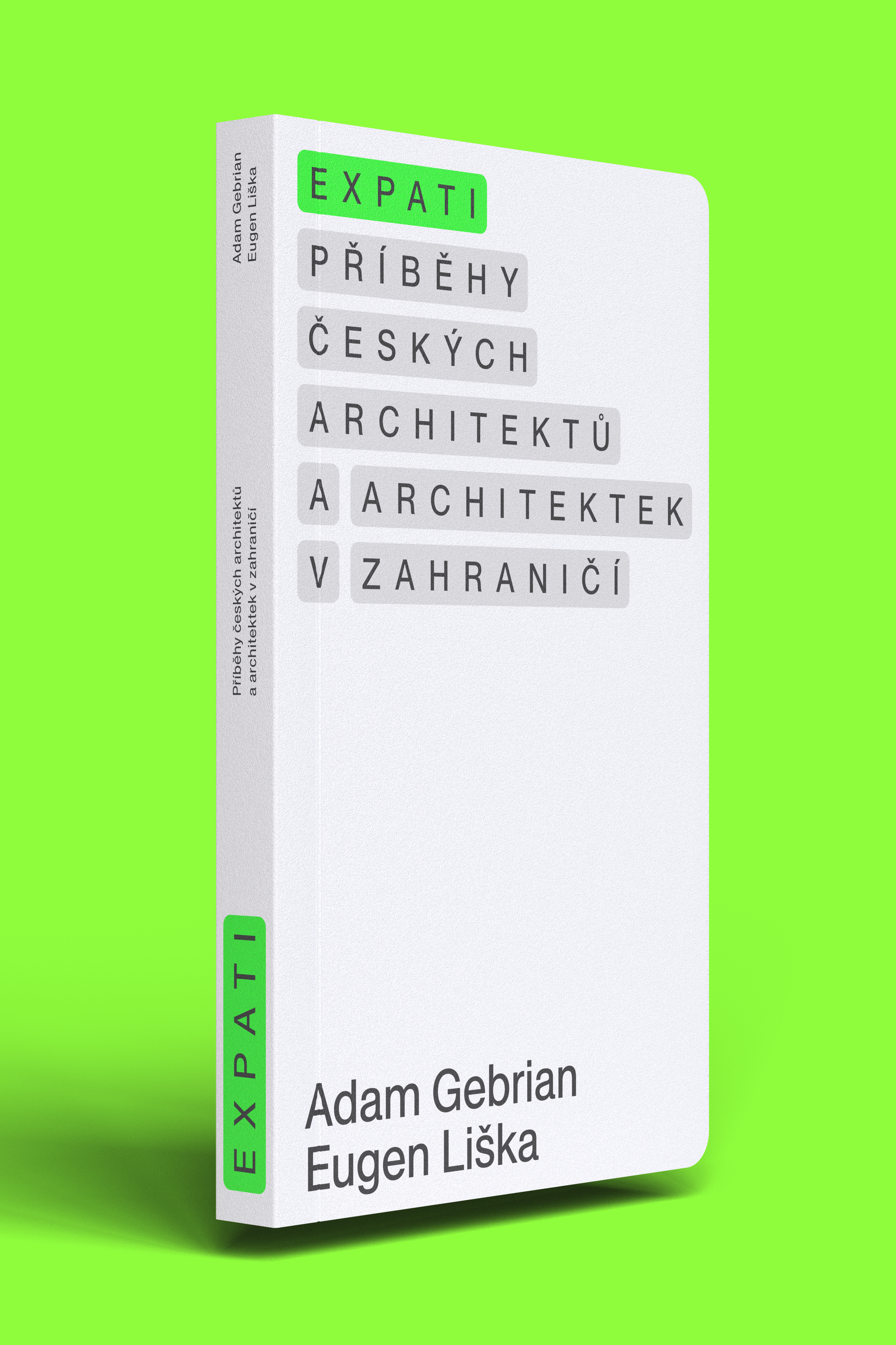
Expats — Stories of Czech architects and architects living abroad
about:
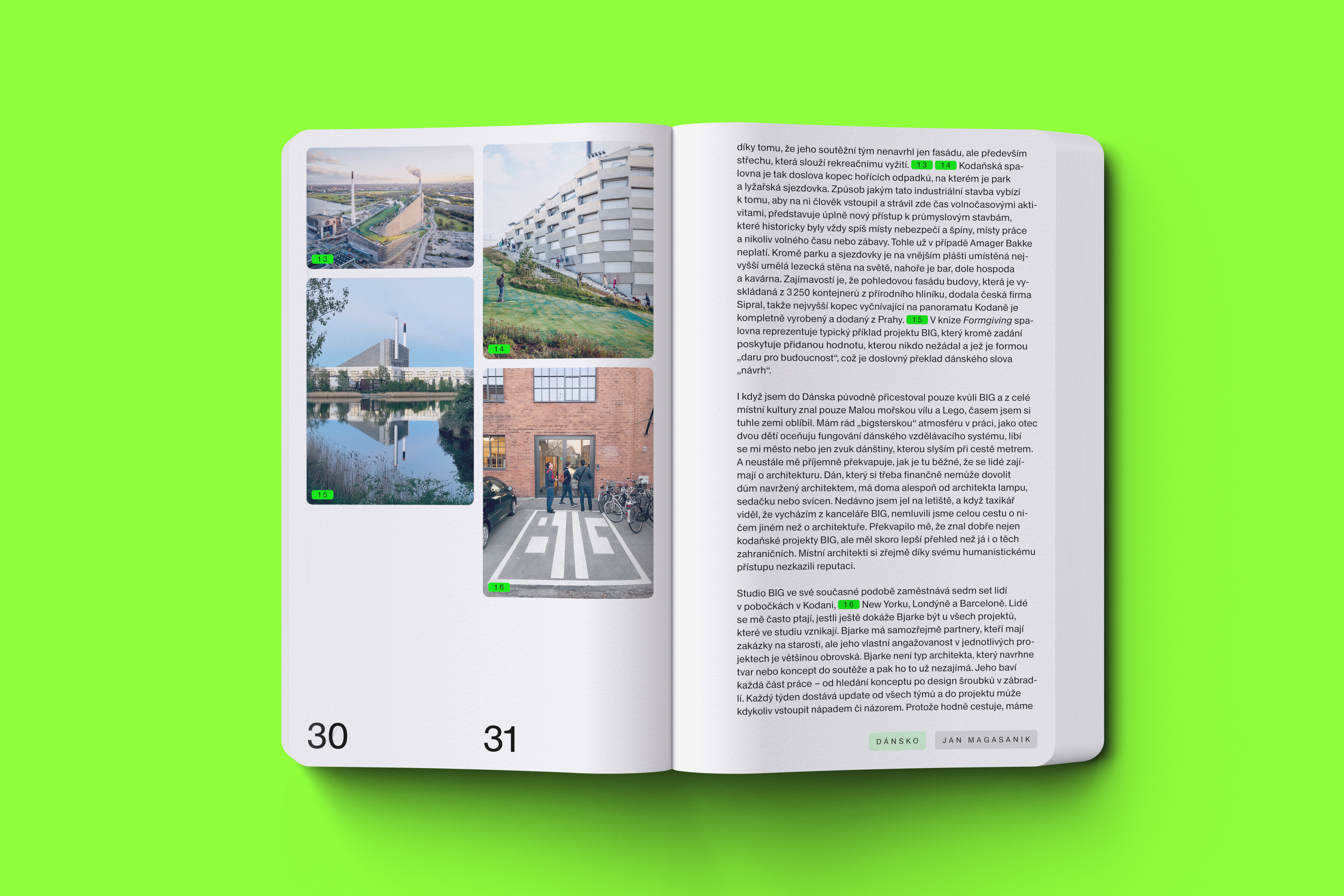
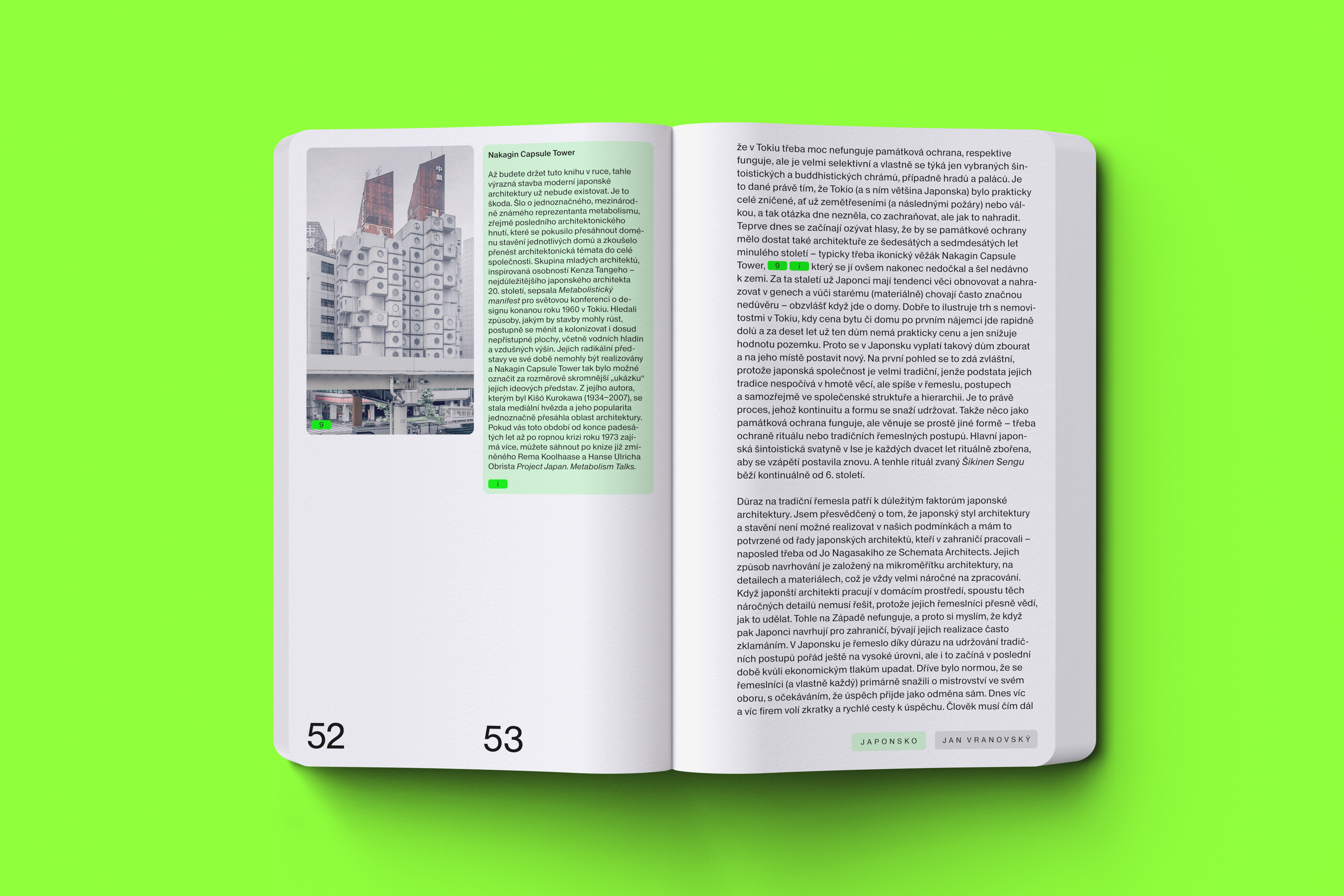
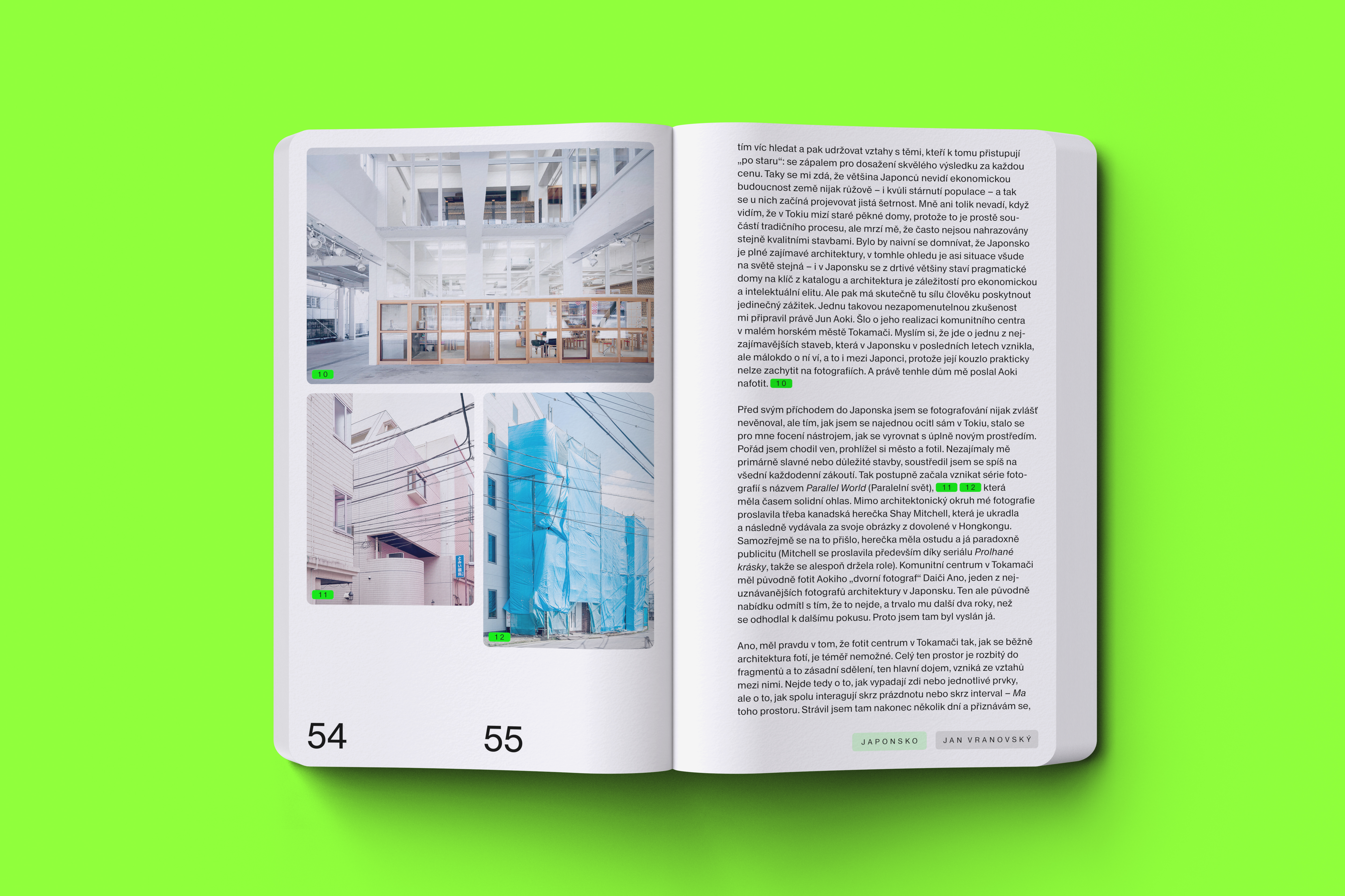
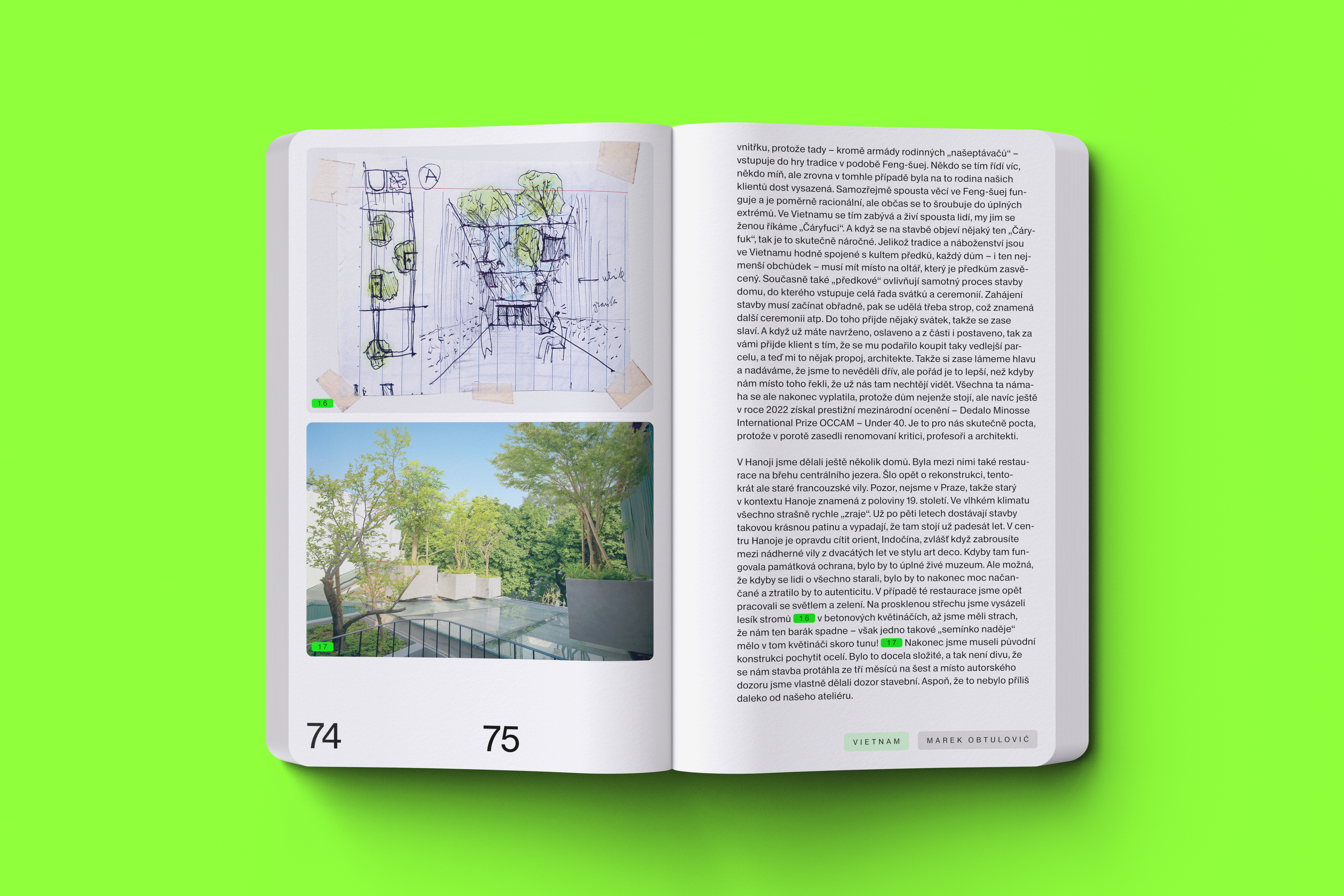
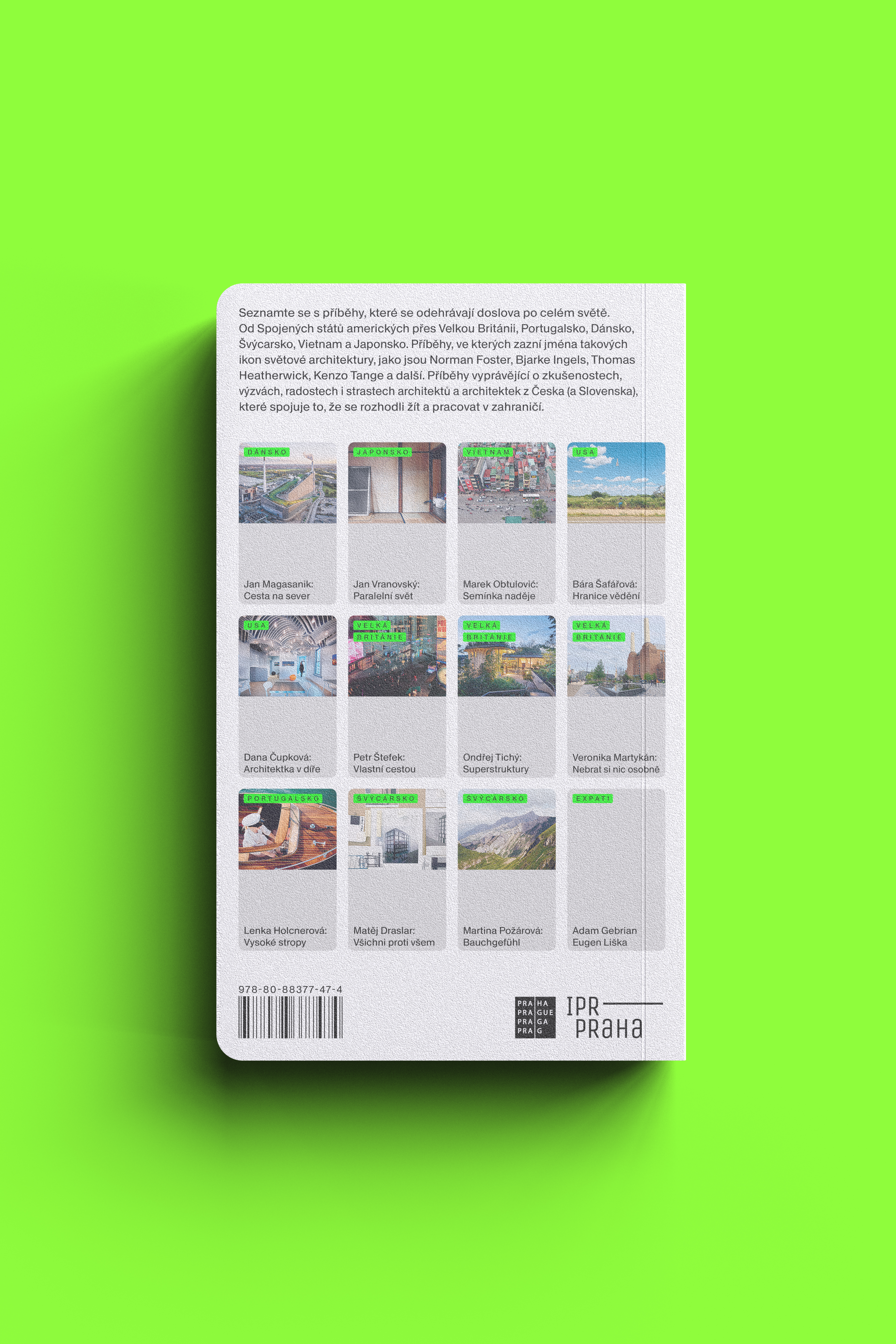
The book version of the original Expats lectures in CAMP is based on the most current form of CAMP’s visual identity, primarily following the design of the new institution’s website. The design of the book thus confirms that we have reached a time when printed media can naturally be inspired/based on the form of online media and practices in UI/UX design. The book’s design is primarily based on practicality/purpose of use — small format, distinctly rounded corners, laminate on the cover — everything is intended to ensure easy carrying of the book and comfortable reading, for example, even when you travel in public transport. The text/image content is separated from each other (on each page) separately and linked back using numbered tags — finding images becomes a game, or you can skip the pictures entirely and focus only on the text. The individual chapters in the book are divided using cards (a popular UX component), which are also shown on the back of the cover. The book’s design is ready to be utilized as a template for the subsequent planned editions.
- link:
-
Read more about the book here
- client:
- team:
-
concept, design, communication: Zuzana Kubíková
concept, design: Jakub Hojgr
consultations: David Březina
- status:
-
Realized
- year:
-
(Time is a construct)
- 3D:
-
Matěj Chabera
- type:
-
#book-design
Visual identity & navigation system for the Emmaus Abbey in Prague
about:
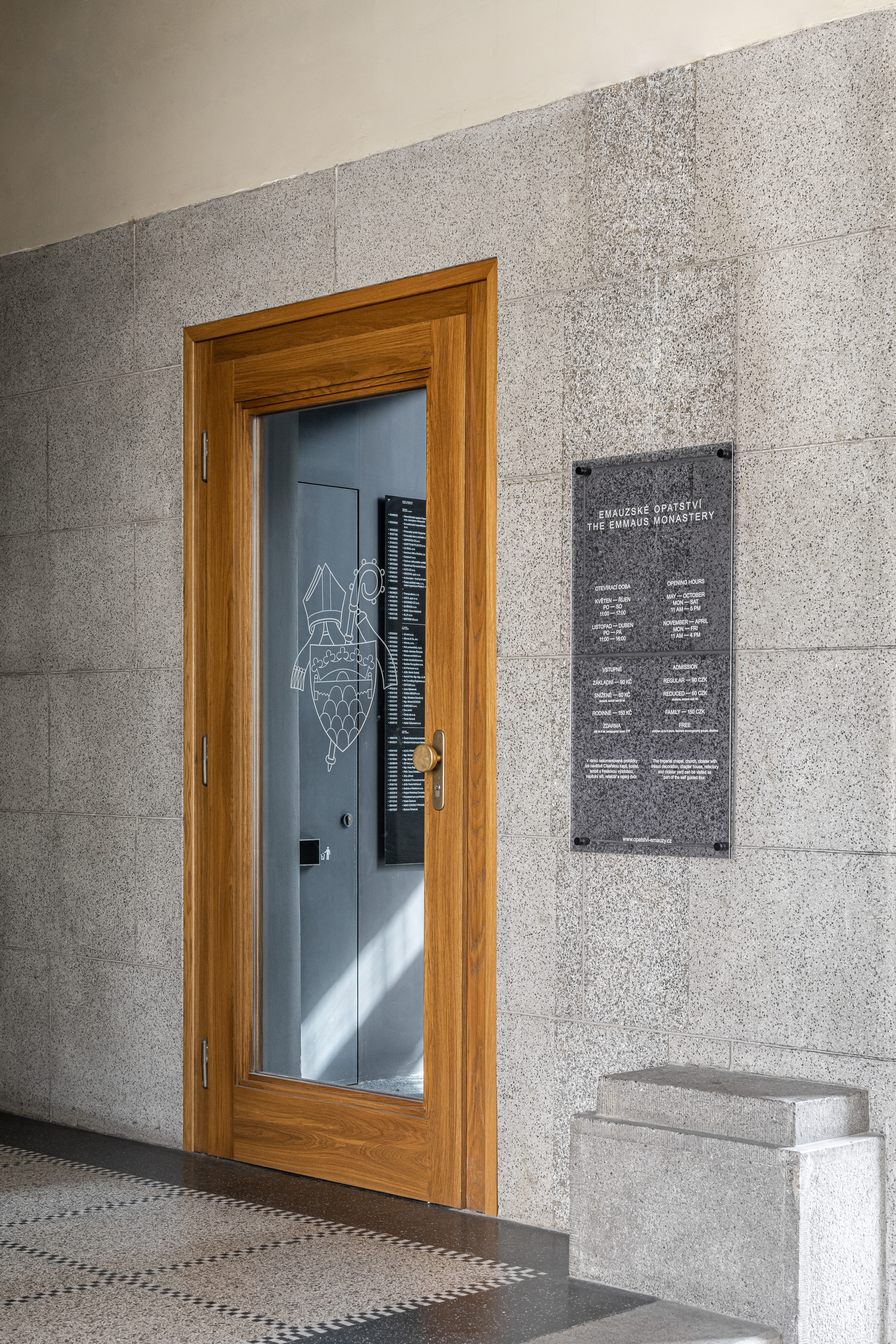
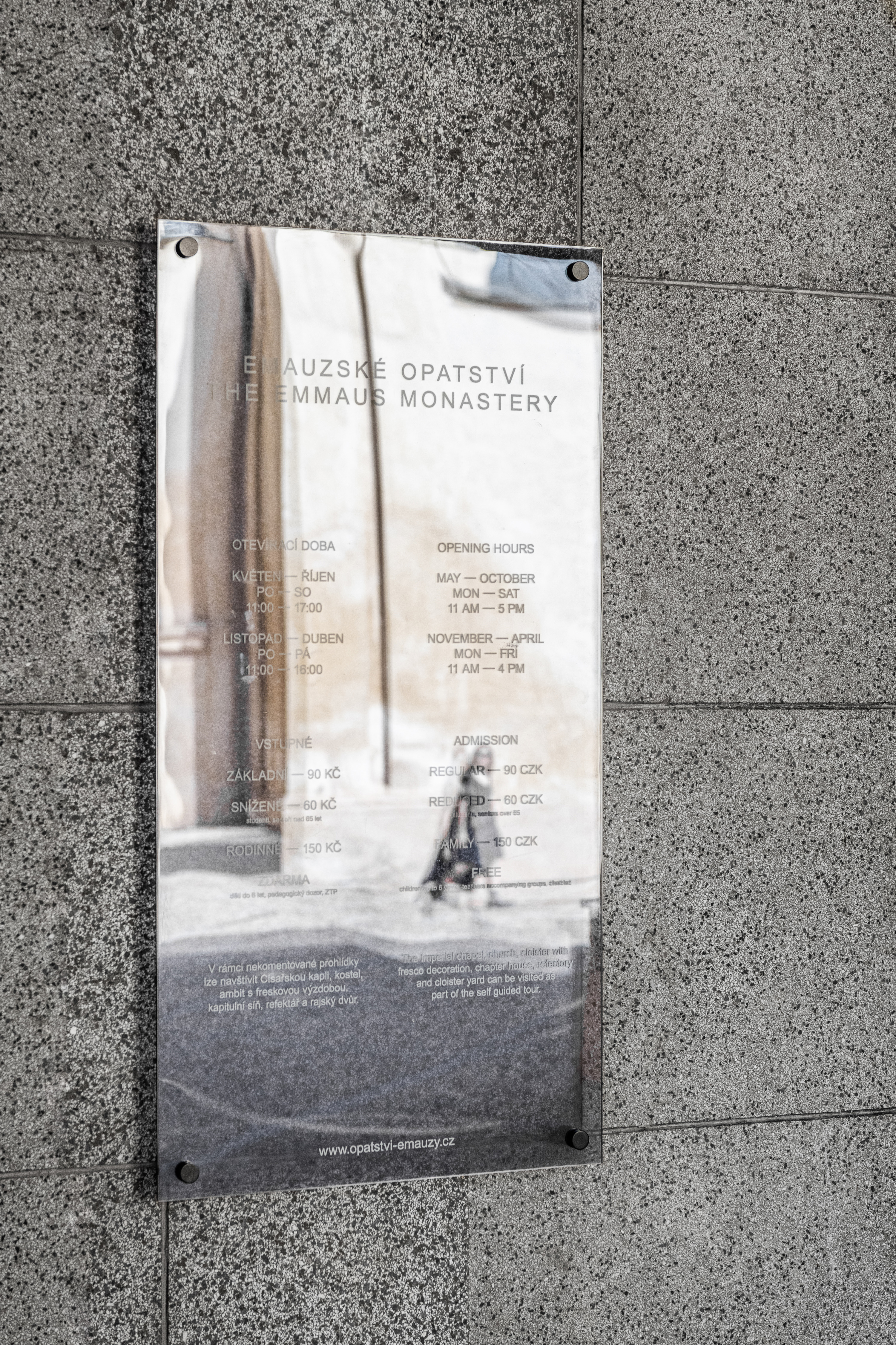
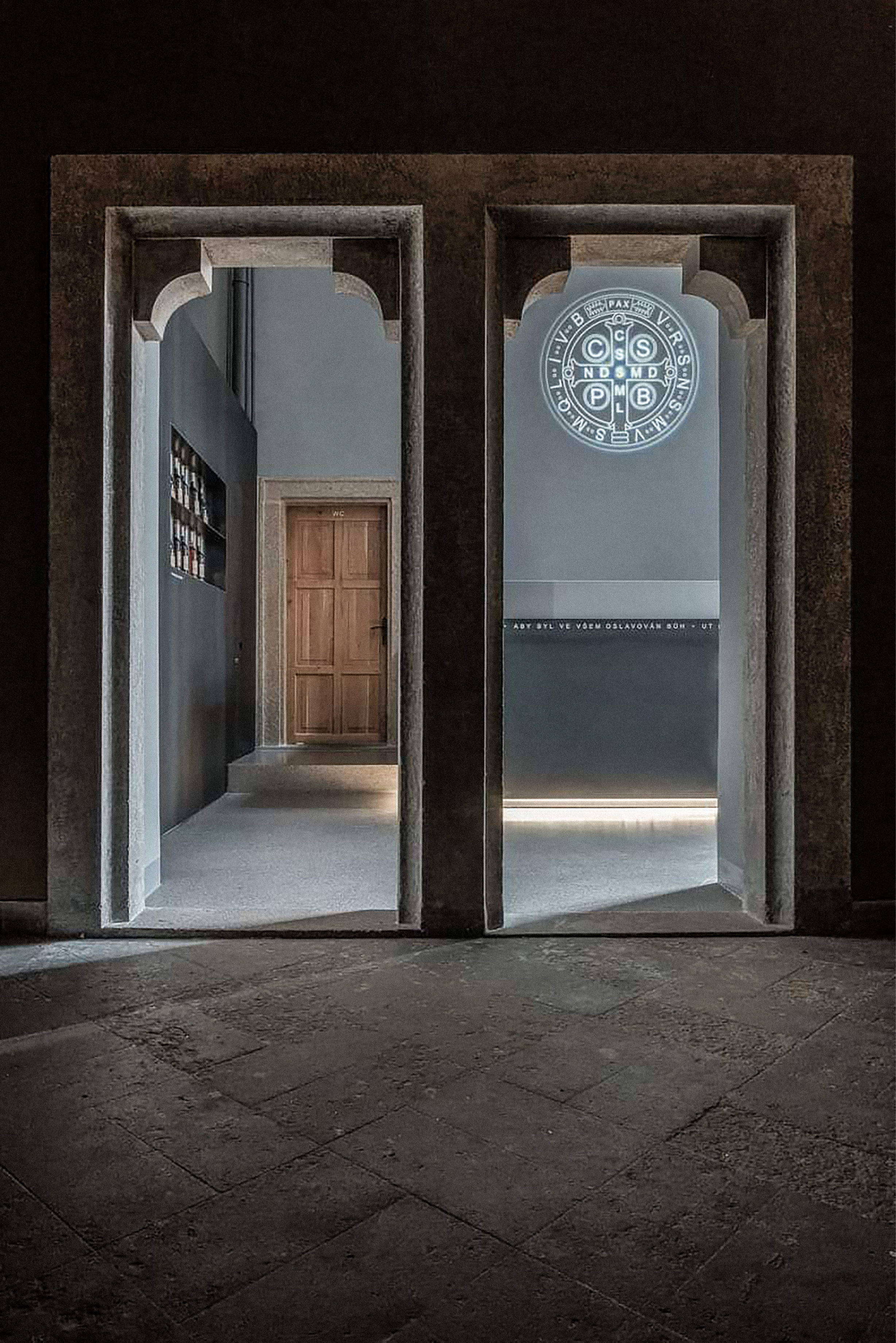
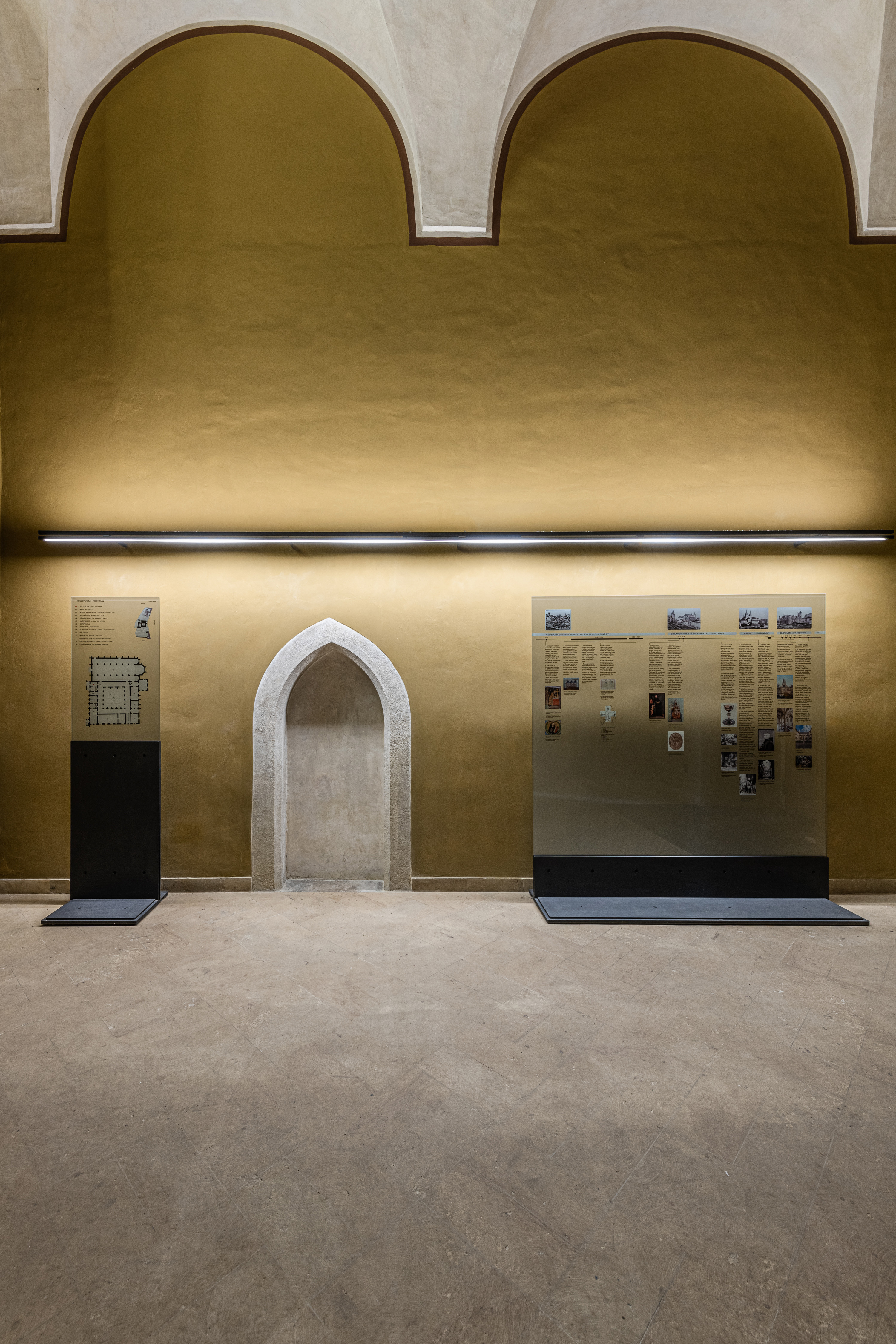
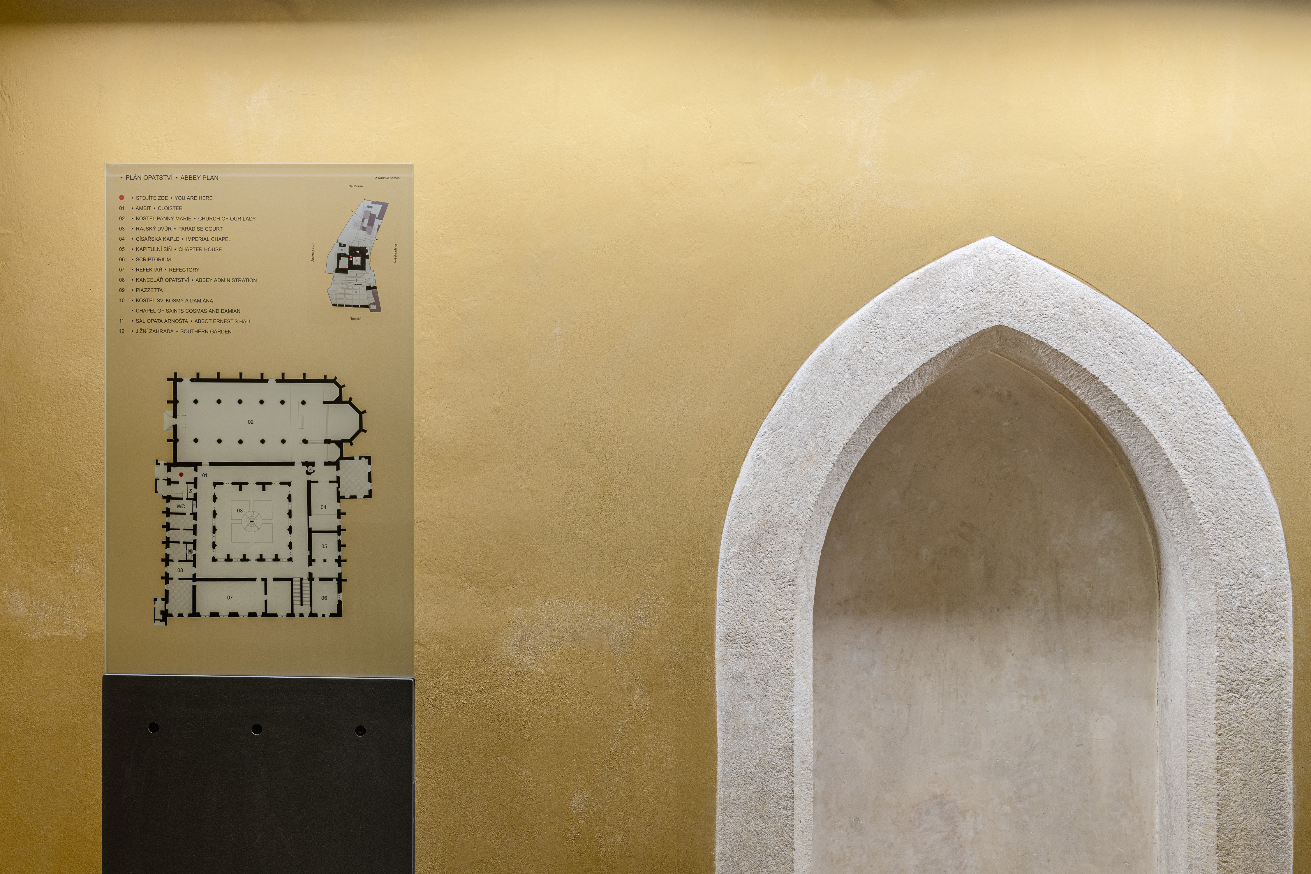
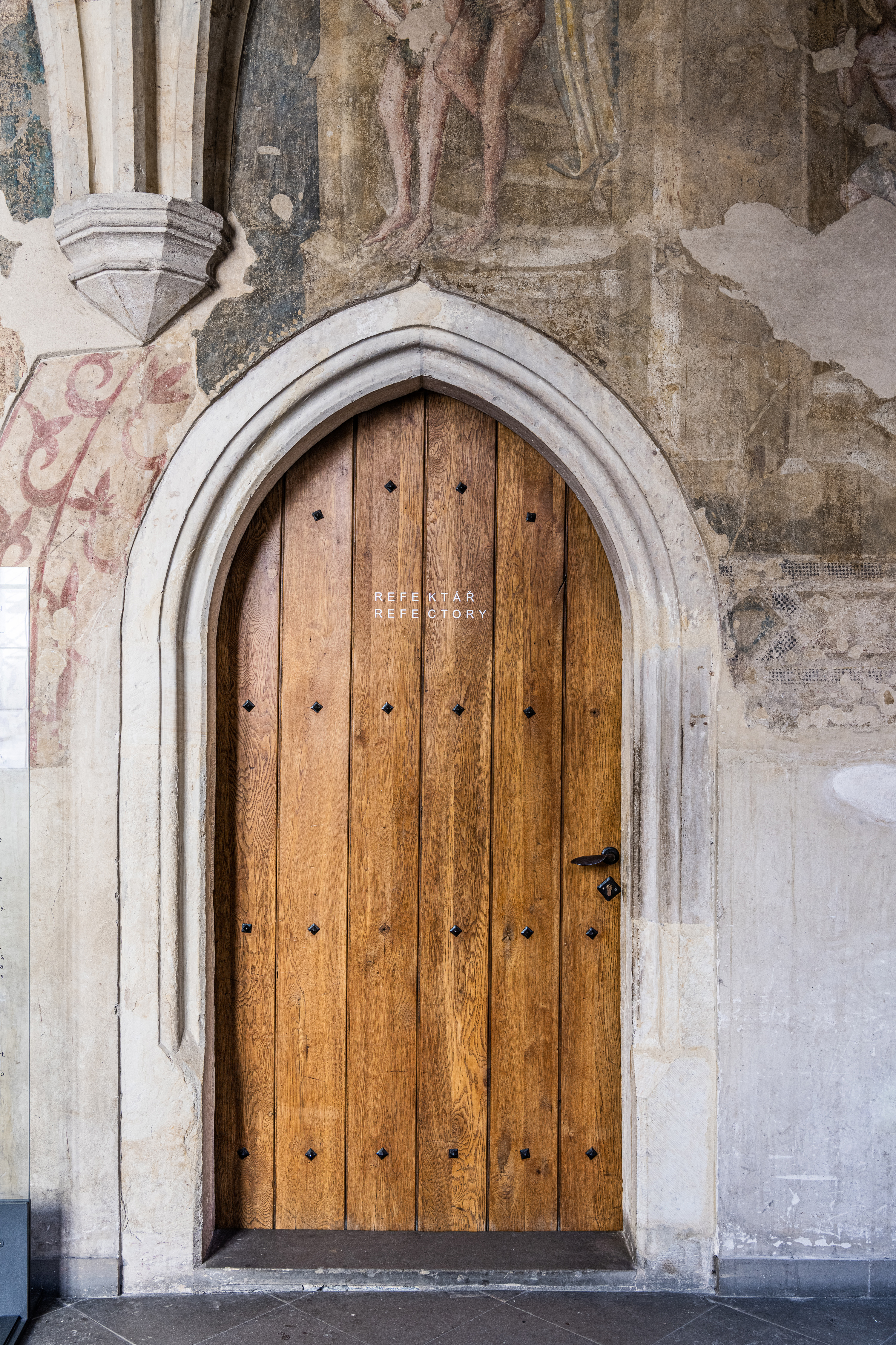
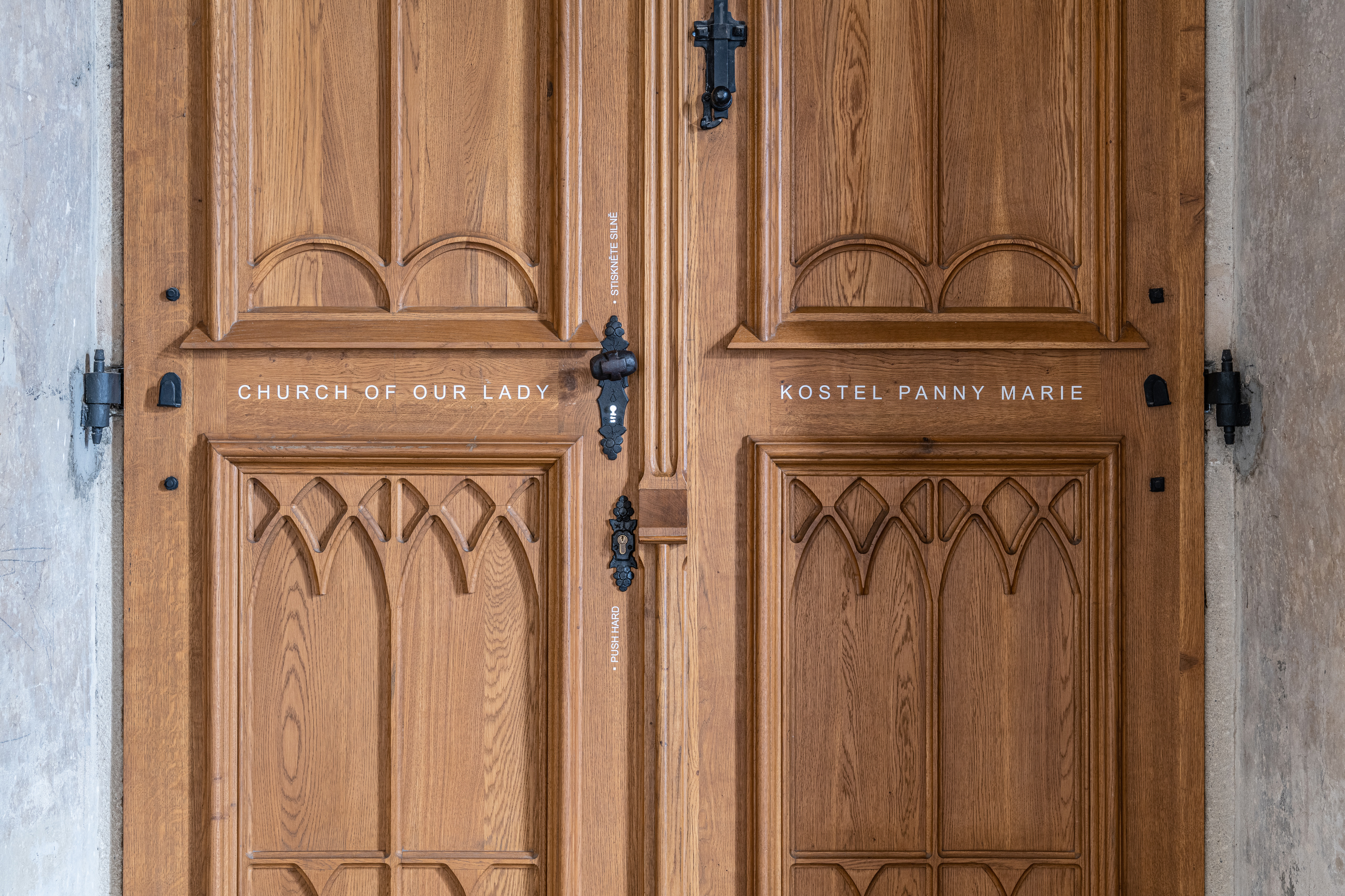
The identity and navigation system for the Emmaus Abbey relies primarily on one word: Modesty, which follows the Benedictine motto “Pray and work” (Ora et labora). What’s more humble in the world of graphic design than the imperfect/default font everyone has on their computer, last exported in the 1990s? We chose the Arial font as a starting point, which was (for both identity and navigation purposes) supplemented/improved with a small package of new symbols. The entire identity and navigation are then practically/only typographic. It sticks to the default graphic editing and Markup language options. More than little effort was also given to the option of internal maintenance of the navigation system so that most outputs can be replaced by the client, only with the help of a standard A4* desktop printer.
The identity and navigation system for the Emmaus Abbey relies primarily on one word: Modesty, which follows the Benedictine motto “Pray and work” (Ora et labora). What’s more humble in the world of graphic design than the imperfect/default font everyone has on their computer, last exported in the 1990s? We chose the Arial font as a starting point, which was (for both identity and navigation purposes) supplemented/improved with a small package of new symbols. The entire identity and navigation are then practically/only typographic. It sticks to the default graphic editing and Markup language options. More than little effort was also given to the option of internal maintenance of the navigation system so that most outputs can be replaced by the client, only with the help of a standard A4* desktop printer.
*However, this concept still needs some fixes to work as perfectly as we would like. Finally (for some specific parts) of the navigation, we prepared a more complex system, which must be edited by a professional designer and made in the printing house.
- client:
-
The Emmaus Abbey [with: atelier IXA]
- team:
-
concept, consultations, communication, technology: Benedikt Markel
concept, design, type-design, communication: Jakub Hojgr
- year:
-
(Time is a construct)
- photo:
-
Benedikt Markel
- type:
-
#identity #navigation-systems
mmcité — Rebranding & visual identity for street furniture company
about:
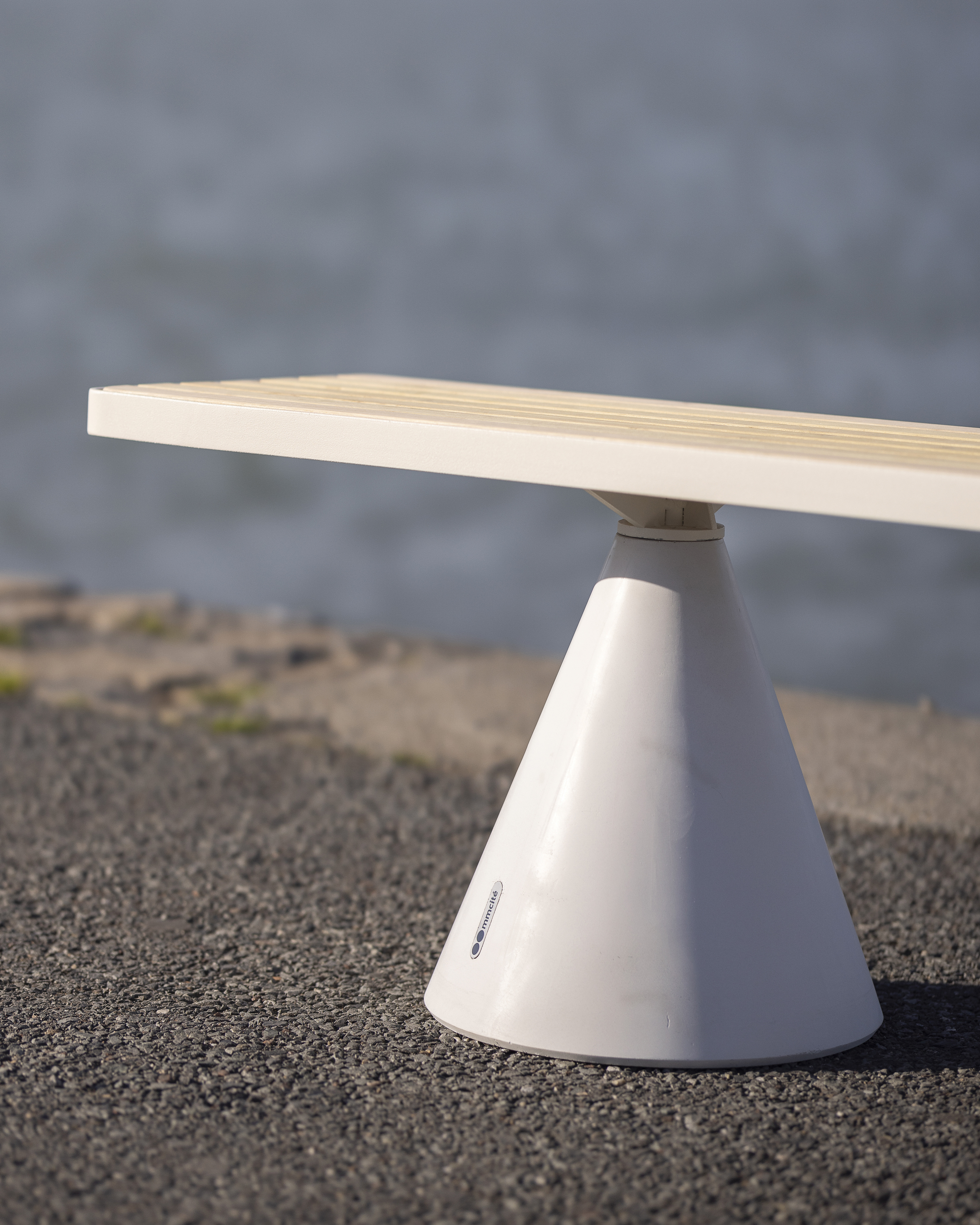
In the Laboratory studio, I had the opportunity to redesign the identity of the mmcité, a company producing high-quality street furniture. Instead of radically transforming the entire brand, I decided on a “rational revision/update” of the current state and development of the logotype & identity. For the main logotype, I made (just) precision typographical changes and touches — the same way I continued in all its variants (mainly, I deal with change of cuts, redrawing of diacritics, and change of metrics/kerning). As part of the identity revision, I choose new additional fonts. Another change was the improvement of color — the corporate Pantone neon orange I synchronized with the web colorspaces such as RGB/HEC — the principles of CMYK color selection were also improved). In detail, I focus on the rules of layout application and the system of working with the logotype, images, and illustrations. Finally, I designed a pack of new pictograms plus prepared and supervised the implementation of a new identity for the latest company’s website.
- client:
-
mmcité [with: laboratory.cz]
- team:
-
consultations, communication: Petr Babák
concept, design*, communication: Jakub Hojgr
*The website was developed by DesignDev and Creepy. I designed a pack of new pictograms and prepared/supervised the implementation of a new identity.
- status:
-
Realized
- year:
-
(Time is a construct)
- photo:
-
(archive of mmcité)
- type:
-
#identity #system-design #uiux-design
UI/UX of mobile app for Kingdom Come: The Board Game
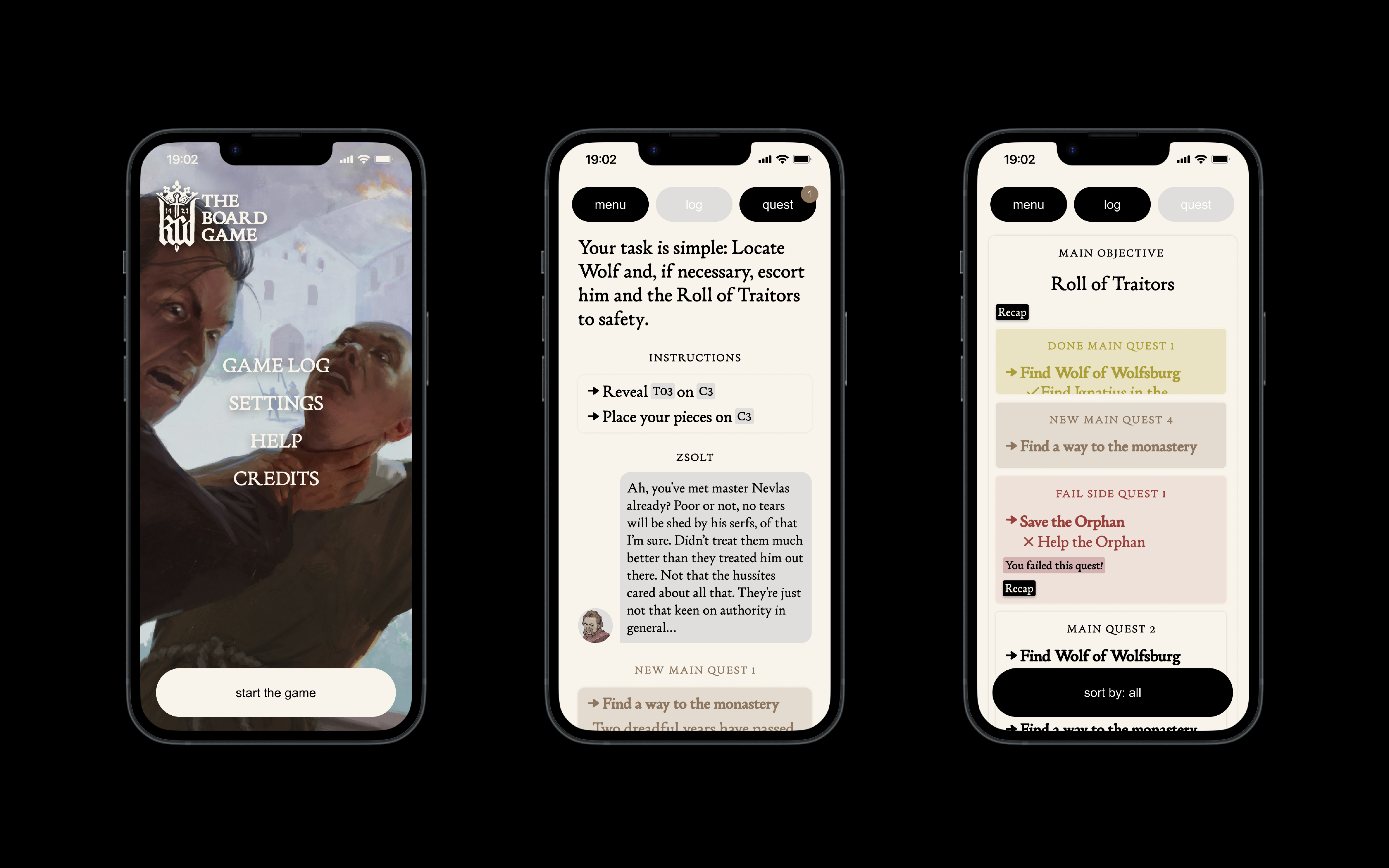
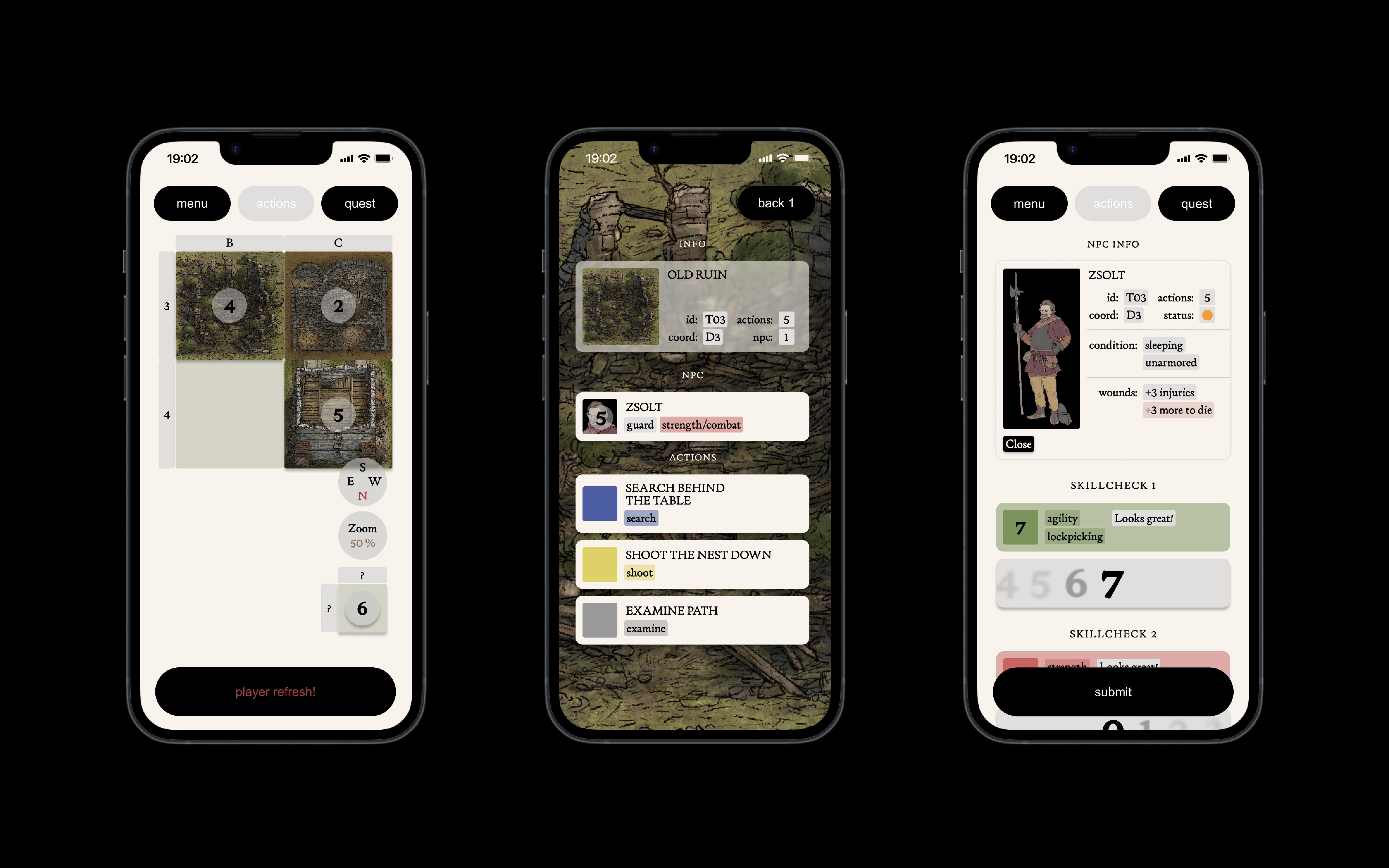
about:
For two years, I had the opportunity to develop UI/UX mobile applications for the board version of the infamous PC game Kingdome Come Deliverance — Kingdome Come: The Board Game — in a team of 17 people. It should be a unique way of incorporating a mobile application into a board game when most of the attention remains on its physical components. The aim of the application was thus to expand the story possibilities of board games. Regarding the UI/UX of the application, I focused on the most balanced ratio between keeping the game’s atmosphere inside the application and the effortless orientation/readability of the functional elements. There was a combination of minimalistic/default design of the application elements, supplemented with a distinctive typography (Creatura font) that “wrapped” all the “story components.” I created three unique application versions and countless iterations during the entire development. Unfortunately, this board game was finally not released due to high production costs (lack of funding). The whole project is thus not yet implemented (the project is on hold).
- link:
- client:
-
Warhorse Studios [under: Boardcubator]
- team:
-
Visit the full list of collaborators here.
- status:
-
Unrealized / On hold (reason: lack of funds)
- year:
-
(Time is a construct)
- type:
-
#uiux-design
Navigation system for the new technology center of UMPRUM
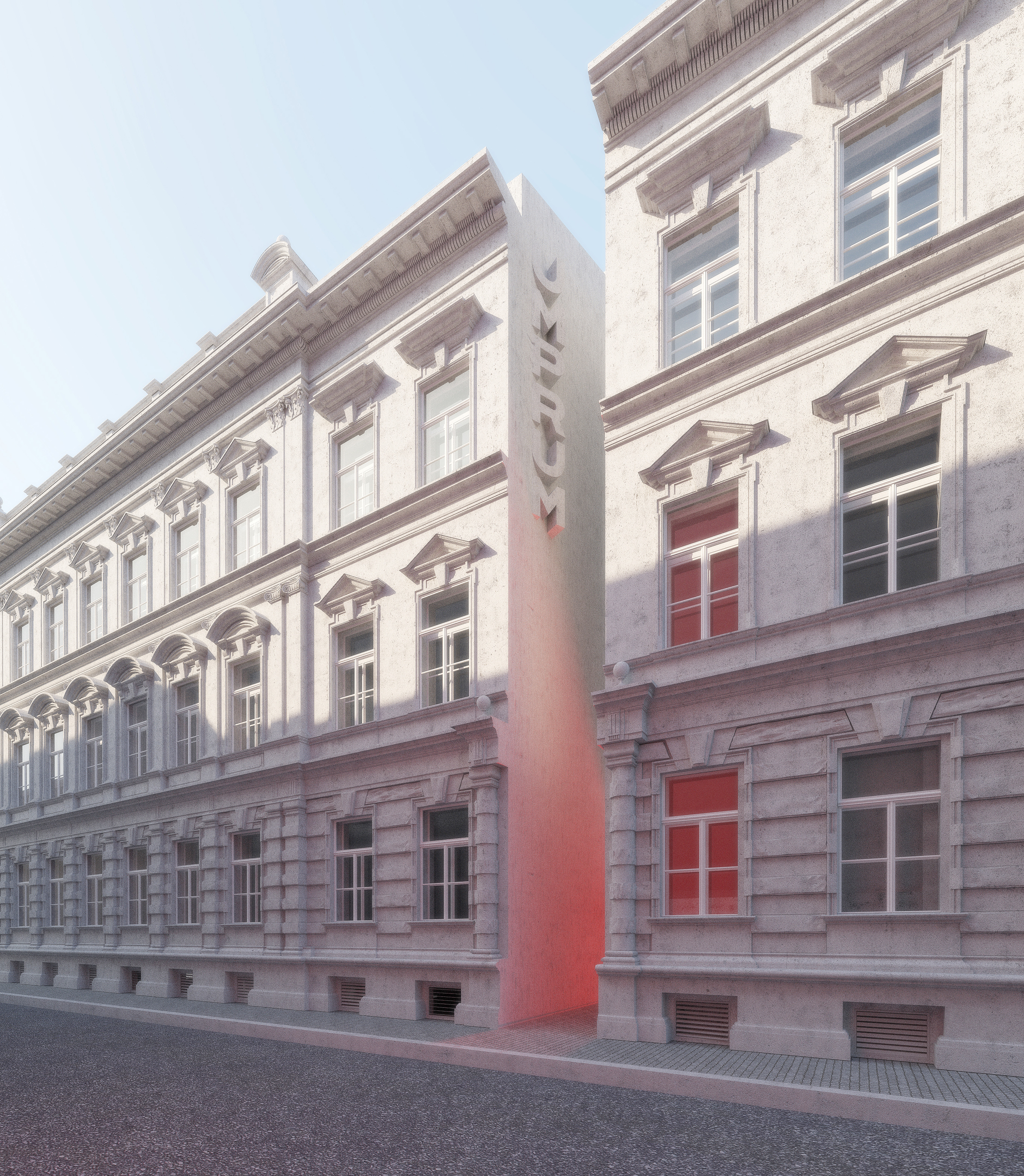
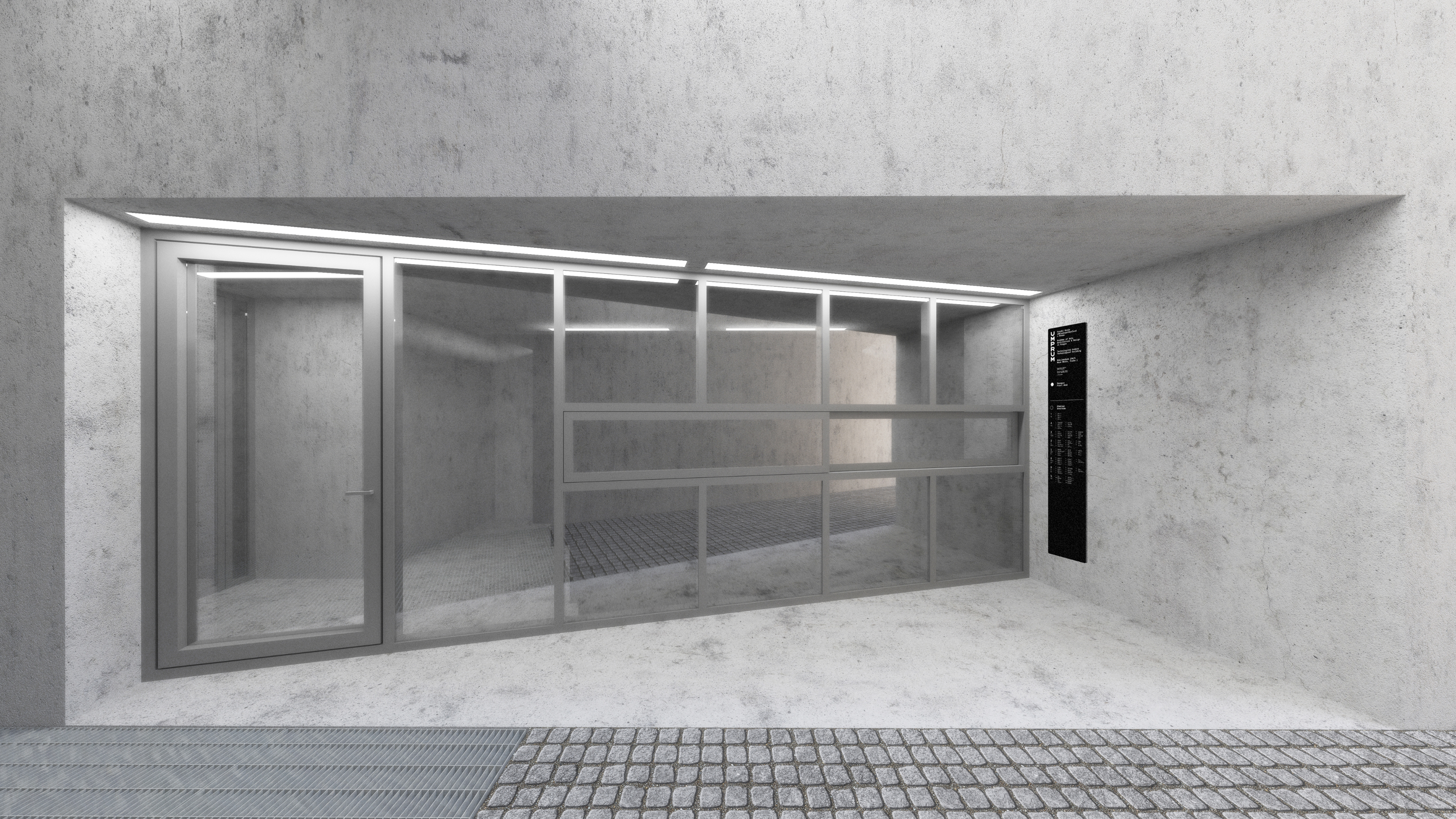
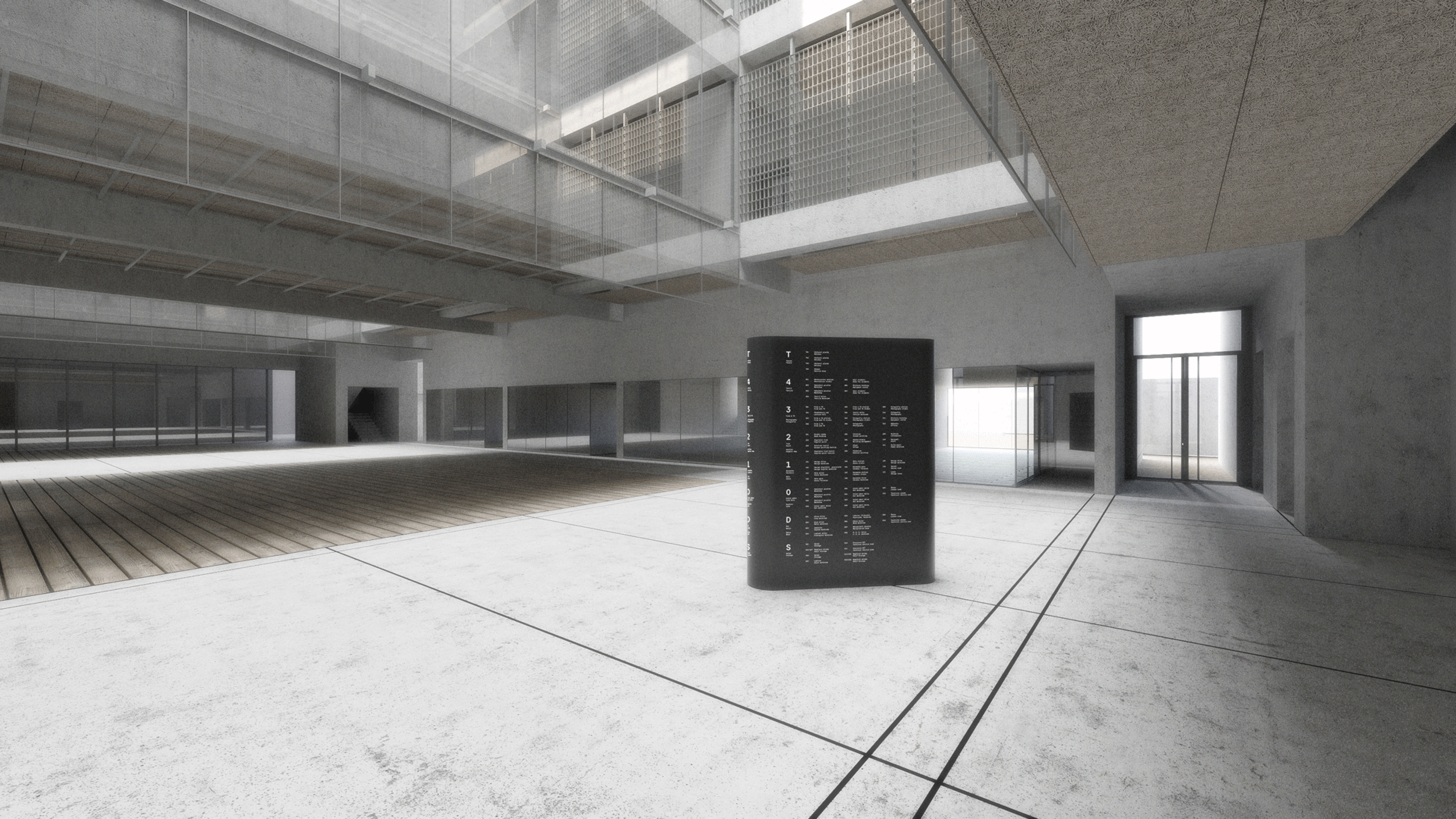
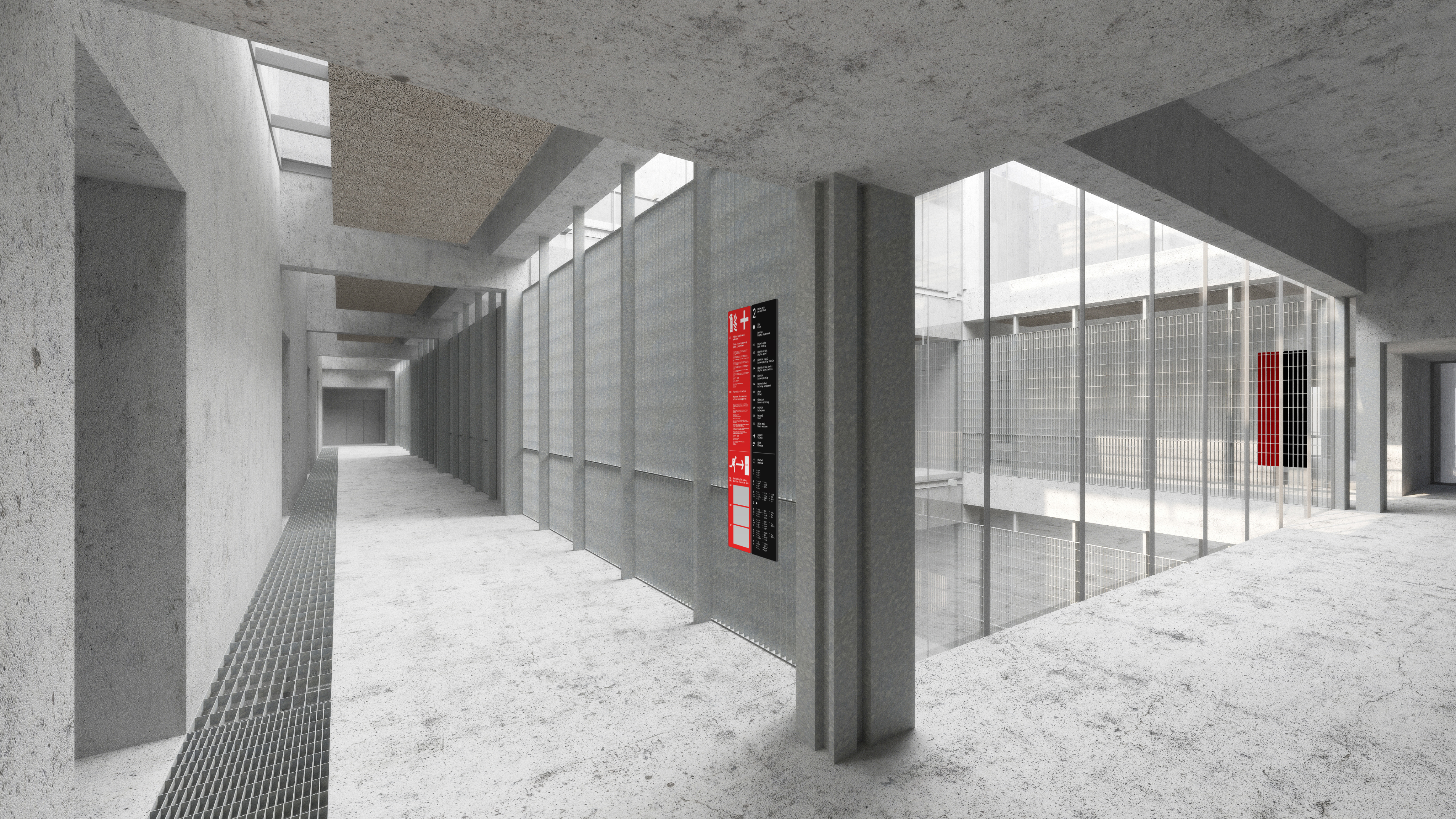
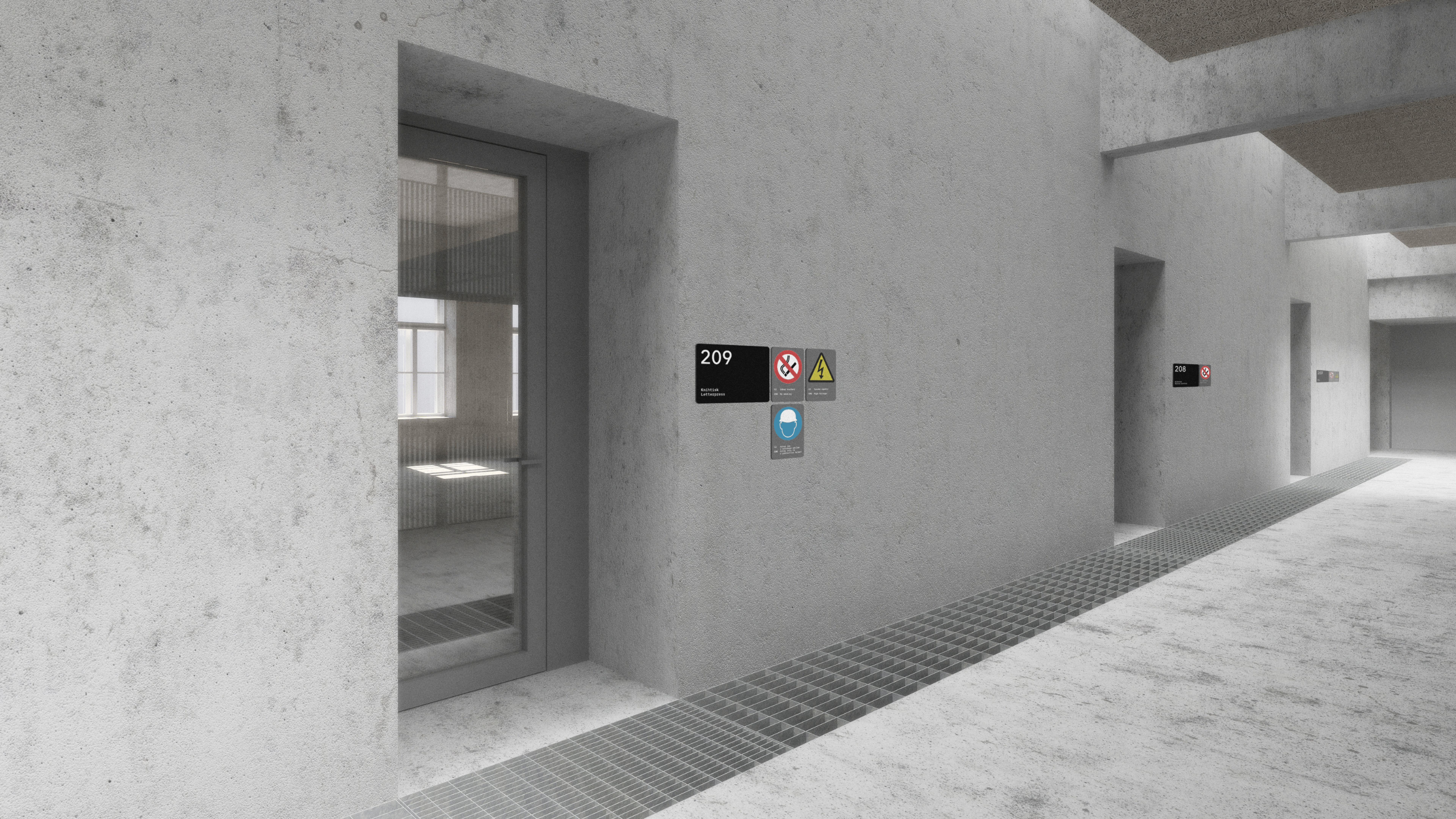
about:
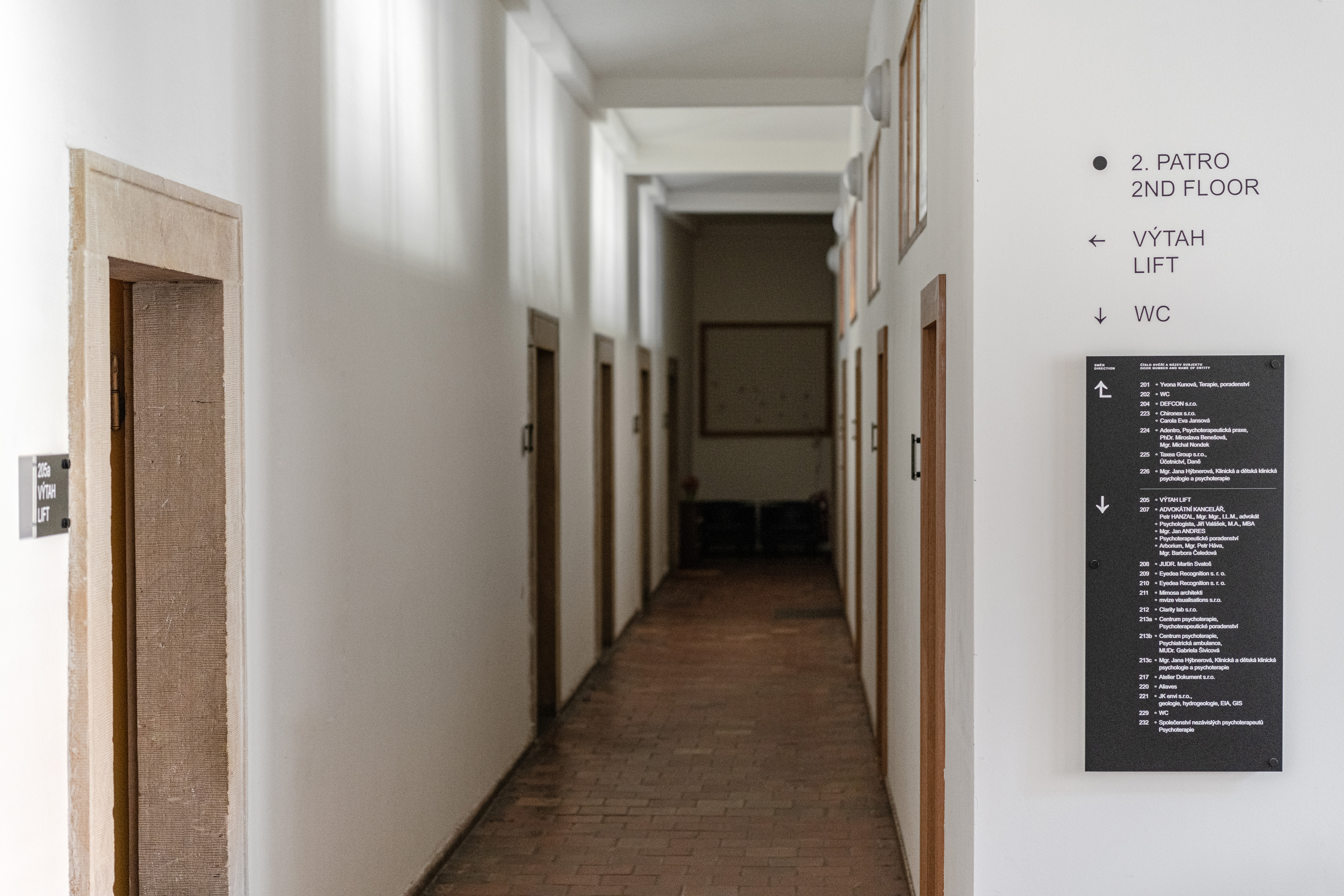
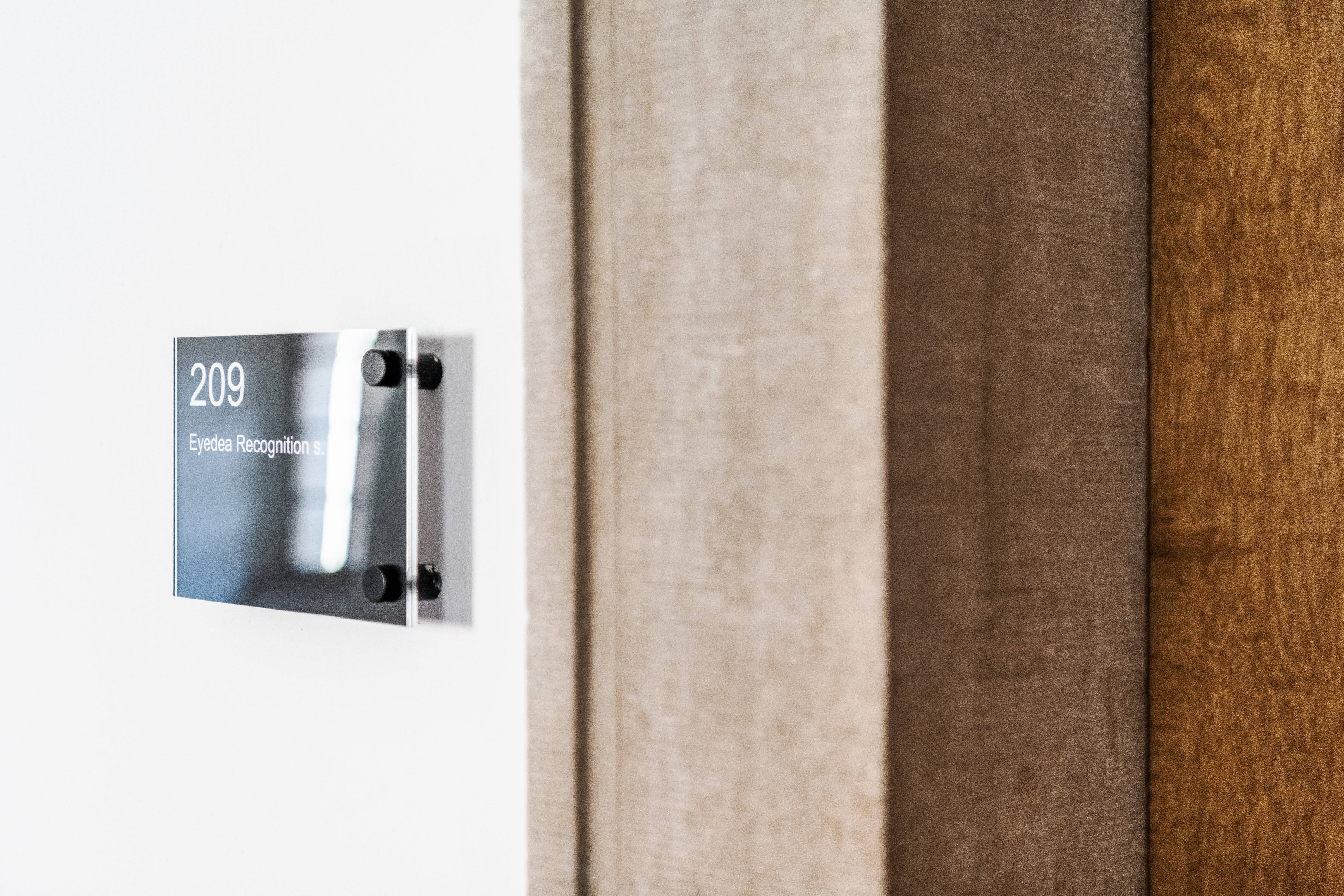
We developed four proposals for the navigation of the new Umprum technology center. In 2017, as students and as a part of school assignment. In 2018, school administrators requested us to develop a new system, and in 2021, we updated this proposal to the final form. The navigation system was divided into two parts / two possible identities / for the technology building and the original school building (future possible application). In the fundamental concept, we used two primary colors as a background to put information on — the “signal red” was taken from the architects’ design (red staircase) and was supposed to be used for safety signage. The black background would serve as an orientation/navigation system. The safety signage was supposed to hit an ideal balance between using prefabs (escape signage, warning tapes, etc.) and tailor-made solutions (safety points, a new package of pictograms). Also, we connected the whole navigation system with the safety signage system at the workshops. For example, we designed the tagging system for tools (which was also suitable/synced with the tool’s online database). We have divided the orientation system into standard signs and main nodal points — multifunctional objects with the possibility of projection and variable positioning.
- client:
-
UMPRUM (Academy of Arts, Architecture & Design in Prague)
- team:
-
concept and design: Přemysl Zajíček, Jakub Hojgr
- status:
-
Unrealized (reason: We could not agree on a schedule for executing the order with the client)
- year:
-
(Time is a construct)
- 3D:
-
Jan Vybíral (Ivan Kroupa architekti)
- type:
-
#navigation-systems #system-design